Best Personal Injury Lawyer Websites
A website is essential for lawyers looking to build a successful personal injury law firm. It’s a great way to showcase your expertise and build trust with potential clients. But what makes a great personal injury law firm website? The answer is simple: features tailored to your audience’s needs. From informative content to easy-to-navigate pages, the best personal injury law firm websites feature various elements designed to engage visitors and help them make informed decisions.
- Our #1 advice: The best personal injury websites have a phone number prominently displayed in the website’s header, linked for “click to call” if the visitor is on a mobile device.
- The homepage should clearly state the firm’s mission and provide an overview of its services. It should also include a contact form and a list of practice areas.
- In addition to providing information about the firm, the website should also include helpful resources for visitors. This could include case studies, legal articles, and blog posts. These resources should be easy to find and should be updated regularly.
- The website should also include testimonials from past clients and a list of awards and recognitions the firm has received. This will help to build trust and credibility with potential clients.
- Finally, the website should be optimized for mobile devices and include social media integration. This will ensure potential clients can easily find and connect with the firm.
5 Top Personal Injury Law Firm Websites
When it comes to personal injury law firms, having a great website is essential. Not only does it give potential clients an insight into the firm’s services, but it also serves as a powerful marketing tool. Lawyers should take the time to create a website that accurately reflects their practice and sets them apart from the competition. Here are five examples of well-thought-out personal injury law sites we like:
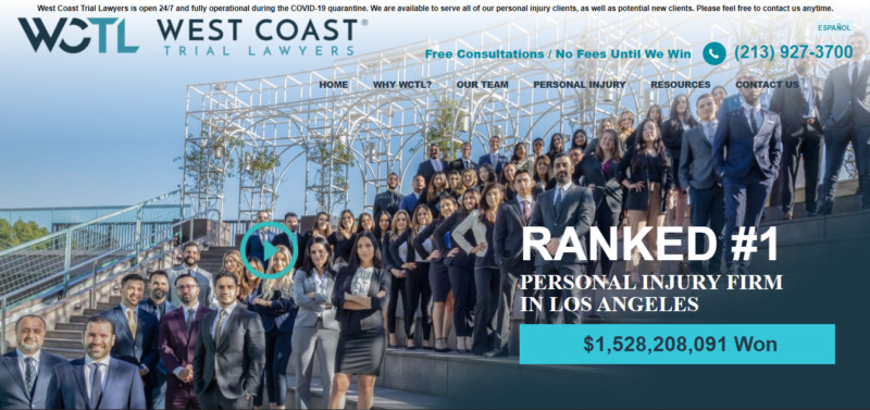
1. West Coast Trial Lawyers
This company’s website knows how to grab the visitors’ attention and give them a great impression. It has placed all the details that a potential client needs to decide to hire one of their lawyers on its homepage.
What We Like About It
If you are injured, the last thing you want to do is to spend hours in front of your computer. As a result, you’ll want to find a personal injury lawyer to assist you within minutes of sitting down. Regardless, you can’t hire just any professional. You at least want to get somebody to help you win and be compensated.
Given this time crunch, it would help if the website featured all of the lawyer’s or firms’ selling points front and center. For example, if you go to the website of West Coast Trial Lawyers, the first thing you will see is a slightly intimidating photo showing dozens of lawyers from the firm. It boldly announces in large text that the firm is “Ranked #1” in personal injury cases. Plus, the total compensation that the firm has won for their clients is highlighted underneath that.
What do these details tell the potential client? First, they show that they have the people to help you. Next, they are the best in their respective area. Finally, their lawyers are experts because they have managed to win over a billion dollars in compensation for their clients.
The website also places a premium on helping the client contact the firm. The number posted is clickable, saving you another five minutes of hassle. Moreover, a chatbot can answer your inquiries if no live customer representative is available.
If those features aren’t enough, the content you see below the fold is text testimonials from satisfied clients and a video testimonial from a celebrity client. Testimonials are critical in this field since you want to hear about the experiences of their previous clients.
2. Florida Personal Injury Law Team
Being in a situation where you need the assistance of a personal injury lawyer is distressing. There are several details to think about and so many decisions to make.
That is why a lawyer’s website needs to contain all the information that a potential client would need, but it should also be organized well. The website of the Florida Personal Injury Law Team is an excellent example in this regard.
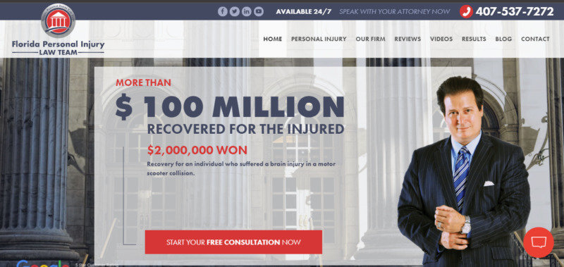
What We Like About It
The first thing that would catch your eye when you look at this firm’s website is the amount of money it has won for its clients. The following detail is its solid 5-star customer rating. If that has already convinced you to hire one of their lawyers to represent you, there is no need to scroll down; there are three buttons to click for you to contact their office.
If you decide to scroll down, you will find the firm’s affiliations and awards neatly presented in logos as a grid. A professional video also introduces the firm and the people who work for it. This is a crucial element to include in a website because a potential client should be able to assess if they feel comfortable working with these professionals.
Below that is a well-organized menu of personal injury situations. These are divided into auto accidents, premises liability, and other areas. You can conveniently click on whatever case you want to consult with the firm. As a result, the visitor wouldn’t need to go over any unneeded information. As soon as you click on the category that fits your situation, you will be able to see the information you need.
3. Clifford Law Offices
When competing for clients against hundreds of law firms, you need to ensure that your website showcases why the client should choose you over any other firm in the area. The designer did this successfully on the website of Clifford Law Offices.
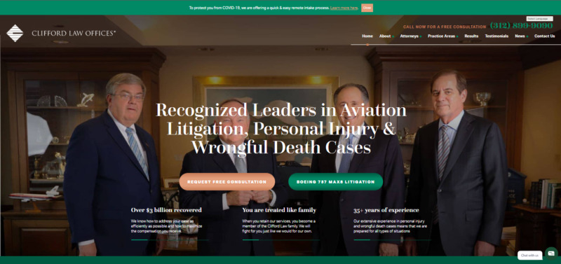
What We Like About It
The website seems unassuming and straightforward at first sight. A picture of the firm’s top lawyers is displayed on the homepage. This is followed by a label proclaiming they are recognized leaders in personal injury, aviation litigation, and wrongful death cases.
Below are two call-to-action buttons. The first is to book a consultation, and the next is to learn more about their most significant case.
The text slider below the picture makes a more significant impact. Three texts are presented that rotate in the middle of the page. The first one states that the firm has over 35 years of experience. That is impressive because clients would want to hire a lawyer who knows the ins and outs of the situation. The next slider claims that the firm treats its clients like family—another essential detail. Finally, the slider states that the firm has won over $3 billion for its clients.
After that, there is a section featuring news articles that cover the firm’s million-dollar settlements. If anything should convince any client to sign a contract with a firm, these elements should do it.
If your client is highly accomplished in any category within this area, you’d want to highlight that on the website. For example, this particular firm is an expert on aviation accidents. Not only has it helped its clients win over $100 million in compensation, but it is also stated in bold text that this firm has represented the victims of almost every commercial airline crash in the country.
Since this is such a specific area, if a potential client’s case falls under that, they will be easier to convince to hire this firm. Knowing which details to highlight affects your website’s conversion rate, and Clifford Law Offices took full advantage of that.
4. McClellan Law Firm
Sometimes, it’s not the content that catches a potential client’s attention. Instead, they stop at a website because of its appearance. That is why a website should not solely be about the firm or lawyer’s total of wins or the amount of settlement they could negotiate. It should also be visually appealing to scroll through and navigate. Check out how the McClellan Law Firm’s website did it.

What We Like About It
Let’s face it. Even if a visitor is looking for something serious, like a personal injury lawyer, the website’s aesthetics is still a significant deciding factor. For example, if a website looks like it was made on a cut-throat budget, a potential client might not be impressed and would click away from it. That is why it is crucial to make a dazzling visual impact.
The McClellan Law Firm’s website uses a muted color palette. Black serves as a formal background for the text and images. They even customized the website’s font.
Following the professional photo of the company’s lawyers, the visitor would immediately see the awards given to this firm. Hover over the logos, and you will see the explanation for those awards. Printed below are the crucial statistics: How much the firm won for their clients under different categories.
A dedicated section includes the firm’s introduction, history, and milestones. The content comes in both text and video form. As you read the various information regarding the company, the logo, call button, and hamburger menu follows you using an active navbar. That makes it easy for you to contact the firm after reading anything that convinces you to hire them.
5. Jackowiak Law Offices
The brown color palette, the chess theme, and multiple clichés and catchphrases should be a bad combination for any lawyer’s website.
However, the designer of Jackowiak Law Offices was able to make them work effectively for this particular firm. So check out why you shouldn’t shy away from unconventional elements.
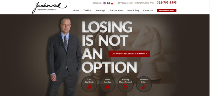
What We Like About It
Brown and maroon are not typical colors that you would use when it comes to law websites. But that is what sets this website apart. The color is so uncommon that a visitor can’t help but remember it for a long time. Coupled with strong fonts and solid background colors, you can’t help but think that this firm knows what it’s doing.
As you read the content, you will readily spot cliches and catchphrases. For example, the designer boldly printed it alongside the picture of Lawrence Jackowiak himself over an image of two chess knights. It boldly states that “Losing is not an option.” As you scroll down, you will spot a few more of these. These include “Make the right choice,” “This is who we are,” “We’re ready for battle,” and “Let’s win.” By the time the potential client has finished reading the text, they can’t help but be convinced that this firm can help them win the case.
The company’s website is comprehensive. It effectively guides the clients through the processes they must undertake depending on practice areas. You will even find an FAQ section per situation. For example, the site contains answers to some typical car accident-related questions if you were in a car accident.
Conclusion
Getting injured or having one’s property damaged is a stressful situation. You don’t want to add to that stress by giving the site visitors a chaotic experience. First, you want to convince the potential client quickly of the lawyer’s competency. You can use testimonials, statistics for cases and settlements won, a notice of awards, and recognition.
Beyond that, you want to give the client information specific to his case. Finally, organizing the website’s content strategically makes it easy for the visitors to find their answers in a few clicks.