Word of mouth is a common source of new patients for doctors in private practice. However, this can be difficult, especially for optometrists, as they serve a small and unique set of people who require eye health care.
Let’s say a person suddenly feels discomfort in their eyes. They are more likely to seek an optometrist online than to approach a family member or coworker for a recommendation. As a result, an optometrist’s website must be engaging enough to make visitors feel like their problem can be solved.
Nevertheless, it’s critical to include all of the required information on the site so that a potential patient doesn’t have to worry about finding the clinic’s address or hours of operation.
Check out our list of the best optometry websites for inspiration:
Best Website Designs for Optometry
1. Whittington Eye Care Associates
The Whittington Eye Care website seems to be a typical site with attractive pictures and call-to-action icons at first glance. However, as you navigate through the site, you can see how engaging the design is.
This is critical since it lends legitimacy to the website and encourages people to remember it.
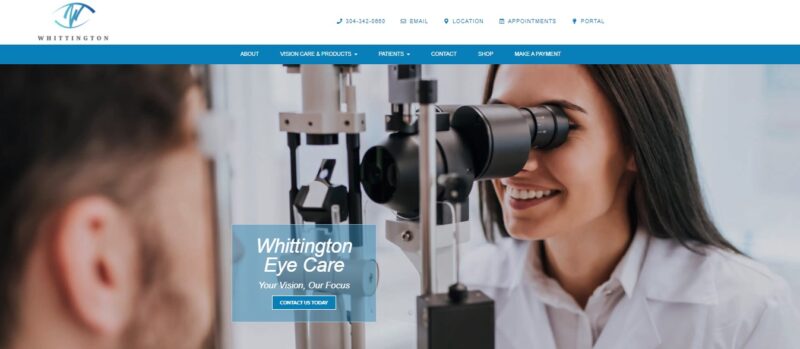
What We Like About It
First and foremost, the website is highly informative. It provides information about eye diseases, symptoms, and vision correction choices in a concise and easy-to-understand style.
Moreover, the simple navigation allows you to quickly get to the page you want, whether you’re a potential patient or just browsing around. If you need to make a payment, there is a prominent button for doing just that. It’s also on the main menu if you want to go to your patient portal.
The clinic’s contact information, office hours, and map are at the bottom of the pages. After reading the content, you can use the website’s live chat function to get answers if you still have questions.
2. CCRS
Some individuals are completely unaware that an optometrist even exists. Most people look for specific problems they’re having and find them on an optometrist’s website because of the information in the blog section.
So, not only do you need excellent content on your website, but you also need a great strategy to convert visitors into buyers. Take a look at how the CCRS website does this.
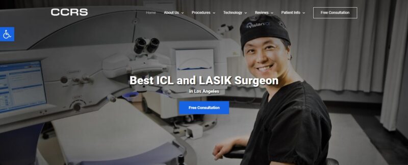
What We Like About It
CCRS is an eye clinic based in California. According to the website, its head doctor is one of the top ICL and LASIK surgeons in the area. Its website lists all of the clinic’s up-to-date machines and techniques. The website also features a grid of the latest treatments and eye-care procedures that they utilize and conduct at their clinic.
Assume a potential patient learns about a new eye machine in the news and is interested in finding out more about the femtosecond laser. This page provides a comprehensive overview of the machine and its operation. Therefore, anyone interested in learning more about this technology could end up here.
After outlining the benefits of utilizing this equipment for surgery, it goes on to say that the clinic’s optometrist is the first in the United States to be certified to use it. It’s a fascinating hook that makes the visitors feel like they should have their surgery done by CCRS’s doctor, the most skilled in this field.
This innovation, which includes an easy-to-find “Free Consultation” button, should help the clinic land new patients.
3. OptoPlus
A unique feature is one way to set your optometry website apart from the competition. Incorporating functional eye tests on your website can help you attract more visitors and convert them into patients.
Check out how the OptoPlus website utilizes online exams to attract new clients.

What We Like About It
The majority of people visit their eye doctor to get their eyes examined. On the OptoPlus clinic’s website, you may find a variety of exams to take at home. But while taking the online test is helpful, it is still recommended that the visitor contact an optometrist for a proper diagnosis.
However, if you are a casual visitor and discover that you can only read approximately half of the letters on the test, you should seek medical attention. Thankfully, at the bottom of the test, there is a “Book an Appointment” button.
If the visitor lives near one of the clinic’s locations, they can schedule an appointment after taking the online exam.
This website also has a lookbook, which is a wonderful feature. Some people despise wearing glasses as they make them appear odd. With this look book, visitors can get ideas for wearing their spectacles and sunglasses while still feeling attractive.
4. UCSF Health
When your eye is bothering you, it’s natural to imagine the worst-case situation. That’s why a pacifying website can go a long way toward converting a panicked searcher into a prospective client.
Check out how the web designer at UCSF Health created a user-friendly website.
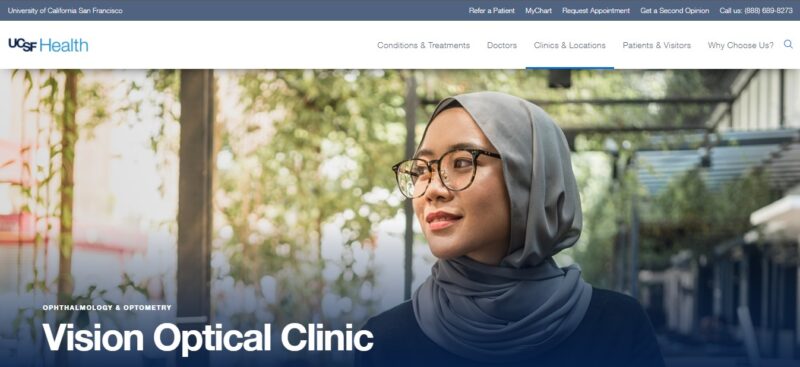
What We Like About It
The UCSF Clinic’s website has a simple blue and white color scheme that is pleasing to the eye. The header picture depicts cheerful individuals wearing glasses.
On the homepage, there is also a grid of portraits of the clinic’s eye physicians. Rather than being intimidating, the images are warm and pleasant. The doctors are in formal attire, but the color scheme is quite inviting.
These may seem like minor details, but they can be incredibly reassuring to a worried patient.
A FAQ section follows a brief description of the clinic’s services. It covers everything from who an optometrist is to what a patient should bring to an eye exam. This is a fantastic feature to add to a site since having all of the required information can assist in soothing a distressed patient.
5. Laser Vision Center – Derby Eyes
The website designer at Laser Vision Center knows how to combine all of the elements that an optometry patient would desire.
As a result, you don’t even have to leave the webpage to determine whether or not you want to go there for your eye treatment.
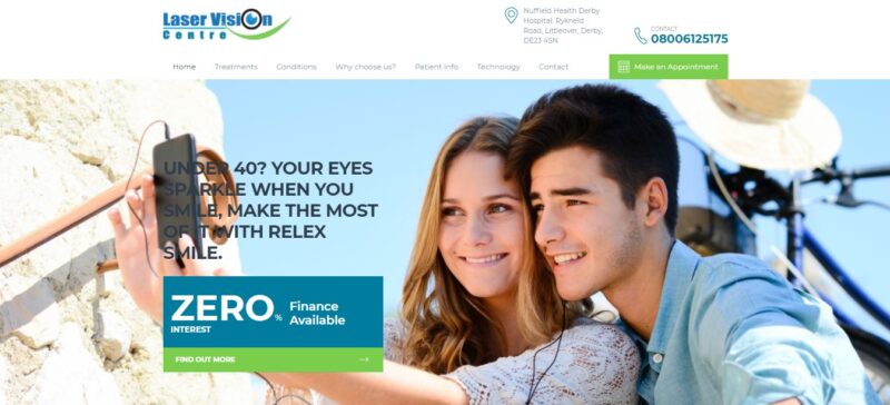
What We Like About It
The clinic’s selling points are the first thing you’ll see on the page. It’s organized into a grid beneath the header’s picture carousel. It mentions that the clinic is located in a prestigious hospital, it employs cutting-edge optical equipment and that its leading surgeon is regarded as the finest in the region.
These are the three most significant features of an eye clinic that a potential customer would look for.
They then divided their services into age groups rather than blasting everyone with them all at once. As a result, visitors are directed to the relevant parts right away when they come to the site.
Moreover, the website has a separate page for patient testimonials. The reviews are thorough and comforting to individuals suffering from the same condition and considering seeking treatment at that facility.
Finally, the website features videos from the clinic regarding eye care, technology, and therapies. Patients investigating their ailments and stumble across these films will learn that they can get their eyes examined at this facility. It’s a great way to turn casual visitors into paying customers.
Conclusion
Any eye issue can be a source of anxiety. Whether you have your eyes examined for a condition or just want to improve your vision, you’ll want to be in a relaxing and soothing environment. The same may be said for an optometrist website, as it should reassure the patient that they are in capable hands.
You can do so by adding several calming photos, including only the information that patients need, and offering content that assures the visitor that the clinic and its physicians are knowledgeable and trustworthy.