Best Nursery & Florist Web Design Inspirations
Fall is rapidly approaching, bringing with it bountiful harvests of autumn vegetables and brightly colored leaves. There’s no doubt that these beautiful changes will inspire people to step outside, breathe in that clean, cool air, and add a splash of fall color to their gardens. Check out these top 10 home and garden store web designs that have people excited for the season:
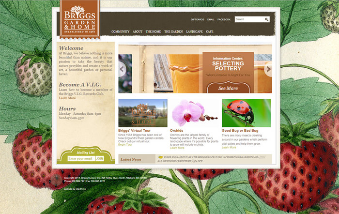
Brigg’s Garden and Home
Upon visiting the Brigg’s Garden and Home website, the visitor’s eye is immediately drawn to the cheery background art. The informative part of the website is framed by a colorful piece of art featuring strawberries-the art work has a hand-drawn look, which blends well with the natural feel of a garden store. Brigg’s includes a welcome message summing up the company’s mission right on the home page, rather than burying it in the “about” section. Placing this simple statement where the visitor will immediately see it can help create a connection. The website offers much more than simply shopping for items-it offers the visitor a whole lot of information and tips regarding home updates, decorating, and gardening. Several of the gardening pages offer handy tips (such as “attracting hummingbirds” and “winter care for birdbaths”) located in a box along the side that you can’t miss.
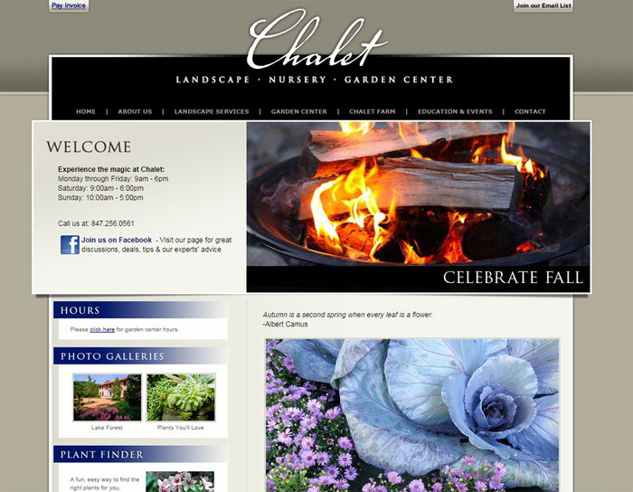
Chalet Nursery
The website design for Chalet Nursery is very elegant and refined. The site uses subtle colors and simple text-this technique works as a frame, helping the beautiful photography of various plants and flowers to stand out. The home page features current events taking place at the nursery, and includes extensive information regarding these events. These events show that this company takes great interest in helping out in the community. The pages are packed full of information regarding all different types of plants and flowers. A link to the in-depth 2014 Rose Catalogue is also available.
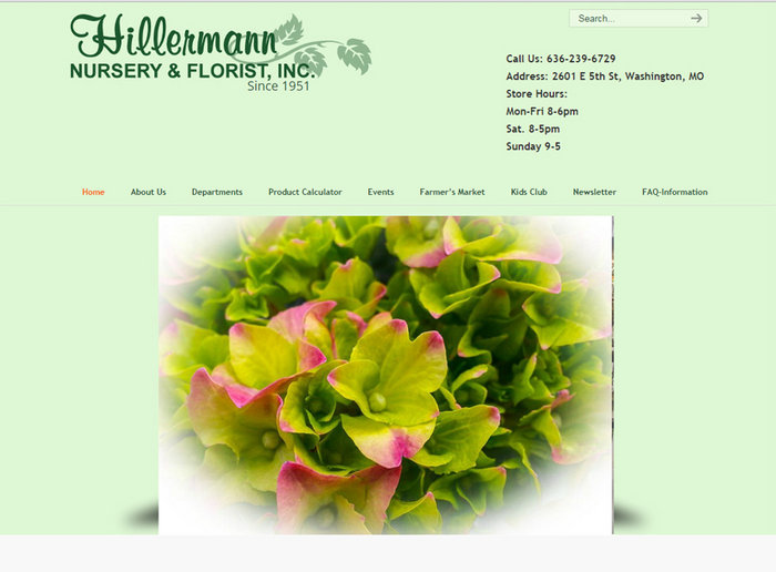
Hillermann Nursery & Florist
The Hillermann Nursery & Florist website uses a unique photograph display on the home page. This continuously twisting arrangement of rectangles spins around and displays a new image every few seconds. This design is a good way to have fun with creative graphics without overwhelming the visitor. The website offers visitors a handy “ product calculator “ which can be used to determine how much mulch, soil, or stone is needed depending on your work space. The website also includes a link to the “ kids club “ events that take place on the first Saturday of every month.
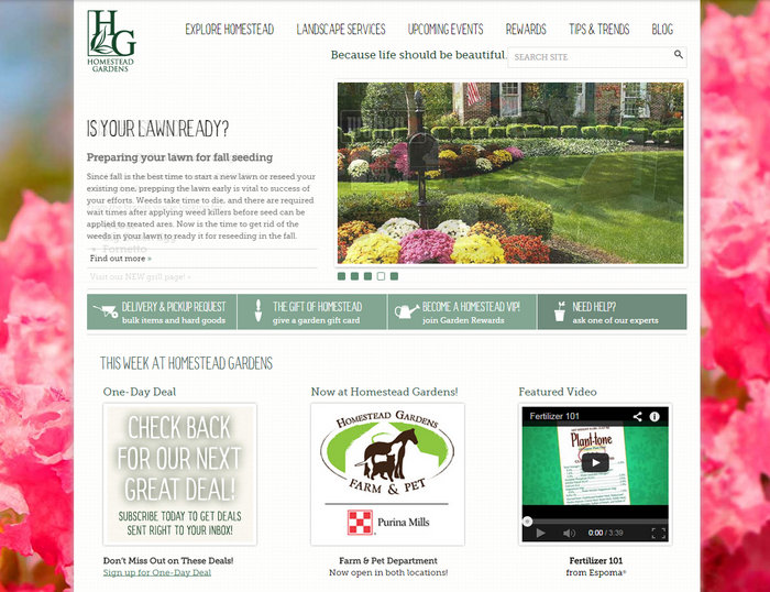
Homestead Gardens
The Homestead Gardens web design sandwiches information between beautiful, brightly colored flowered borders. The main navigation bar is easy to use and full of informative pages for visitors. A second bar is located under the scrolling images, and lists four main areas of the website, such as pickup and delivery requests and a help page. The website promotes interaction with visitors, displaying tweets, upcoming events, and a “Q & A with our experts” area. Links to pertinent information are found on the home page, rather than being buried in various pages throughout the website.
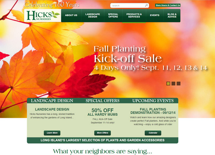
Hick’s Nurseries
Visitors will be intrigued by the large, breath-taking images on the Hick’s Nurseries home page . Photographs include a beautifully landscaped home, fresh vegetables, and bright flowers. Featured along the bottom center of these images are important notices such as special offers and upcoming events. The home page also features testimonials from customers that visitors can flip through. A “plant finder” is located on the home page, to assist visitors in finding the ideal plant for specific areas of their homes.
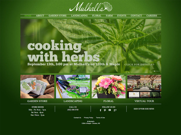
Mulhall’s
Mulhall’s web design is heavily based on visual content. Original photography of the company’s products and designs fill every page, and text is strategically placed in areas that will not detract from the photographs. This design is clean, uncluttered, and visually pleasing. The visitor can see photographs of numerous plants, flowers, and original landscaping designs that the company offers. The categories and sub-categories have useful headings that make it very easy to navigate around the site.
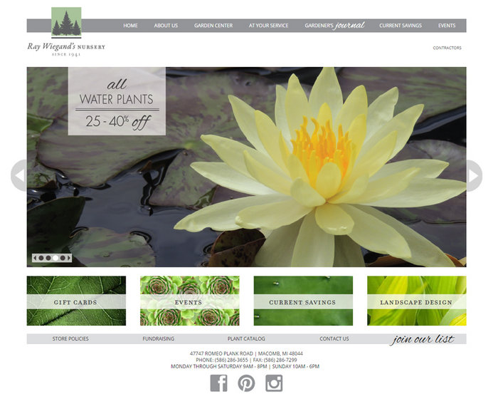
Ray Weigand’s Nursery
This website uses a very simplistic design and layout. A generous amount of white space helps to draw attention to and showcase the great photography. The minimalistic design is refreshing and easy to navigate. The highlight of this website is the “gardener’s journal”, a page where visitors can go to get daily suggestions for each part of their garden based on the season. This page also contains many helpful links for gardeners on a variety of subjects.
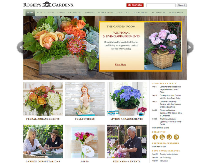
Roger’s Gardens
Roger’s Gardens website design is packed with information, but the text is not overwhelming or hard to navigate. The main navigation bar allows visitors to roll over each heading, producing a drop down box for quick access to specific pages. The events schedule and social network buttons located on the right side of the page are static, staying in the same place during navigation. The scrolling images in the center of the home page highlight some upcoming events and special offers specific to the season. The current highlight is the “Halloween Boutique”-visitors will be intrigued by the description of Halloween decor for their gardens and might just have to stop by to check it out.
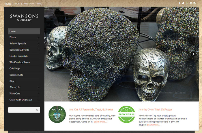
Swanson’s Nursery
Swanson’s Nursery’s home page highlights special offers and current events. An eye-catching black navigation bar is easy to use and is set in a unique place along the left side of the page so as not to interfere with images. Visitors will love the “Swansons Recommends” section located on many product pages. These sections recommend favorites and best sellers from the nursery.
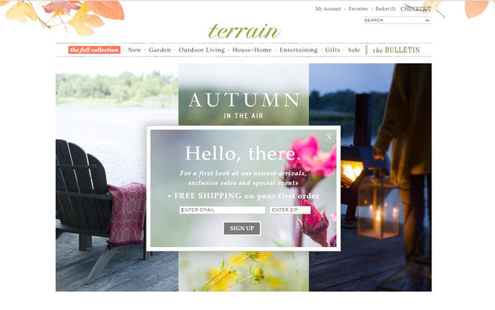
Terrain
Terrain first entices visitors with a pop up box that allows them to sign up for free shipping on first orders. The visitor can choose to take them up on this offer, or simply close the box and move on to the site. Terrain’s design is a combination of white space and images, each image featuring inviting text describing the page. The text used in the navigation bar is slightly rough, giving the site a rustic, natural feel consistent with the outdoors and gardening. Visitors can also link to “The Bulletin”, an interactive newsletter chock full of outdoor living, decorating, gardening, and food articles.
Whether you’re selling pumpkins at your road-side farm stand, or creating clever landscape designs that embrace all the seasons, please feel free to contact us for help designing a unique website perfect for your business.