When we think of jewelry, we conjure images of elegance, luxury, and wealth. These qualities are what most people look for in a jewelry store. It is also what people expect from a jewelry website. But can you make the website stylish and functional at the same time?
A decorative window at the mall is useless if it doesn’t entice people to come in and buy the products. The same is true for websites. It can be luxurious and elegant, but if it isn’t functional and makes it easy for visitors to buy the items, it is not doing its job.
Let’s look at a few of the best jewelry web designs out there that combine beauty and luxury with functionality.
Best Jewelry Website Design That Combines Beauty and Functionality
1. Limnia
Limnia is a small jewelry shop that caters to modern women. It has to carve itself a niche to compete with major brands. So the company needed to make sure that it appealed to its target audience to grow the business organically. Here is how their website helped them achieve this.
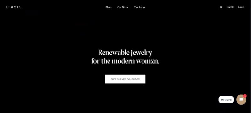
What We Like About It
You need an effective means to contact your customers and website visitors. That is why your website must have a reliable mechanism in place to collect email addresses from visitors.
This way, you can update them when a new collection becomes available.
Limnia does this by having a newsletter sign-up window appear before you can enter their site. While some may find this annoying, it is still an effective way to get email addresses for its email campaign.
Limnia’s stunning website is worth the minor inconvenience of clicking the exit button on the sign-up panel. A video header greets the website’s visitors when they land on the homepage. The contents are arranged strategically, with lots of white space in between elements.
To be able to compete with giants in the industry, you must work with a professional photographer. Unlike in a physical store where people can see the product up close in good lighting, the visitors will be judging the products based solely on how they appear in the photo.
Therefore, you want to make sure that the photos are captivating and suit the store’s theme. If you look at the product photos of Limnia, you will see that the company invested in a good photographer.
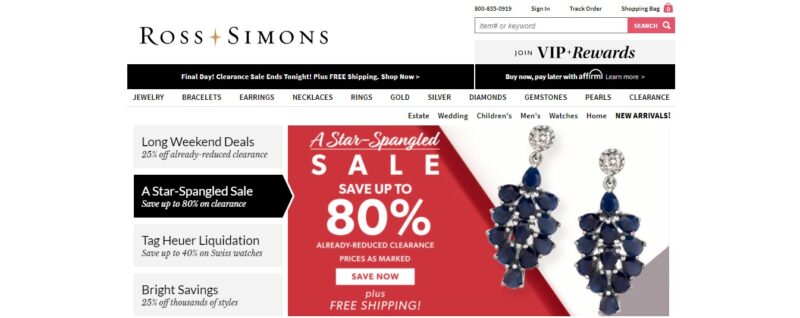
2. Ross-Simons
Jewelry can be expensive, and it is hard to find a good bargain. So, if your client carries a great collection of items and has an ongoing sale, it is a great idea to put that sale announcement where everyone can see it. This is what the designer of Ross Simons’ website did to attract more customers.
What We Like About It
Ross-Simons is a jewelry shop that offers numerous beautiful pieces at an affordable price. The company has many promotional sales, and its website’s homepage features all of them effectively. The header is all about the different types of ongoing sales.
Below that banner is a section for the curated collections. It is efficient to categorize the collection into themes, as it makes it easier for the visitor to look at the items without getting overwhelmed by the number of choices.
The website is consistently updated, so there is always something new to see. It has a Birthstone Spotlight section, so if it is your birth month and you are looking for a gift for yourself, you’d naturally check this collection first.
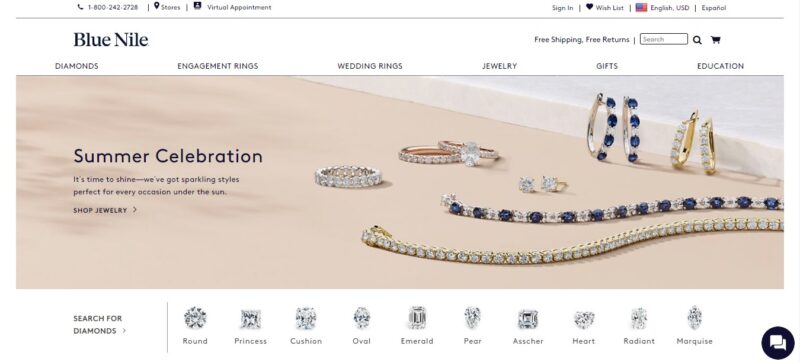
3. Blue Nile
Blue Nile specializes in engagement rings. The features on their website are aimed at a specific demographic — people shopping for an engagement ring — since they know this is their best seller.
What We Like About It
Even though the business sells a wide range of jewelry, it is their rings that stand out the most. Weddings, engagements, and gifts are among the occasions included on the menu, which feature several types of rings.
Instead of a text menu, the search box includes numerous cuts to make the selection process easier. This allows visitors looking for a particular appearance to get straight to the ring of their choice.
A build-your-own-ring option is also available on the website. You can begin with either the setting or the diamond. So, if they don’t have what you want or have a specific appearance in mind, you can easily have them make it for you.
Additionally, there is a call option to contact the shop’s ring expert if you want assistance designing your ring. These are just a few things to think about including on your website.
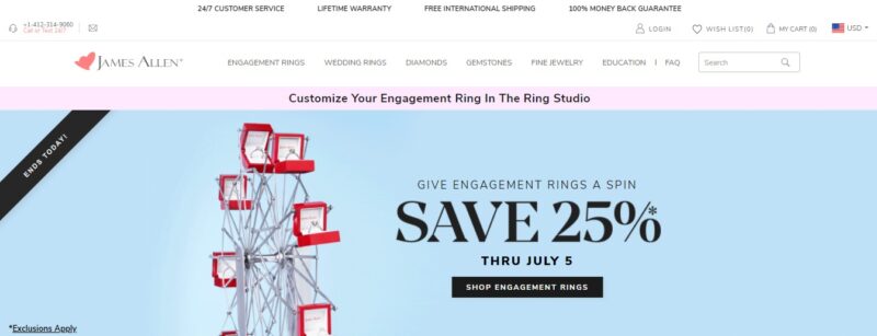
4. James Allen
It’s not simple to shop for jewelry on the internet. A diamond’s entire splendor is almost impossible to convey in a photograph, as it can’t capture the appearance from every angle. However, the website designer for James Allen was able to find a way to make it more convenient to buy diamonds online.
What We Like About It
The loose diamond page on the James Allen website is one of the most popular. With its step-by-step guide, the site makes it simple to choose a diamond. To begin, you can pick a diamond from the shop’s extensive inventory based on its origin (earth or lab). Then, based on shape, color, clarity, cut, carat, and price, you may enter the details of the diamond you’re looking for.
After you’ve whittled down your choices, it’s time to look at the items. A 360-degree HD view of the diamonds is available on the website. Simply move your cursor over the option to have the diamond spin around, giving you a 360-degree perspective.
If you want a closer look at a particular loose diamond, simply click on it, and you’ll be able to zoom in or out. It’s nearly identical to inspecting a diamond in a shop. Furthermore, you may examine all of the gems without any employee becoming frustrated with you, allowing you to take your time and make the best selection possible.
The website also has a real-time diamond inspection option if you want an expert opinion. This means you may talk to a non-commissioned jewelry expert at any time and on any day of the week to receive answers to all of your inquiries.
5. Alex and Ani
When you go to the homepage of a jewelry store’s website, you want to know who their target audience is right away. Dark hues or white backgrounds are typically associated with high-end luxury brands. However, the use of pastel hues by Alex and Ani instantly indicates that it is aimed at a younger, hipper crowd.
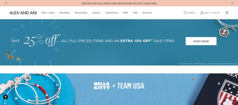
What We Like About It
To begin with, the pastel background adds to the website’s youthful atmosphere. The jewelry items were photographed in the same vivid hues as the background. Despite many accessories on display, visitors will have no trouble finding what they want, thanks to the well-organized menu.
The younger generation does not buy accessories just for the sake of looks. Instead, the majority of young customers prefer items that have a deeper meaning for them. That’s why the store’s search filter includes a “Meaning” option. So, if a visitor wants to find a bracelet that conveys the emotion of “faith and hope,” they may click on it to see all of the pieces that fall into that category.
Another feature we appreciate is that when you hover your cursor over the menu, you don’t only see the text of the items beneath it. Instead, there is a picture of a featured item along with the words. This is a fantastic way to promote a product and perhaps persuade people to purchase it. In addition, the website’s creator has placed an announcement of their current sale in the drop-down menu.
6. Abbey Seymour
It is critical, especially at a jewelry store, to emphasize the beauty of the products for sale. Take a look at how Abbey Seymour’s website displays its work.
What We Like About It
The website for this store has an aesthetic vibe to it. The color palette of the photos is related to nature since the jewelry line is nature-inspired. Moreover, browns and greens were chosen as the primary colors.
Because the website is intended to focus on the collection, it has a few brief texts for the menu and an attention-grabbing carousel of models and jewelry pictures on the homepage. Then, it jumps right to an image of the products, which are organized into grids.
To preserve the visual effect of the pictures on the website, the details of the items are displayed only when you hover over their images. So, for example, when you click on an item to go to its product information page, you’ll see a larger image of it as well as a photo of it being worn by a model.
This is a great feature to have because it may be tough to judge a piece of jewelry based just on its size. Since there is no frame of reference, you may wind up purchasing an item that is larger or smaller than you anticipated.
A lookbook is another excellent element of this website. Getting a sense of what tops or other accessories may look good with a particular piece of jewelry is an excellent addition to any website. Furthermore, if they can see a few items that look nice together, it is an efficient way to sell more products.
Conclusion
A jewelry store’s website must be more than beautiful. It has to be functional too. Buying jewelry online can be more challenging than going to a physical store to check it out since it is difficult to judge the beauty of a piece without actually seeing it.
As a result, it’s critical to offer as many features as possible that replicate the in-store experience on the digital store. Real-time jewelry inspection, the ability to spin a piece around, and seeing how the item looks when worn are just a few of the features you can include on your site to make it one of the best jewelry websites out there.