The bulk of construction businesses’ clientele comes through referrals. At the same time, a decent website that specifies the firm’s specialized market, showcases its portfolio, and allows potential clients to contact them promptly can help the company acquire new customers.
For many construction businesses, how well they did on their most recent job determines how they perform in the future. If a client is satisfied with their job, they are likely to recommend the firm to their friends, relatives, and neighbors.
However, construction companies nowadays need to rely on more than client’s referrals to get projects. It is also crucial to have an effective website that highlights their expertise.
A strategically made website is an excellent way to showcase what the company can do. Let’s look at some of the essential elements of a good construction website and see how these top sites implement them.
Best Construction Company Web Design
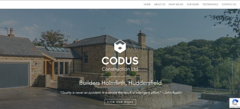
1. Codus
Codus Construction is a well-known construction firm based in England. Those in the know recognize this company for its clean and accurate work. These characteristics are also evident in the company website.
What We Like About It
At first sight, the company’s website is relatively straightforward. The contents are in neat grids to make it easy for a potential customer to scroll through the material.
It starts with a good image for the header. The visitor has the option to go straight to the portfolio by clicking a button. On the other hand, they can scroll down to continue learning about Codus Construction.
Furthermore, the website’s design is pleasing to the eye. Grids are used to organize the material that explains what the firm does, its story, and its major selling points.
In addition, the sections are divided by the various colored backgrounds. Designers do this so that visitors’ eyes are directed in the right direction.
Finally, the latest entries to the portfolio are presented in an organized 4×4 grid. The high-definition pictures have great lighting, so you can easily see the construction details they did. Also, you can view a larger-sized image by clicking on it. There is also some text information about it at the bottom. Each project is shown from different angles so that you can see the company’s designs.
All these are presented on one page. So the visitors wouldn’t have to click out and can easily see everything needed to decide whether Codus is the construction firm for them.
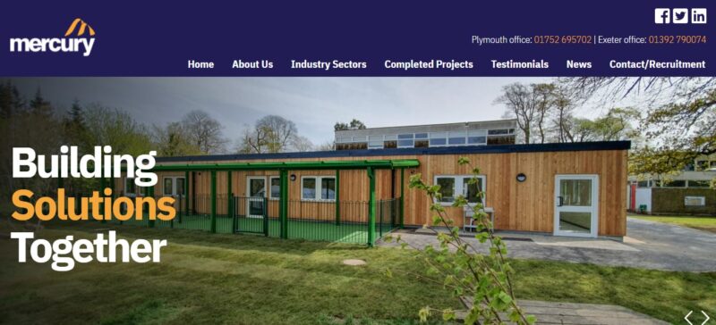
2. Mercury Construction
When a construction company specializes in one type of construction, it is crucial to make that apparent on its website. It would waste a visitor’s time to explore a company’s website for hours only to find out that they don’t do the type of service they require. If you look at Mercury Construction’s website, you will find out within ten seconds of landing on its home page what the company specializes in.
What We Like About It
Most construction companies work in a niche market; Some focus on home constructions while others get more projects in the public sector. If a visitor has a particular project, he should work with a company that is an expert in that field. For example, looking at Mercury Construction’s website, you can immediately tell that their niche is schools, factories, and nursing homes.
This niche is made apparent by the images the designer chooses to showcase on the site’s homepage. The company boasts decades of experience in this type of construction, claiming they already know the ins and outs of these projects. This includes all the constraints and challenges that such a project involves. Because the designer chose to print this statement prominently on the site, anybody looking for a company that can handle an expansion project for a school or construction of a new storage facility will know to contact this company over others.
Upon clicking on the images of its portfolio, the visitor sees the project’s information page. There are various pictures of the project displayed in carousel form. The selection includes the certificate of recognition that this particular project received. The text beside the graphic details the scope of work that the company performed. It is straightforward but concise. It is easy enough for interested visitors to skim through because it is descriptive but not too technical.
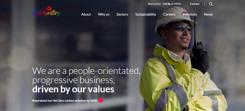
3. Galliford Try
News coverage brings an instant stamp of approval for a company’s reputation and it is essential to highlight this on the official website. In the layman’s eyes, if a business is being awarded and recognized in the news, they must be doing something right. Galliford Try has a simple, straightforward website that knows how to impress its potential clients.
What We Like About It
Galliford Try’s website is quite unassuming. However, there is a reason why it is one of the leading construction groups in the UK. Its portfolio includes massive projects worldwide, and it has been covered in the news countless times.
If you are making a website for a company featured in press articles a few times, it is good to add a link to these articles on the homepage. This section establishes its credibility. Plus, it allows readers to share the article on their social media accounts. Finally, it’s free publicity for the company.
Another good feature on Galliford Try’s website is the “Half-year highlights” section. It looks like an infographic of relevant stats from the company. It shows an animation of the number going up to the current value. This animated statistics board is a great visual to use in showcasing the company’s revenue so far.
If the visitor is impressed with the company’s performance, he would try to contact the firm for a consultation—all the pages of this website end with a link to its contact form. There is also another contact button on the navigation bar. Having these buttons readily clickable is an excellent way to ensure that a potential client contacts the firm.
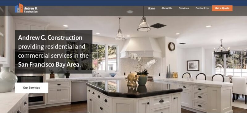
4. Andrew G. Construction
Besides showing how much your company has earned in revenues, another effective way to show your credibility is by including testimonials on the homepage. The designer of the website for Andrew G. Construction understands that traditional word-of-mouth advertising still works.
What We Like About It
The website of Andrew G. Construction is very clean and neatly organized into sections. The text’s background colors stick to the color scheme of the company logo: blue, grey, white, and orange.
On top of that, it has all the usual content on the homepage. The company’s description, services offered, specialization, and unique selling points are there in bright and clear print.
One of the unique features that it does have is the slider of testimonials from happy clients. It is just in text form with the name of the client at the bottom. It would have been better to include photos of the projects. But it is still effective. And right next to the testimonials is a call-to-action button to get a quote for your project. This is a good placement for this button because many potential customers rely on the word of other satisfied customers before making decisions.
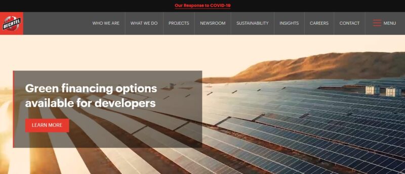
5. Bechtel
Bechtel is a world-renowned construction company with over 25,000 projects in its portfolio. Its website contains a lot of information about the company, its sustainability goals, and its projects. One thing that you would notice when you go through all the pages is that there is good design cohesion.
What We Like About It
There is something very satisfying in going through an entire website and noting the consistency in the design of all the pages. This uniformity is what you will notice with Bechtel’s website. No matter which menu button you click on, you will see the design cohesion.
The menu bar stays the same throughout, except for the pages for career opportunities. It is also a sticky menu bar. This menu stays on top of the screen even if you scroll down. Therefore, it makes navigating the well-organized pages even more convenient.
The pages follow a similar format. A great photo always accompanies the content. They are all arranged in grids to give the pages a structured and neat appearance.
Additionally, the color scheme is consistent. The background for the content is white, the essential words are red, and the background for important sections and the footer is light grey.
To sum it up, keeping the elements of the website consistent makes it memorable. If a client likes the output, it would be easy to remember which website he visited.
6. Maman Corp.
A video header is always eye-catching. The designer of the Maman Corp. website uses this space efficiently, not just to capture the visitors’ attention but to showcase the construction company’s latest project.

What We Like About It
Visitors always appreciate a good project tour. A visitor can see first-hand how the construction company’s project started and how it ultimately turned out. For Maman Corp.’s website, the company’s main selling points accompany the video header. A solid red block over the video states its years of operation and what sets them apart from other companies.
The website is very interactive and dynamic. Indeed, every scroll brings in a new element. For example, with one scroll, you are presented with a static page of the company’s history. Then, the following scroll cues a video transition slide for the next static page. Each video transition highlights a project of the company that you might not see if you don’t go through their entire portfolio.
Even their portfolio uses slideshow navigation. The blocks of texts and the pictures slide in to fill the entire screen. The information is concise. There is one paragraph to introduce the project, and then the details are in keyword form at the bottom. The link for more pictures of the particular project only appears when you mouse over the image.
Finally, when you get to the information page for each project, you will see good pictures of the finished construction and a video tour. This video tour is the highlight of the portfolio because you can see how the construction project turned out.
Conclusion
Word of mouth advertising used to work for construction firms years ago. However, with more and more companies going digital, they must establish a strong online presence to entice more people to hire them for their projects. Chances are, even if a potential client hears about a company, they will look up the website before contacting them.
A construction company’s website must showcase its previous works and use good pictures of the finished projects. Putting in a video tour of the project is also another effective way to showcase one’s expertise.