Best Practice for Crossfit Websites
A CrossFit gym’s website should effectively communicate your gym’s services and benefits and provide members with the resources they need to succeed. Here are some key features that a CrossFit website should include to communicate the services and benefits of a CrossFit gym effectively:
- Workout of the Day (WOD) tracking: CrossFit is all about intense and constantly varied workouts, and members will want to keep track of their accomplishments. A WOD tracking feature allows members to log their workouts and see their progress over time.
- Class schedule and booking system: A comprehensive class schedule and booking system is essential for any CrossFit gym. Members should be able to easily view upcoming classes, sign up for sessions, and manage their bookings through the website.
- Member profiles and leaderboards: CrossFit is a community-driven sport, and a member profile system allows members to connect, see their progress, and compete with one another. Leaderboards can provide motivation and encouragement to members.
- Nutrition resources: Good nutrition is a key component of CrossFit, and a CrossFit website should include resources to help members make informed decisions about their diet. This could include recipes, nutrition tips, and meal-planning resources.
- Coaching and training resources: CrossFit is challenging, and members will want access to expert guidance and resources to help them reach their goals. A CrossFit website should include resources for members, such as workout demos, training videos, and coach profiles.
- Community features: CrossFit is more than just a workout; it’s a community of people passionate about fitness. A CrossFit website should include features that facilitate communication and community building, such as forums, social media integration, and member-driven events.
- Mobile-friendly design: Many CrossFit enthusiasts are active and on-the-go, and a mobile-friendly website design is essential to ensure members can access information and resources on the go.
5 Best CrossFit Web Designs
To attract more devoted members to your CrossFit gym, you’ll need a website highlighting its distinctiveness. See what you need to add to your website project by looking at these top CrossFit websites.
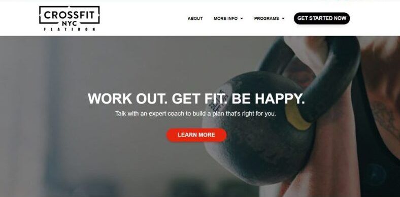
CrossFit NYC
When you first visit CrossFit NYC’s website, you are greeted with value statements. You’ll find CTA after CTA and some engaging and motivating catchphrases on the gym’s website.
What We Like About It
If you go to a CrossFit facility, you won’t hear the trainers saying, “Please toss that ball.” Instead, they shout, “Throw that ball! Smash that set! Go!” The messages are intended to motivate you to work more. You can find a similar mood on the CrossFit NYC website.
The hero is a standard image of someone lifting a kettlebell, but the message is clear. It reads, “Work out. Get fit. Be happy.” It doesn’t end there, either. Following that tagline comes a CTA to talk with one of their professional coaches. Immediately below that header, you will see three steps to becoming happy. Three stages to happiness are listed below that header. It may appear basic, but it successfully communicates the idea.
Furthermore, the website features advantages that clients can expect when they visit the gym. For example, it states that when you step inside, you let go of your to-do lists, struggles, and worries.
In addition to a clear call to action, the website also provides free material. You will receive a PDF file of 15 At-Home Workouts in exchange for your email address. As a result, the gym gets your email addresses for marketing purposes, and you get a taste of what to anticipate when you join CrossFit NYC.
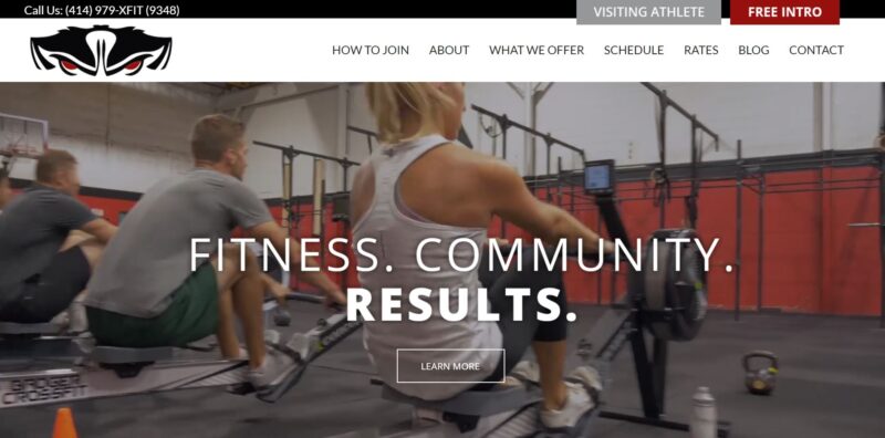
Badger CrossFit
Making a fool of oneself is a common worry for novices who want to join a gym. CrossFit gyms are often perceived as intimidating places populated by muscly men and women. With the help of a compelling hero video, Badger CrossFit successfully eliminates this preconceived idea.
What We Like About It
While hero photos are appealing, a background video for your header is much more impactful. The video on the Badger CrossFit website entices visitors to sign up for the gym in various ways. For starters, it shows off the gym and its many pieces of equipment. Following that, it depicts several groups of individuals who appear to be having fun while working out. Finally, it features gym-goers of all genders, ages, and fitness degrees. As a result, rookies can be more motivated to sign up because it appears that there are other newcomers as well.
Below the fold, you’ll find an image-based menu of everything the Badger Gym offers. You can see these options when you click on any of those buttons. Furthermore, the page is broken down into parts, with each header in large and bold typefaces. On top of that, each offer has a compelling photograph of gym-goers in action. Finally, the descriptions of the various services are never more than one paragraph, making them informative but straight to the point.
The sticky call-to-action buttons follow you as you scroll further down the website. The top right corner of the screen constantly has their “Free Intro” and offers for Visiting Athletes. As if that weren’t enough, each page concludes with a form for a Free Intro Session.
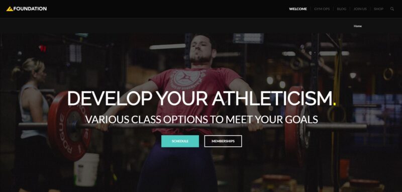
Foundation CrossFit
Foundation CrossFit’s website employs a black and yellow color scheme for eye-catching pages. The bold typography and colorful images stand out from the dark backdrop, allowing the website to offer excellent visuals and graphics.
What We Like About It
The designer used solid black and dark-colored photographs as the perfect background for white text and bright pictures. Because of the dark setting, the carousel of images and slogans appears even more compelling. Furthermore, the use of yellow and teal for key text and call-to-action buttons makes the website one of the most aesthetically pleasing ones we’ve come across so far.
Since it is a CrossFit gym, visitors can also find WODS or ‘Workouts Of The Day’ under the site’s blog section. These include photos showing several gym members doing the exercises while the instructors demonstrate the workouts. Such videos are particularly useful since they provide a more practical guide for people who wish to perform these routines at home.
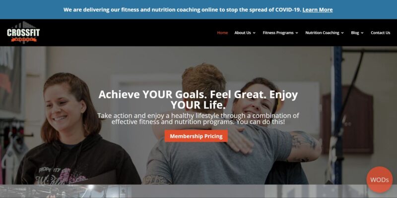
CrossFit Mansfield
When you are cared for, you are at ease. This is the type of feeling evoked by the CrossFit Mansfield website’s visuals and text. As a result, it communicates with its visitors in a way they can understand.
What We Like About It
Sometimes, visitors can be turned off by a strong call-to-action, as they may come off as pushy rather than motivating. However, the slogans, content, and photos on CrossFit Mansfield’s website affect visitors positively.
Starting with the header background image, you can see a coach giving a warm hug to one of their students. Above the photo, you can see a phrase, and unlike other gym websites where everything is written in bold, only the word “YOUR” is highlighted here. The designer also added an encouraging “You Can Do This!” message to the image.
The website offers a checklist of the common issues faced by people attempting to lose weight. This gives the impression that the trainers know your situation, that others have been in your shoes, and that the people there understand. The statement “You can do this, and we can help!” puts all the concerns and fears to rest. Furthermore, this design appeals to the visitor’s emotions and is more likely to persuade a new gym-goer.
The testimonial area on the homepage is another fantastic element of the website. It is divided into three sections, and the first part consists of a video testimonial from various gym members. Of course, we know that a video is more engaging than a picture or text, especially when done correctly.
Next is a before-and-after photo gallery, which includes photographs of several members showcasing the fruits of their labor. This gives visitors something to strive for, seeing what they can accomplish with hard work.
Last but not least, there’s the standard testimonial slider. Although this may not seem as impactful, it is still valuable for demonstrating how the gym’s program helped previous clients.
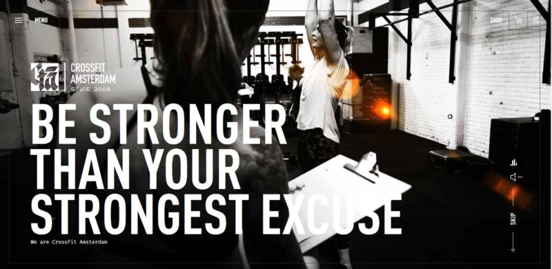
CrossFit Amsterdam
Going to the gym is difficult, but you persevere because you want to improve. With a similar vibe, the website of CrossFit Amsterdam will appeal to anybody who enjoys a good challenge. Everything is gritty and edgy, from the color scheme choice to the slogan. The homepage even starts playing a rock song to get the visitor’s attention.
What We Like About It
To begin with, the images on the site do not show smiling individuals. Instead, they feature gym attendees who are working hard. In addition, rather than using vividly colored photographs, the designer used black and white photos to enhance the visual impact of these images.
Furthermore, the banner photographs have an orange glare design to make them more appealing. To add to the drama, the website automatically plays rock-and-roll music. While some users may find this distracting and eventually mute the page, we have to admit that it does work as an attention grabber.
If that wasn’t enough, the visitor is compelled to “Become one of us!” by the call-to-action button at the bottom. Like everything else on the page, this appears to be more of a challenge than a motivational CTA. Nevertheless, it will appeal to gym users who value a supportive community that encourages them to go above and beyond.
Conclusion
While all of the CrossFit websites on this list had to follow the parent company’s rules, they could still show off their unique values. Those who preferred an empathetic approach used friendly photos and motivational slogans. Others utilized gritty images and edgy CTAs to demonstrate that CrossFit is challenging but incredibly rewarding.
Moreover, most companies offer free materials to collect email addresses for newsletters and marketing campaigns. They also use striking photographs to promote their gyms, equipment, and members. Aside from that, they all publish articles or WODS to improve their SEO rankings and highlight the trainers’ expertise.