There are a plethora of black and white-themed websites available on the internet. Since the combination can be stark or trendy depending on how it is applied and perceived, the style is quite popular. Some websites are visually stunning, while others are simply bland. What is the difference? Why do certain websites make black and white appear vibrant and dynamic while others make them look flat?
It can be tricky to use a lot of colors on your website. To avoid it seeming cluttered and overly busy, you’ll need to strike a balance. Using only two colors, on the other hand, can be even more complicated. You must make sure that the design is consistent with the brand and the message it wants to communicate. Take a look at our collection of visual aids.
See how to do it best by looking at our collection of aesthetically stunning black and white websites.
4 Best Black and White Website Designs
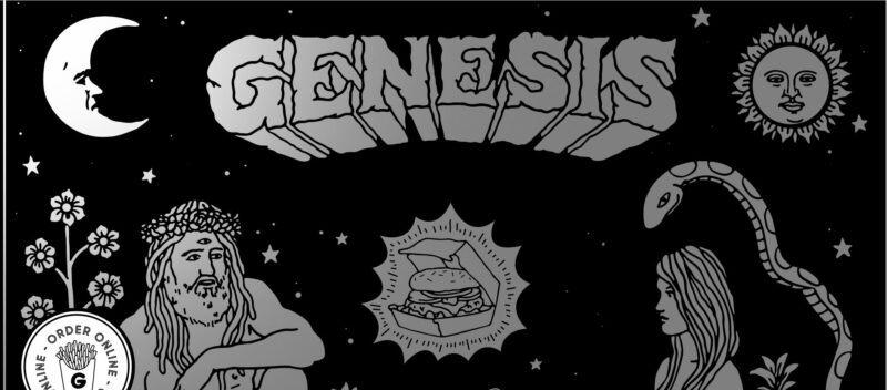
1. Eat Genesis
Eat Genesis is a restaurant that serves only plant-based meals. However, its website, which is black and white, is anything but dull. On this website, visitors will find a variety of things to do and see, ranging from unique artwork to picture animations.
What We Like About It
This webpage is essentially a one-pager, with a drawing of Adam and Eve as the hero image. The artistic style is one-of-a-kind and enthralling. Furthermore, mouseover animations are available for almost all features on the website. Flowers sway, the stars glitter, and even the bald head’s eyes follow the cursor’s movement.
Another exciting feature is that the sticky order button is also animated. When you move your cursor over the fries, they move as though you accidentally tapped them. Because the movement is so appealing, you’ll know where to click when you’re ready to order.
In addition, the headings of each section on the website are also written in a strong typeface. The one-inch headers are hard to overlook, and the mouseover animations in the other paragraphs make it even more challenging to look away. Overall, every part of this website is designed to interact with and draw the visitor’s attention.
2. The Black Sheep Agency
With a name like “Black Sheep,” you can certainly anticipate a lot of black on the agency’s website. And surely, it does not disappoint with its black and white motif and splashes of color. Take a look at how this website uses scroll animations and pop-ups to make a lasting impression on visitors.

What We Like About It
The strong introduction of The Black Sheep Agency’s name draws your attention the minute you arrive at the website. You will see the concept of what the agency is and what it does as you scroll down. The company description, which does not come all at once, is the most intriguing element. The text is grey, but the sentences turn darker as you scroll down, causing your gaze to follow. As a result, the scroll-down animation directs the user’s gaze to the desired location on the page.
Furthermore, a pop-up gives a quick overview of each project when the visitor reaches the part discussing the agency’s prior accomplishments. Each pop-up consists of a brief text explanation and accompanying illustrations. The drawings are mostly black with a few colorful details. The visitor can also view additional information about the campaign by clicking on this pop-up.
Aside from that, each campaign’s description page is primarily black. The designer of the website used real photographs with digital drawings layered over and under them. You can find a short description and some campaign statistics beneath the huge image that depicts the initiative. These include how much money people donated to the cause or how many people attended the event.
In addition, a list of tasks completed by the agency as part of the campaign is also included. While most of the pages are black and white, some colors are also used to highlight key themes and figures. Again, they immediately draw the visitor’s attention to the concepts that matter.
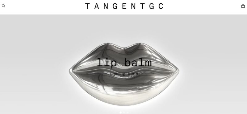
3. Tangent GC
The color combination of black and white is ideal for body grooming products. Since Tangent GC is a natural, organic product company that uses sustainable materials, the color palette fits it relatively well. Furthermore, as the company doesn’t use color in its packaging, sticking to a stark color scheme makes perfect sense.
What We Like About It
Tangent GC’s website is primarily an online shop. The homepage features a header that promotes a product that will be released shortly. In addition, a black and white image of a metallic lip shows that the company will be releasing an organic lip balm soon.
When you scroll down, you’ll find grids of the company’s body washes, soaps, hand creams, and soap bars. While the black and white color scheme may appear boring, the typeface used on the package, along with the product’s slight tint of color, is enough to draw the visitor’s attention.
Furthermore, the company’s use of the barest material to create the goods it sells is echoed in the minimalistic approach. Tangent GC’s mission is to introduce products that are beneficial for the skin, clean effectively, and utilize the fewest resources possible so they can remain sustainable.
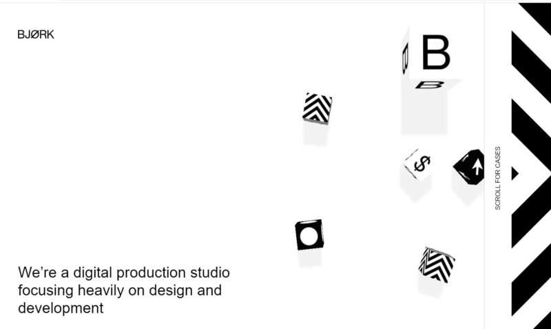
4. Studio Bjork
Studio Bjork is a web-based design firm. Because it works in the design business, you may expect the website to be highly artistic and innovative. And, without a doubt, it succeeds on both counts. The website not only wows with its introductory video, but it also uses a horizontal scroll for dramatic effect.
What We Like About It
The attention-grabbing animation of a bunch of blocks on a white surface greets you as soon as you enter the website. The only content on the webpage, aside from the firm’s name at the upper left, is a one-sentence description of the company.
The company’s About page is divided into two sections. One paragraph expands on the agency’s responsibilities and is written with a black backdrop. The other text discusses how the design studio is all about collaboration between the designer and the developer. The black and white theme demonstrates how the two elements work together to produce the agency’s output.
The only element of the studio’s portfolio that has varied colors is the portfolio. Each project is represented by a single photograph that turns animated when you mouse over it. The picture corresponds to the name of the commissioning firm and Bjork Studio’s involvement in the campaign.
In addition, the pictures are clickable links to each campaign’s description page. The short text description is written on a black backdrop on the left side of the screen when you navigate to the information page. Visitors can quickly read the content and focus on the visuals thanks to this short and straightforward copy.
Conclusion
A website’s backdrop can be made clean and classic by using a black and white color scheme. It’s up to you to utilize your creativity to give this blank canvas a personal touch. When done incorrectly, a website can come out as dull and unattractive. However, if you do it right, it may attract more visitors, effectively communicate the brand’s message, and provide a better user experience.
When using this color scheme, you don’t have to adhere to only black and white. Small flashes of color are an unexpected feature that can help direct visitors to pay attention to the site’s call-to-action. Furthermore, colors in a black and white website design can draw attention to the images and content you wish to highlight.