In the twenty-first century, the tourism business is more significant than ever, and individuals make it a point to learn everything they can about the places they intend to visit. You need to manage accommodations, and we’re fortunate to be living in an era where a simple Google search helps us book a room in another country. Due to the extent of research tourists do, a well-designed hotel website is essential to attract potential guests to the place.
The best hospitality website design provides visitors with the best visual proof that guests will enjoy their stay in that hotel. Additionally, it must make it convenient for the guests to book their rooms directly. Check out the best hotel website designs below to find inspiration for your next hotel website project.
Top 5 Hospitality Website Designs
1. Walhous Flims
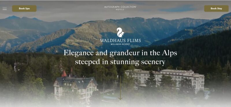
Waldhaus Flims is a luxury hotel and spa in the Alps. In real life, the resort exudes luxury and elegance. Its website provides the same atmosphere.
What We Like About It
The video background that the designer used is breathtaking. It provides an aerial view of the hotel with the mountains as its backdrop. As you scroll down, you see picture after picture of the sprawling sanctuary accompanying the description of each feature that the hotel offers. The copy is short but compelling. It vividly describes what you can see and do at each place in the hotel.
Should the visitor decide to book a spa treatment or a stay, they can easily do so. The two buttons are on a sticky navigation bar that stays with the visitor as they scroll down.
Each page opens with a video that automatically plays. For example, the accommodation information page begins with a video of two guests enjoying their stay in one of the rooms. Next, the different room types are presented in text and photos. The pictures are extremely inviting. There is a concise description below each room picture and two buttons to either book the room or get more details about each accommodation type.
2. Palazzo Avino
Palazzo Avino is the number one hotel in Italy, and you can see from its website pictures why. Besides using stunning photographs and incorporating videos, the website also uses the hotel’s logos numerous times per page.
What We Like About It
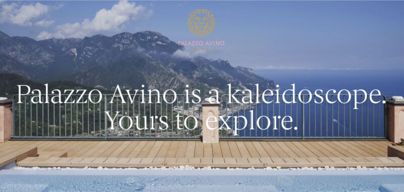
The website starts with a loading page. This features the lion logo of the hotel and the distinctive pink “Palazzo Avino” name. This logo zooms to the top of the page when the website is ready.
The website uses slideshow navigation in the beginning. With one swipe, the following section scrolls up. The first pages that you will see contain the slogan of the hotel. When you reach the first information page, you will find the hotel’s description, including the list of amenities. When you get to this part, you will notice that you can now scroll down without activating a new slide.
On the side, there is a list of section titles. As you scroll down, the lion head logo goes to the section’s title that you are looking at. In addition, each section has a picture divider. The photo is either a place in the hotel or a tile pattern.
As usual, the descriptions for each hotel feature come with stunning pictures. There are also mini links that you can find over some headings. For example, when you scroll down to the Wellness section, you will see four links appear on top of the word “Wellness.” These are Spa, Fitness, Swimming pool, and Solarium. This mini link feature is a beautiful way to make navigation easy for the visitor.
Another lion logo accompanies the Book Now button. It stays on the left as you scroll down the pages. The booking system is very convenient. You need to click on your visit dates and select the room type you wish to book. The prices for the rooms are on the page, so you don’t have to search for them elsewhere.
3. The Langham
The Langham website knows how to sell the hotel by using text that is benefit-driven and highly dynamic. In addition, the pictures they have used are so inviting that you can’t help but want to book a room and stay there.
What We Like About It
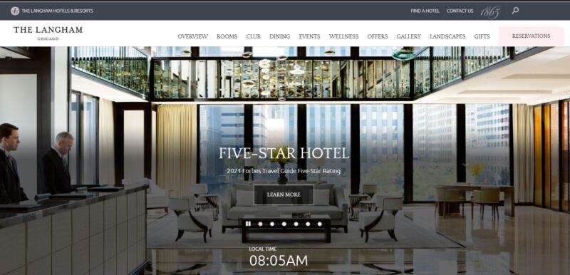
As soon as you land on the homepage, a small pop-up appears on the side. It contains a seal that the Forbes Travel Guide endorses the hotel. This immediately establishes that the hotel meets a specific criterion that makes it better than others.
Below that seal is a list of all of the hotel’s selling points in bullet form. It states that the hotel follows the highest sanitation standards, and there is an express check-in/check-out option, plus it also offers flexible rates if you need to stay longer. This feature is ideal for people who are in a hurry and want to know about the hotel.
The pictures in the header are stunning. On top of each image, the designer imposed a title of a recent recognition given to the hotel. The text mentions that The Langham is a 5-Star hotel, according to Forbes. It also notes that the hotel made it to the 2020 Gold List released by Conde Nast. This immediately gives the visitor an idea of how prestigious and luxurious this hotel is, granted that it had so many recognitions.
4. Basecamp Hotel
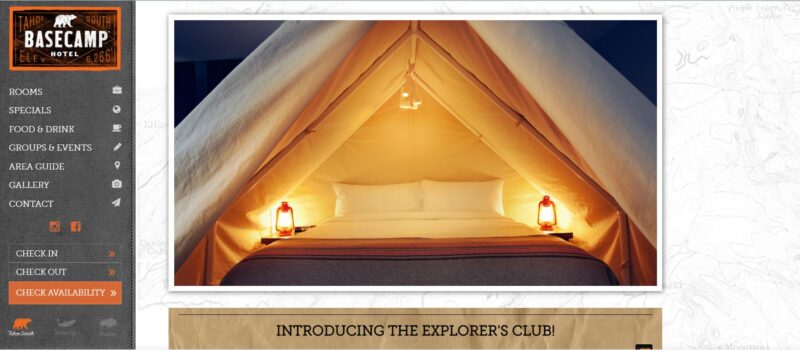
Basecamp Hotel is a group of the most popular boutique hotels in California. Everything about the website, from the background image to the typography, gives off a camping vibe.
What We Like About It
The hotels are situated in the best location to explore the lake or the mountains. According to the information on the homepage, the hotels provide amenities for relaxation seekers and adventurers alike. The elements used on the pages are all related to camping.
The website uses a side navigation bar, which is always there on the left as you scroll through the pages. If you look at the bottom of the navigation bar, you will notice three image-based links. The bear leads to the website for the Basecamp hotel in South Lake Tahoe. Second, the trout is for the hotel in Tahoe City, where you can start exploring the lake. Finally, there’s the bison which leads to the hotel’s site for their Boulder lodging. The thematic buttons add an interesting visual to the navbar.
As mentioned, the website has a campy feel. The logo looks like a stamp that you get when you go camping in different locations. The texture of the navigation bar appears to be a stitched tent material. And even the background of the webpage is a semi-transparent map of the area.
The booking system is easy to navigate. When you click on the rooms, you will see the different accommodations in the form of polaroid pictures. When you hover over the photos, you will see a short description for each one. Once you’ve selected your check-in and check-out dates, the website generates a total for your entire trip and offers several packages. The notice contains all the inclusions and the cancellation policy for each package.
5. The Fortress
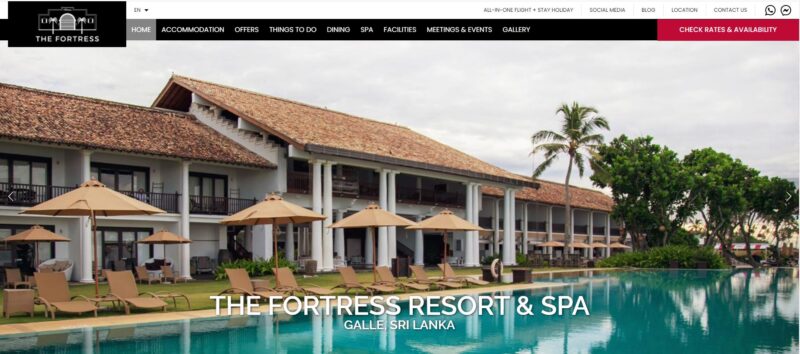
The Fortress is a resort and spa based in Sri Lanka. However, the establishment recognizes that the visitors are not just there to stay inside their rooms, so the website highlights activities that their guests can indulge in while staying at the resort.
What We Like About It
The first thing you will see is a massive carousel of the resort’s picture as the homepage’s header. The images are a mix of shots of the hotel’s pool and the beach. Immediately, the visitors will know what awaits them if they book a room.
The website also features a live cam. You can see what is happening on the beach at any time of the day. This feature is fantastic because potential guests can see what the area looks like in actuality and the weather. Is it raining there now? Is it sunny? You can plan your trip accordingly thanks to this feature.
And finally, there is a scrolling list of attractions that the guests can enjoy while staying at the resort. You can book seats for specific interests directly from the hotel’s website. You can see some pictures of the attractions from the homepage and look at them on the map to see how far each is from the hotel. So, if a guest is interested in Blue Whale Watching, they can click on the ‘Inquire Now’ button after the attraction’s short description. There is a form that the guest can fill out to inquire about availability, and the hotel will be the one to make arrangements.
Conclusion
In making a hospitality website, you need to tap into the potential guest’s emotions. If the hotel offers a relaxing time, you want the website to feel and radiate calm. If it offers adventure, you want to build up the excitement by providing visitors with an immersive experience. By showcasing the different rooms in eye-catching pictures, you make it easy for the potential guest to see which accommodation type will suit his needs.
It is also a great idea to show what awaits them should they choose to stay at the hotel. Pictures of the different amenities and activities that they can try out are a must. While videos may slow down your website, they are a better way to showcase the hotel. Choose just a few of the hotel’s offerings to highlight using videos.
You also want to make booking rooms very convenient. The websites that we showcased made sure that you can book from any page. Some even had sticky booking buttons so that the visitor doesn’t need to scroll up or down to find it. If you can go a little further and add a way for your guests to secure tickets for nearby attractions, go ahead and include that on your website.


