Chiropractic Websites – Case Studies
In the evolving landscape of healthcare and wellness, chiropractic practices face the unique challenge of establishing trust, showcasing expertise, and appealing to the health needs of potential patients through their online presence. A well-crafted website serves as a cornerstone in achieving these goals. It’s not just about listing services or qualifications; it’s about creating a connection, educating visitors, and building confidence in the practice’s ability to deliver effective care.
The following case studies delve into various chiropractic websites that excel in different aspects of digital engagement – from leveraging testimonials and blogs to utilizing virtual tours and showcasing practitioner expertise. Each case study offers insights into the strategic decisions that make these websites successful in converting visitors into patients and in establishing a strong online reputation.
1. New York Chiropractic Lifestyle Center
Effective Chiropractic Website Design
The New York Chiropractic Lifestyle Center’s website is a prime example of effective web design and content strategy in the healthcare sector. It masterfully blends visual appeal with functional design to create an engaging user experience.
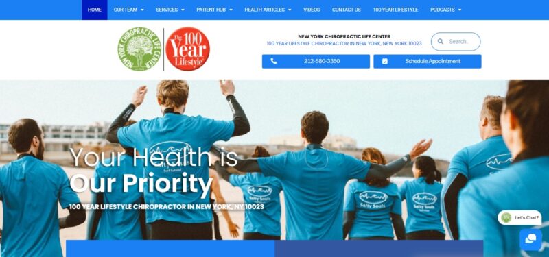
What We Like About It
- Visual Appeal:
- Color Scheme: The website’s color palette, dominated by bright blue and white, perfectly balances attractiveness and clarity. This choice ensures that the site is visually appealing without detracting from its primary goal of conveying information.
- Animated Header: Upon landing on the homepage, visitors are greeted with an animated header featuring vivid colors and images. This captures attention and sets a welcoming tone for the site.
- Engaging Content:
- Slogan and Copy: The center’s slogan, “Your health is our priority,” is prominently displayed, encapsulating the center’s commitment in a memorable phrase. The website content, while concise, provides a clear overview of the center’s services and expertise, drawing visitors further into the site.
- Video Content: A standout feature is a video that elaborates on the center’s guiding philosophy, “The 100-Year Lifestyle.” Presented in a poetic style, this video informs and inspires visitors, encouraging them to engage more deeply with the center’s message.
- Brand Recognition:
- Consistent Messaging: The center’s “100-Year Lifestyle” principle is consistently highlighted throughout the site, reinforced by a distinctive red emblem. This consistency builds strong brand recognition and resonates with the center’s core message.
- Customer Testimonials:
- Review Integration: A unique aspect of the website is its integration of an app that displays 5-star reviews from satisfied patients. These reviews, appearing as dynamic pop-ups, offer social proof and add credibility, enhancing the trustworthiness of the center.
2. Dr. Steven Shoshany
Leveraging Video for Enhanced Patient Engagement
Dr. Steven Shoshany’s chiropractic website exemplifies the effective use of video content to engage and inform potential patients. While the site incorporates standard features seen on healthcare websites, it distinguishes itself through a strategically placed welcome video.
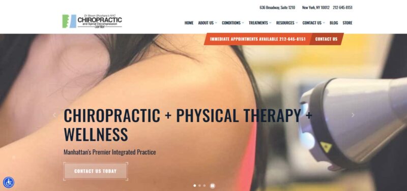
What We Like About It
- Website Design and Features:
- Standard Healthcare Website Elements: The website includes a carousel that showcases the clinic’s range of services, providing a comprehensive view of what patients can expect. A dedicated section also introduces the clinic and Dr. Shoshany, giving the website a personal touch.
- Insurance Information: Recognizing the importance of financial considerations for healthcare services, the website thoughtfully lists the insurance plans accepted by the clinic. This transparency is crucial for potential patients and is conveniently located at the bottom of the homepage for easy access.
- Welcome Video:
- Immediate Engagement: The most striking feature of Dr. Shoshany’s website is the welcome video. This video, placed prominently on the site, captures the visitor’s attention immediately, differentiating it from other text-heavy sites.
- Content and Impact: The video, under two minutes long, efficiently communicates what Dr. Shoshany and his team offer. It provides a glimpse into the clinic, showcasing the treatment environment, which helps set realistic expectations for new patients. The video alleviates potential anxieties and curiosities about the treatment experience by demystifying the therapy process.
- Building Trust: Seeing Dr. Shoshany and his clinic in action adds a layer of trust and authenticity. It allows potential patients to connect with the clinic even before their first visit, making them more comfortable and informed about their choices.
3. SpinePro Singapore
Balancing Promotional Offers with Professionalism
SpinePro Singapore’s website adeptly demonstrates how to feature promotional offers on a healthcare website without compromising the perceived quality and professionalism of the services offered. This case study explores the strategic design choices that allow the website to attract attention with discounts while maintaining a premium and effective image.
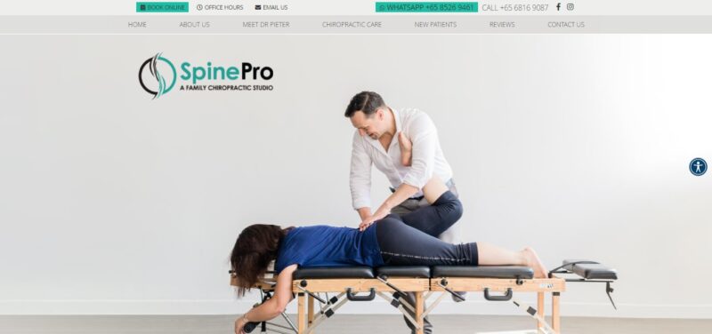
What We Like About It
- Visual Design and First Impressions:
- Colorful Photographs: The website immediately grabs attention with vibrant photographs of the leading doctor engaged in various therapies. These images showcase the services and establish a personal connection with visitors.
- Structured Content with Bold Headers: As visitors scroll down, they encounter well-organized information about the benefits of the clinic’s treatments. Each benefit is succinctly described under bold headers, with different colored fonts used for emphasis and easy navigation through the content.
- Promotional Offer Presentation:
- Subtle Placement: The promotional offer is positioned in the middle of the homepage, ensuring it is noticeable without dominating the page. This placement strikes a balance between highlighting the offer and maintaining the focus on the clinic’s services.
- Consistent Design Elements: The promotion section aligns with the website’s overall color scheme and visual style, using black, grey, and teal. This consistency ensures that the offer feels like an integral part of the website rather than an intrusive advertisement.
- Professional Presentation: The promotion is presented in a manner that upholds the clinic’s professionalism. It avoids overly bright or flashy colors, which could detract from the seriousness and effectiveness of the healthcare services.
- Marketing and Perception Strategies:
- High-quality: The careful design approach is crucial in healthcare, where overly aggressive or flashy marketing can create impressions of cheapness or ineffectiveness. SpinePro Singapore maintains a delicate balance, offering value while upholding a high-quality image.
- Perceived Value: The promotion is framed to add value to the clinic’s offerings rather than detract from them. It’s portrayed as an opportunity for patients to access quality care at a more accessible price point rather than implying lower quality.
4. Warrior NYC
Impactful Use of Pop-up Video and Branding
Warrior NYC’s website effectively demonstrates the use of video content and strong branding to create an engaging online presence. Unlike typical website pop-ups, Warrior NYC’s approach enhances user experience and reinforces its brand identity.
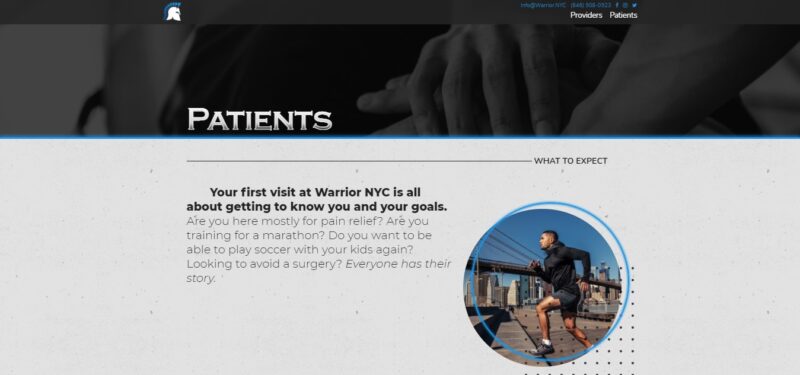
What We Like About It
- Innovative Use of Pop-ups:
- Video Pop-up Instead of Standard Offers: Upon visiting the Warrior NYC website, users are greeted with a pop-up video, a departure from the common practice of presenting discount vouchers or newsletter sign-ups. This approach immediately engages visitors with dynamic content.
- Content and Messaging: The video efficiently outlines the services offered by the facility and is accompanied by a powerful slogan that declares the center as a life-changing entity. This direct and impactful messaging captivates the audience right from the start, setting the tone for their entire website experience.
- Consistent Branding:
- Warrior Motif: The website strongly adheres to a “warrior” theme, consistent with the brand name. This is reflected in the center’s logo, which creatively incorporates a warrior’s helmet with a vertebra, symbolizing strength and spinal health.
- Location Integration: Including a New York view with the emblem and the center’s name instantly identifies the center’s location, adding a sense of place and relevance for local visitors.
- Interactive and Visual Menu:
- Image-based Menu Design: The website employs an image-based menu to showcase the services of Warrior NYC. This visual approach makes the site more engaging and user-friendly, as visitors can easily navigate through the services offered.
- Dynamic Interaction: The menu features an interactive element where the grey menu items turn neon blue upon interaction. Accompanying copy changes provide detailed information about each service when selected. This adds a modern touch to the website and enhances the user experience by making information retrieval intuitive and visually appealing.
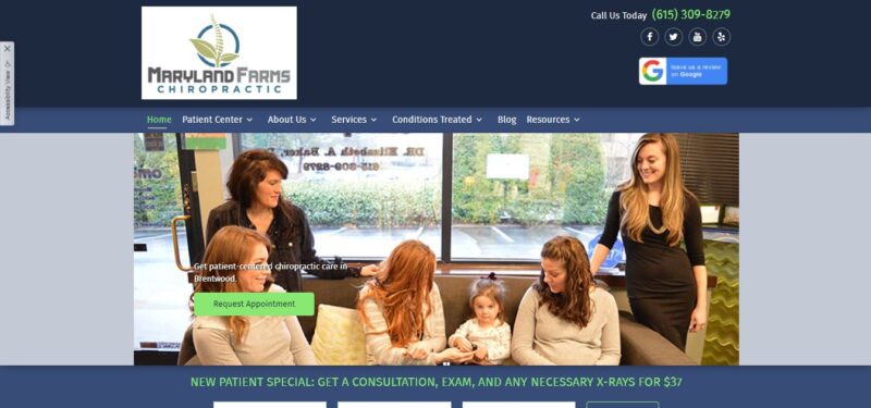
5. Maryland Farms Chiropractic
Showcasing Clinic Features and Community Connection
Maryland Farms Chiropractic’s website provides an excellent example of effectively using digital tools to showcase clinic features and build community trust. The website goes beyond highlighting chiropractic competence by giving potential patients a comprehensive view of the clinic’s environment and the doctor’s community involvement.
What We Like About It
- Virtual Tour Integration:
- Utilizing Google Maps for Virtual Tours: Maryland Farms Chiropractic incorporates a virtual tour using Google Maps technology. This allows visitors to navigate through the clinic, from the reception area to treatment rooms, offering a realistic view of the facility.
- Detailed Exploration: The tour even allows visitors to view the doctor’s degrees on the office wall, adding an element of transparency and authenticity to the online experience.
- Call-to-Action Buttons: Strategically placed call-to-action buttons beneath the virtual tour invite visitors to schedule an appointment, effectively turning virtual engagement into real-world consultations.
- Highlighting Community Involvement:
- Emphasis on Local Roots: The website emphasizes the doctor’s local upbringing, creating a sense of familiarity and trust with the community. This approach is particularly effective in small towns, where local connections are significant in choosing healthcare providers.
- Recognition and Awards: The doctor’s recognition as the Best Chiropractor in Brentwood from 2016 to the present is prominently featured, including in the header carousel and through award logos. This showcases the doctor’s accomplishments and reinforces community trust in the clinic.
- Effective Use of Imagery and Awards:
- Carousel of Photos: The header carousel of photos helps to visually engage visitors while highlighting the clinic’s accolades and features.
- Award Logos: Displaying award logos on the homepage is a testament to the clinic’s credibility and excellence, further instilling confidence in potential patients.
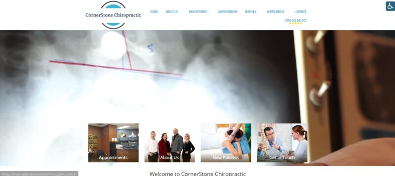
6. Cornerstone Chiropractic
Enhancing Patient Comfort with a Virtual Tour
Cornerstone Chiropractic’s website adeptly addresses the apprehensions of first-time chiropractic patients by providing a detailed virtual tour of the treatment process. This approach not only educates visitors but also significantly reduces anxiety associated with the unknown aspects of chiropractic care.
What We Like About It
- Step-by-Step Virtual Tour:
- Introduction at the Front Desk: The virtual tour begins at the clinic’s front desk, offering a friendly and familiar starting point. This immediately sets a welcoming tone for the website visitor.
- Medical History Consultation Area: The tour then guides visitors to a space where medical history is discussed, reassuring them about the personalized attention and care they will receive. Clear visuals accompanied by descriptive copy explain each area’s occurrence, demystifying the process.
- Neurological Evaluation Explained: The website shows an area for neurological evaluations, providing brief but informative descriptions of the examination objectives. This transparency helps in building trust and setting realistic expectations.
- Patient-Centric Features:
- Adjustment Suite Visualization: If an adjustment is deemed necessary, the tour shows the suite where this will take place, helping patients visualize their experience ahead of time.
- Child-Friendly Facilities: Including a fun-looking bed with plush toys for children showcases the clinic’s family-friendly approach and consideration for young patients.
- Strategic Call-to-Action Placement:
- Appointment Scheduling Button: The tour concludes with a strategically placed appointment scheduling button. This placement effectively converts the visitor’s interest into action, as it comes after they have been reassured and informed about the treatment process.
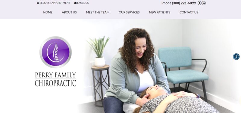
7. Perry Family Chiropractic
Showcasing the Chiropractor’s Expertise and Compassion
Perry Family Chiropractic’s website successfully centers around Dr. Katy, their chief chiropractor, highlighting her expertise, certification, and compassionate approach. Focusing on the chiropractor’s personal and professional qualities effectively attracts new patients by building trust and showcasing specialized skills.
What We Like About It
- Prominent Display of the Chiropractor:
- Photographic Introduction: Dr. Katy is introduced through a series of photographs where she appears friendly and compassionate. These images create a strong first impression, portraying her as caring and approachable, which is crucial for patients seeking relief from pain.
- Images in Action: The website includes photos of Dr. Katy treating patients, including a notable image of her caring for a newborn. These pictures humanize her and demonstrate her hands-on approach and skill in handling patients of all ages.
- Descriptive Homepage Section:
- Expectation Setting: A section on the homepage outlines what patients can expect during their treatment. This transparency is key to setting realistic expectations and reducing patient anxiety.
- Highlighting Unique Qualifications: The website emphasizes Dr. Katy’s unique qualification as the area’s only Webster-certified chiropractor. This distinguishes her from other practitioners and can be a deciding factor for patients seeking specialized care.
- Personal Quotes and Testimonials:
- Doctor’s Perspective: The website features quotes from Dr. Katy explaining how Perry Family Chiropractic differs from other clinics. These personal insights add depth to her professional profile and allow potential patients to connect with her philosophy and approach.
- Visual Accompaniment: Each statement is accompanied by a photo of Dr. Katy in action, reinforcing her active role in patient care and her warm, engaging manner.
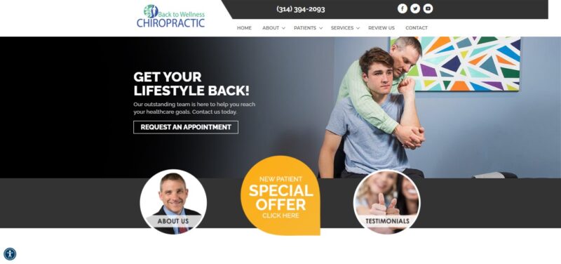
8. Back to Wellness Chiropractic
Leveraging a Blog for Patient Engagement and Clinic Growth
Back to Wellness Chiropractic showcases a well-maintained and informative blog’s powerful role in attracting new patients and enhancing a clinic’s online presence. Their blog is not just a repository of information but a strategic tool for patient education and engagement, leading to clinic growth.
What We Like About It
- Comprehensive and Relevant Blog Content:
- Wide Range of Topics: The blog covers various topics, from specific conditions like bulging discs and various forms of headaches to general wellness advice, such as choosing the right school backpacks for children. This breadth of content addresses a wide array of potential patient concerns and interests.
- Search Engine Visibility: By focusing on topics relevant to chiropractic care and wellness, the blog ranks high in search results for terms like “chiropractic blog.” This visibility is key in attracting casual visitors who are researching chiropractic treatments or related health issues.
- Educational and Persuasive Writing:
- Informative Content: Each blog post is crafted to be highly informative, providing valuable insights into chiropractic treatments and wellness. This positions the clinic as a knowledgeable and trustworthy source of information.
- Incorporating Clinic Services: The blog skillfully weaves in the benefits of consulting a chiropractor within its posts. This subtle inclusion acts as a pitch to the reader, encouraging them to consider scheduling an appointment with the clinic.
- Conversion of Visitors to Patients:
- Meeting Information Needs: By addressing common questions and concerns through blog content, the clinic meets the informational needs of potential patients. This builds trust and establishes a connection between the reader and the clinic.
- Call-to-Action Integration: Strategically placed calls-to-action within the blog encourage readers to take the next step, whether it’s scheduling a consultation or learning more about the clinic’s services.
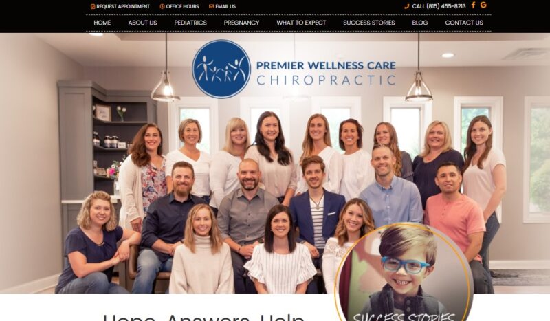
9. Premiere Wellness Care Chiropractic
Authentic Testimonials as Success Stories
Premiere Wellness Care Chiropractic effectively showcases testimonials on its website, transforming them into compelling success stories. This approach adds a personal and relatable dimension to the testimonials, enhancing their credibility and impact on potential patients.
What We Like About It
- Personalized Success Stories:
- Detailed Patient Journeys: Each testimonial is structured as a success story, detailing the patient’s initial health issues, the treatments provided by the chiropractor, and the outcomes achieved. This comprehensive approach provides a clear picture of the patient’s journey and the effectiveness of the treatments.
- Inclusion of Patient and Doctor Photos: Accompanying each story with photos of the patient and the doctor adds a personal touch, making the stories more relatable and trustworthy. It visually reinforces the bond between the patient and the chiropractor, fostering trust in the clinic’s services.
- Credibility and Relatability:
- Avoiding Overly Sales-Oriented Language: The testimonials avoid excessively positive or generic praise, which can often be insincere or “sales-y.” Instead, they focus on genuine experiences and specific health improvements, enhancing their authenticity.
- Resonance with Potential Patients: The detailed narratives of health issues and successful treatments resonate with visitors who may be experiencing similar problems. These stories provide social proof and offer hope and encouragement to potential patients.
- Impact on Patient Decision-Making:
- Building Confidence in Treatment: By reading about real patients who have benefited from the clinic’s care, potential patients gain confidence in the chiropractor’s ability to treat their conditions.
- Encouraging Appointment Bookings: Authentic and relatable success stories can be a decisive factor for visitors considering chiropractic care, potentially leading them to book an appointment with the clinic.
Conclusion
The case studies of various chiropractic websites underscore the importance of a thoughtful and patient-centric online approach. Whether it’s through engaging storytelling in testimonials, informative and SEO-optimized blog content, or immersive virtual tours, each website has found unique ways to connect with its audience. These strategies go beyond the basic display of information, creating interactive experiences that resonate with potential patients and foster a sense of trust and credibility. The key takeaway for chiropractic practices is to focus on personalization, authenticity, and patient education in their digital presence. By doing so, they can effectively communicate their values, expertise, and commitment to patient care, which are crucial in attracting and retaining patients in a competitive healthcare landscape.


Comments are closed.