Part of the philosophy of HTML, as the markup for web browsing, has always been creating a consistent and seamless experience for visitors across all platforms. As web sites incorporated fancier design and more functionality over the years, it became harder to focus on this goal.
However, now that mobile devices are starting to account for the lion’s share of internet traffic, and PC sales have begun to decline, consistency and fluidity on all channels is crucial. This is whyresponsive web design is now the guiding principle for virtually all web design teams .
What does responsive web design look like? Diving into the following three sites, while resizing, navigating links, and loading pages across a variety of devices illustrates it very well.
Leading News Magazine
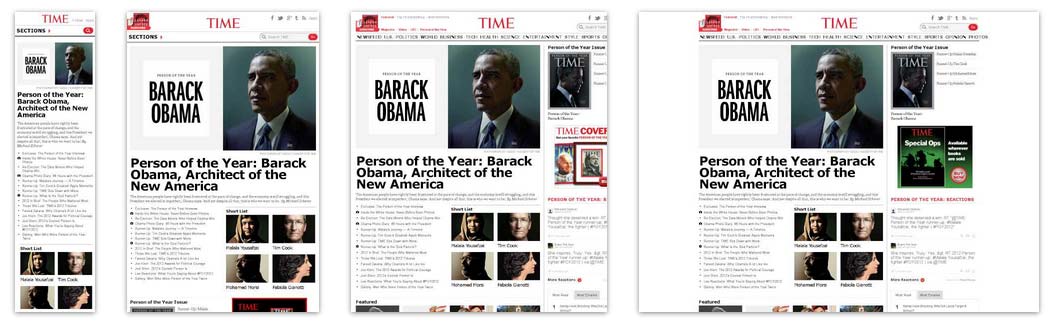
Business is rapidly transforming for the print and news industry, as it must move away from hard copy presentation and build a subscription base for mobile devices. Tablet access at the breakfast table or on the subway is becoming the new morning newspaper ritual. Time Magazine’s online version demonstrates a keen awareness of the fact that its readership will be primarily mobile from now on, and dynamically arranges the leading news stories in a way that is easy to follow. Time Magazine
Popular Tech Blog
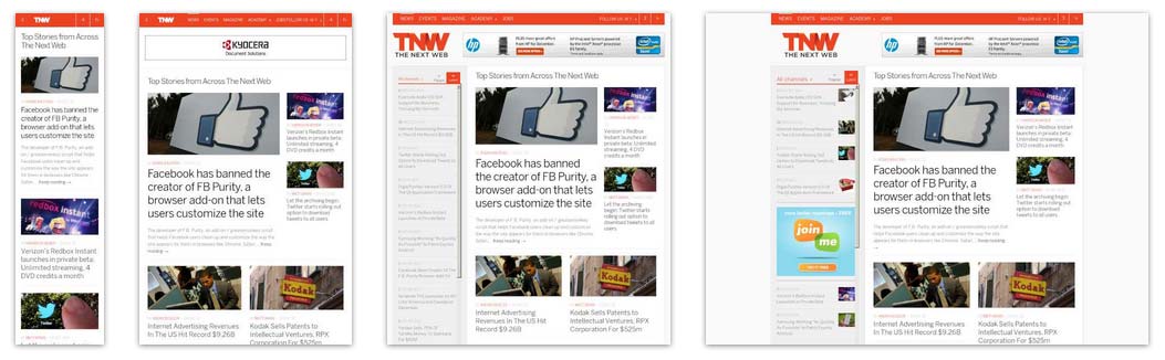
This popular tech website would probably lose credibility if it did not live up to its name, and fortunately it does through its responsive choices. The large images are inviting and present themselves well across both mobile and PC browsing. When the site is minimized to mobile sizes, the main menu becomes an unobtrusive dropdown and the search icon gains more visibility. The news stories always take primacy, but the key navigation links are always made available to the user in a seamless way. The Next Web
Student Housing website
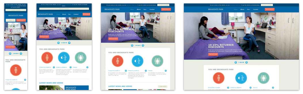
The owners of Broadgate Park, a student housing facility, realized the importance of mobile-first design for their website. With a vast majority of students surfing the web on their smartphone or tablet, Broadgate needed to find a balance between ease of use and striking design. The result is a site with a personality. Broadgate Park
Your website
If you would like to discuss a responsive, mobile-first design for your website, give is a call or shoot us an email.