People resort to yoga to get in some much-needed physical activity while simultaneously relaxing. Yoga is commonly associated with serenity and calmness, and these features should be represented in your web design. A website allows you to demonstrate your expertise in ways that are impossible to achieve in person. Plus, it is an opportunity to build a better relationship with your clients.
We scoured the internet for what we consider to be the best yoga website designs, keeping the qualities listed above in mind. Take a look at them to gain a better understanding of what makes a good yoga website.
Top 5 Yoga Website Designs
1. Yoga Maya
The first yoga website on our list is an all-rounder in terms of graphics and user interface. The Yoga Maya website successfully combines a creative layout with a user-friendly experience. In addition, they offer free trials to entice viewers. They also provide a video library of lessons to help potential clients learn how things work.
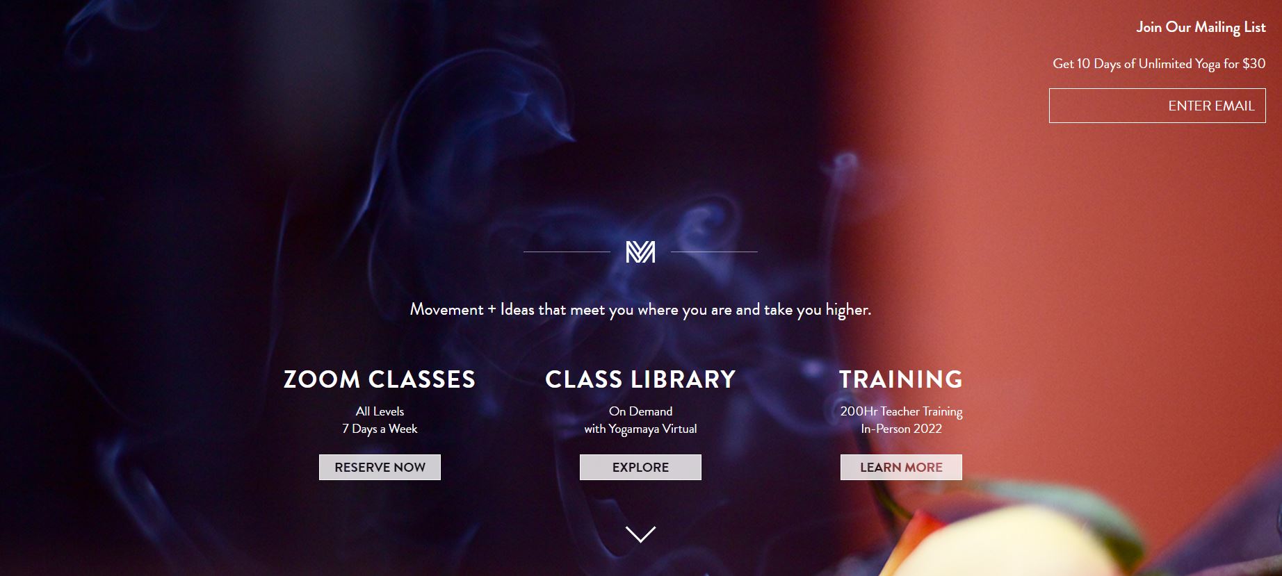
What We Like About It
The homepage of the Yoga Maya website is an exceptional experience on its own. The header provides access to zoom classes, the class library, and information on the semi-private 200-hour training. Simply enter your email address in the top right corner to join their mailing list. As you scroll down the menu, you’ll see options for meetups, coach training, buying classes, virtual yoga lessons, and booking a class.
Each option has been divided into separate sections on the homepage. There are blocks for their zoom lessons, as well as a virtual yoga studio that can be accessed on-demand. A seven-day trial of the website’s virtual yoga studio is also offered. Teacher training, events & workshops, journals, and stores are all available as additional blocks.
Yoga Maya’s Instagram posts appear at the bottom of the page. Their contact information and links to their social media accounts, such as Instagram, Facebook, and Spotify, can be seen in the footer.
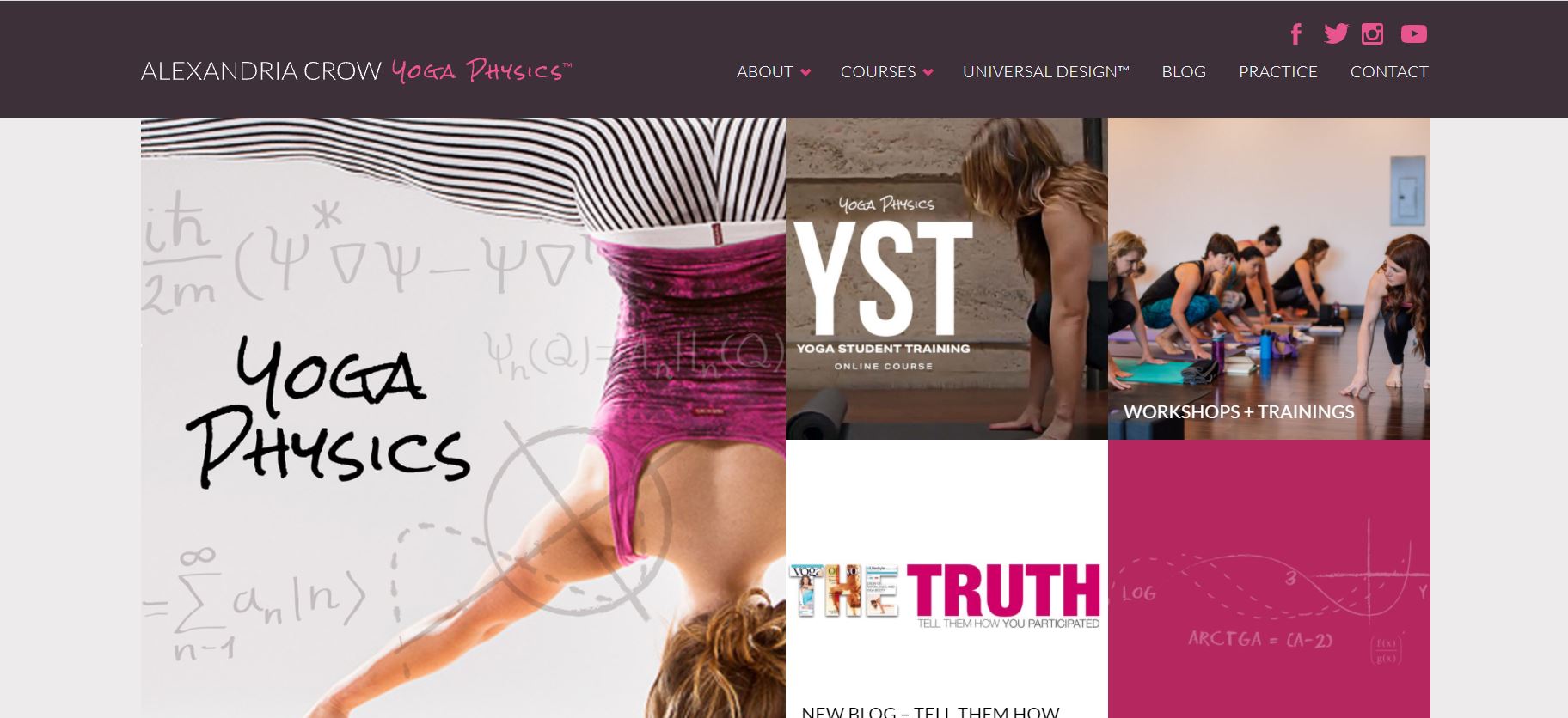
2. Yoga Physics
Yoga Physics has gone for a more daring website design. The pink and black color palette is striking but aesthetic, especially considering its use in the photographs. The website’s owner, Alexandria Crow, has focused on the concept of yoga and the science behind it.
What We Like About It
The webpage has a standard top menu with links to Yoga Physics’ social media accounts, including Youtube, Twitter, Instagram, and Facebook. Visitors can also navigate the website using options such as About, Courses, Universal Design, Blog, Practice, and Contact. However, the main menu is not loaded with options, as that may cause users to become overwhelmed.
You can click on the blocks in the header to be redirected to the relevant pages. Yoga Physics, Blog, Workshops, and the Online Course are all included on these pages. You can sign up for the mailing list on the website by typing your name and email address into the designated space.
Lastly, the footer contains links to pages not found in the top menu, such as Bio, Media, and Schedule.
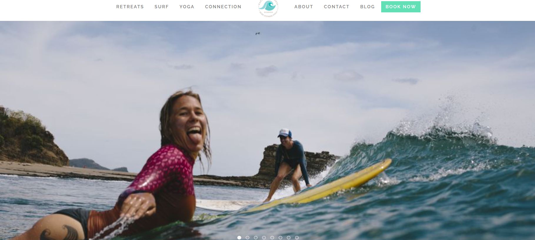
3. Papaya Wellness
Papaya Wellness has taken a unique approach to yoga, as they have introduced a blend of yoga with surfing. The photographs on their website, as well as the pastel color scheme, represent this concept. In short, their website is a mixture of adventure and relaxation.
What We Like About It
Clients enjoying their stay on the retreat while participating in yoga, surfing, or simply relaxing on the beach are featured on the sliding header. The top menu has options for Retreats, Surf, Yoga, Connection, About, Contact, and Blog. A call-to-action button next to it encourages customers to book their tour right away.
Next, there’s a part that explains what Papaya Wellness is and what they offer, as well as how you can get in touch with them. The section that follows is about their upcoming retreats. It contains information on the time and pricing. However, you can get further details by selecting the Learn More option.
In addition, there is a section with information on upcoming workshops. You can also browse the full schedule and watch their YouTube video to see how things are done.
Furthermore, instructors can check out the website to determine if they are qualified to lead a retreat. There are also testimonials from prior clients on the page. Finally, the footer has all of the relevant links and the option to book a trip.
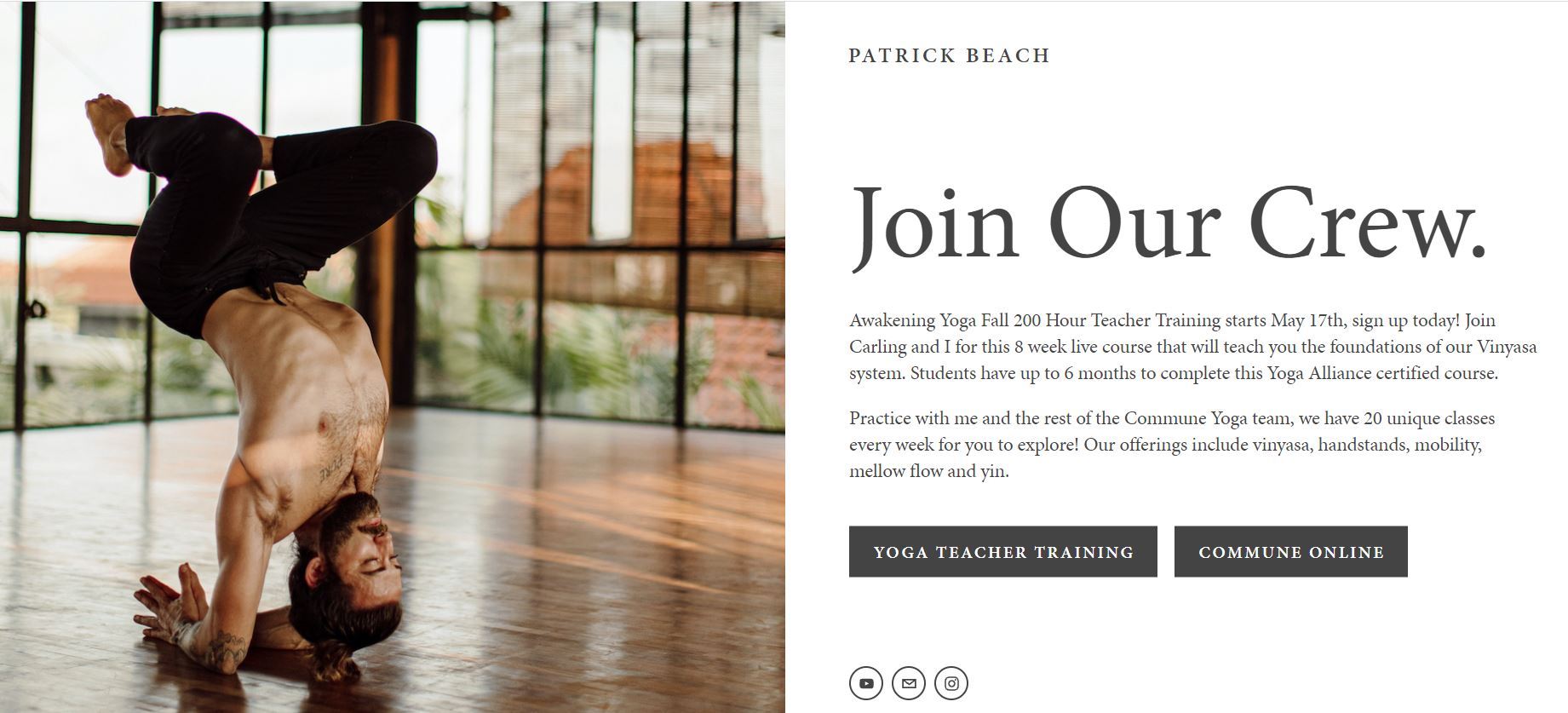
4. Patrick Beach
“Professional” is one way to describe the website for Patrick Beach. To make navigation easier, they offer separate sub-sites for training yoga teachers and people who want to learn yoga.
What We Like About It
The first thing you’ll notice on the web page is a picture of Patrick Beach in all his glory. If you select the “Commune” option, the website will redirect you to a page where you can sign up for a free 7-day yoga class trial. The following section discusses how their yoga studio stands out from the competition.
Next, you can check how much their plans cost and sign up for the web app. Then there’s the team introduction; you may learn more about them by clicking on the team members’ images. There’s also a FAQ section with answers to the most frequent issues and concerns. Gift Cards, Terms, Privacy, Student Waiver, and social networking links are all available at the bottom.
On the other hand, selecting the “Teacher Training Option” on the homepage will lead you to a separate page for the Awakening Yoga Academy. It shows a photo of Patrick in action in the header, along with an introduction to the teaching course and a call to action button.
Registration, Qualifying Criteria, Pricing Alternatives, Study Schedule, Instructor Profiles, Student Reviews, Curriculum, and a FAQ section are all included on the page. They also present their refund policy alongside the pricing options to avoid any future misunderstandings.
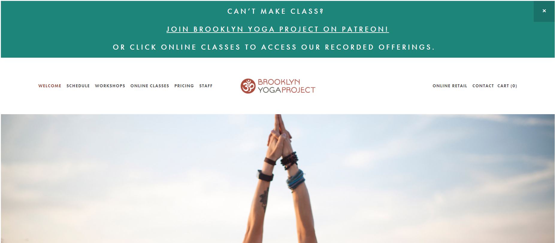
5. Brooklyn Yoga Project
The Brooklyn Yoga Project is another website that follows a minimalistic design. The stunning graphics paired with the aesthetic typography result in a great web design. The website presents all relevant information, and users can easily navigate the website via the top menu. All in all, this website is simple to use.
What We Like About It
When you first visit the website, you’ll get an invitation to support them on Patreon. The main menu on the Brooklyn Yoga Project website features the logo in the center and options on both sides. Welcome, Schedule, Online Classes, Pricing, Staff, Online Retail, and Contact are the options available on the homepage. If you miss a class, recordings are available via the online class option or Patreon.
A photo appears in the header, followed by information about the yoga studio. Below the introduction is a call-to-action button. You can become a member of their community by entering your name and email address in the designated section. To improve the aesthetic appeal of the website, they have also included photos of people in various yoga poses.
The studio’s contact information is listed in the footer, including its address, phone number, and email address, along with links to its social media accounts. From there, you can also get to the FAQ section and the contact page.
Conclusion
After reading this list, we hope you have a few more ideas for making your website stand out. Keep in mind that the focus is not just on the appearance but also on the content. Including high-quality photos and videos is a great approach to ensure that people are interested in your yoga facility.
Overall, your website should be simple to navigate and have a clean design. Plus, it would be a massive plus for you if people could book classes online using the site.