Winery Website Design
Updated for 2023. The winery industry is competitive, and having an effective web presence is essential to staying ahead. A winery website should be designed to provide an attractive and user-friendly online experience.
When planning and designing a website for a winery or vineyard, your job is to spark people’s interest in the vineyard. You want them to visit the vineyard and buy the wine produced there.
Here are 12 features you should consider adding to your winery website:
- A product catalog with photos and descriptions of the wines available for purchase.
- An events page to showcase upcoming tastings and other gatherings.
- A contact page with social media links and a map of the winery’s location.
- An interactive virtual tour of the winery and vineyards.
- An FAQ page for customers to find answers to common questions.
- A blog where you can discuss recent news from the winery.
- A newsletter signup page to keep customers updated on new releases and events.
- An online store for customers to purchase wine directly from the website.
- A loyalty program where customers can earn rewards for their purchases.
- A photo gallery showcasing images of the winery and its grounds.
- A wine list where customers can find specific bottles available for purchase.
- A search feature that makes
Our Top Picks For The 6 Best Winery Websites
Ensure your winery website makes the best possible impression and stands out from the competition. Create a content strategy that focuses on telling a story and highlighting the unique aspects of your winery. Incorporate quality visuals, including pictures and videos of the winery, its wines, and its events.
This can be accomplished in a variety of ways. Let’s look at some of the best winery website designs to see what they’re doing right.
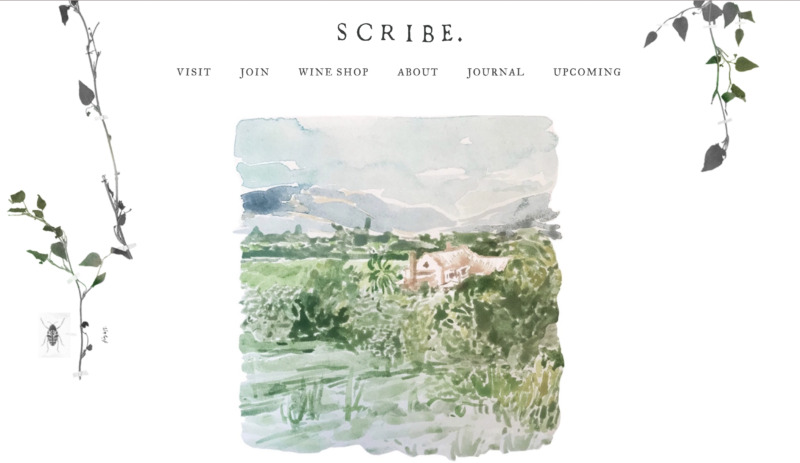
1. Scribe Winery
Having been established in 2007, Scribe is a relatively new winery compared to its competitors. The vineyard is managed by Andrew and Adam, brothers and fourth-generation farmers. Scribe offers a one-of-a-kind experience for its visitors, and its website showcases that distinctiveness.
What We Like About It
A watercolor painting of the vineyard greets you as soon as you arrive on Scribe’s homepage. The image is captivating and rustic, causing you to feel nostalgic and intrigued.
There are only six items on its main menu, which makes it easy to navigate. When you select the “Journal” option, the selling begins.
Enticing and well-chosen photographs taken at the vineyard fill the blog pages. There are also magazine photos of the vineyard and winery. This implies that since magazines cover this winery, it must have something unique to offer.
The site also features food recipes to go with the wines available at the shop. These recipes are then demonstrated in cooking videos to keep the viewer engaged. A link to the wine that pairs best with that dish is also included. You’ll be taken to the winery’s online store if you click on the link.
The store is relatively well-organized and gives off an aesthetic vibe. Each page includes a gripping description of the wine and the crucial details a sommelier might be looking for.
Overall, the website is straightforward yet compelling. The store is simple enough to navigate, and the wine pictures load quickly enough to make the reader stay. With its intuitive use of images, it makes you want to visit the vineyard right away.
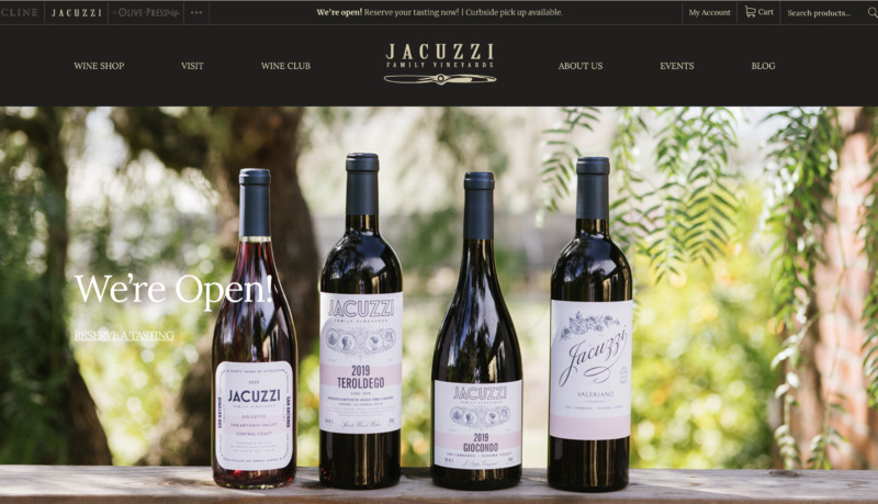
2. Jacuzzi Family Vineyards
Jacuzzi is a family-run vineyard that first opened its door in 2007. However, the family has been farming grapes and making wines since 1921.
The vineyard was created as a homage to their grandfather, Valeriano. This webpage tells a tale more than anything else. You can sense the owners’ passion for their family and heritage from the very first page.
What We Like About It
A carousel of gorgeous photos of the building and wines is the first thing you’ll notice when you arrive at the home page. The website is designed in a black and gold theme, which provides the perfect backdrop for the vineyard photographs.
Underneath, you’ll find more eye-catching images that also serve as links to different content pages. Each image demonstrates what you can do at the vineyard, showing people participating in wine tastings and attending a wedding.
The wine shop is another page with stunning photographs featuring the products available. In addition to the standard wine description and tasting notes, each page includes matching ideas for the meal.
So, not only do you learn about the wine you can buy, but you get to know about various dishes to pair it with as well. These ideas also include a link to their blog for the recipe for each dish.
This website is the right blend of stunning visuals and valuable content for people looking to make an impression on their guests.
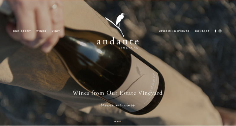
3. Andante Vineyard
Andante signifies “at a moderately slow tempo.” This is how the owners see the tempo of their vineyard. It is a place for unwinding and calming down from the hustle of life. Their website does an excellent job of reflecting this sense of peace to the visitors without a hitch.
What We Like About It
Have you ever seen a website that makes you feel like you’re reading a magazine article? Andante Vineyards gives you the same feeling thanks to the seamless layout and color palette.
It all starts with a photo carousel. There is a particularly eye-catching image of the owners walking their dogs amidst the grapevines, which makes you want to go there and do the same.
When you scroll down, you can see an introduction to the vineyard’s story and several Call-to-action links for scheduling a wine tasting and learning more about their wines via the blog. Moreover, you can find the vineyard’s rustic map to the vineyard at the bottom of the homepage.
The website makes effective use of an element that is often overlooked, the typeface. While most of the material is in print, some text parts are written in cursive.
The impressive application of this font draws the visitors’ attention to the critical section of the site without jarring bold letters. You’ll also note that this cursive text makes the CTAs stand out.
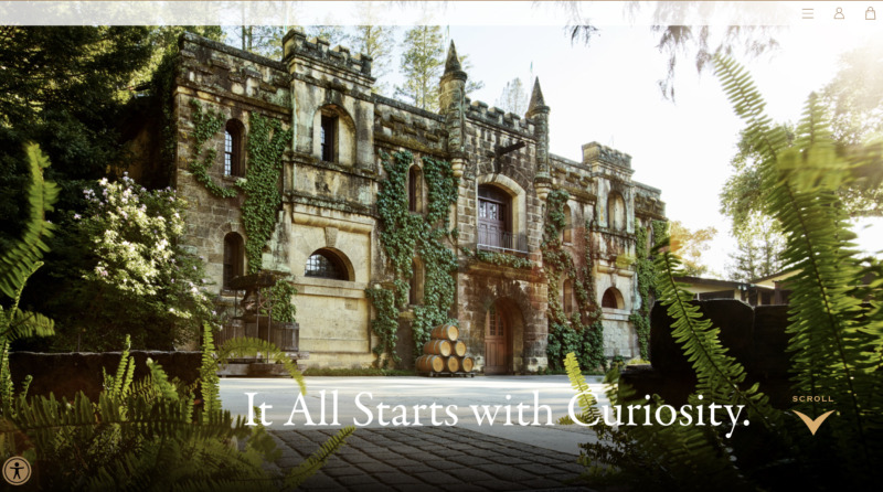
4. Chateau Montelena
Montelena is a winery that has been in operation since 1888. You probably imagine something stuffy and boring about anything with a 14-decade legacy.
With Chateau Montelena, what you get instead is an attractive, one-of-a-kind website that makes you want to browse and scroll to get to know more about the vineyard.
What We Like About It
Montelena’s website offers an interactive and immersive experience in a class of its own. When you scroll down the website, it’s as if you’re turning pages of art.
The site features a full-screen image of the vineyard with the phrase, “It All Starts with Curiosity.” Needless to say, the site surely does pique your interest at first glance.
The most distinctive feature of the website is that instead of scrolling down, a single swipe causes the next page to slide in. As you continue to go through the pages, you can learn more about the vineyard while also delighting in the classic functionality.
At the top right corner, you can find the collapsible menu and links to access the shop.
Another feature that makes the website stand out from the crowd is the accessibility menu on the bottom left of the screen. This menu allows visitors to adjust contrast, font size, spacing, pause animation, and activate a dyslexia-friendly version of the site, among other things.
The entire website screams elegance with its black and green background and a script font for the headers. The images are well-curated, with artistic shots of the wines and vineyard.
Admittedly, site navigation can be a bit of a challenge after a while. This is where the hamburger menu comes into play.
If you find yourself lost in the beautiful pictures, you can use the menu to skip to another section and schedule a wine tasting or buy a bottle of wine from their collection.
5. Hannes Reeh
When you think of a winery website, pictures of grapevine fields and cursive fonts come to mind. However, Hannes Reeh’s website bucks that trend by using bold colors, big fonts, and an asymmetrical layout instead.
When you look at the website, you think of something modern rather than conventional.
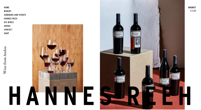
What We Like About It
The homepage of this Austrian winery website displays an image of the company’s main building. With cement walls and sparse greenery, it gives off a modern, industrial vibe.
The next photo features a bottle of their wine. Besides the picture of the owner and a handful of other grape farmers, you’ll notice that there aren’t many people in the photos used on this site. Instead, the images emphasize the delicate glasses, bottles, and venue.
You’ll see curated photos of the wine bottles, vineyard, and winery owner as you scroll down. These images also include links to the individual content pages on the website.
At the bottom, after the photo grid of Andau’s wine bottles, you’ll be right back to the site’s menu page. This intuitive navigation option eliminates clicking on the top menu to get to another page.
6. Mumm Napa
Mumm Napa is a California-based winery that has been around since the 1970s. While the website appears pretty straightforward, it contains several noteworthy features.
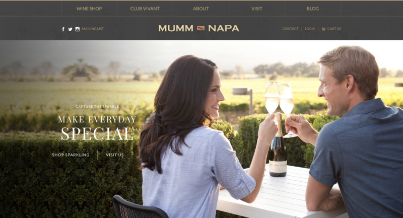
What We Like About It
Even though this winery website is jam-packed with content, it is well-organized into five main sections. Thanks to the sticky menu, you can browse any page without having to scroll up.
The majority of the images on this website are of individuals enjoying their wine. This is a play on the company’s slogan, “Capture the Sparkle,” and “Make Everyday Special.”
This website stands out because of its powerful CTA that makes it easy to convert visitors into buyers. The homepage boasts a total of 11 CTA buttons.
Even though the images are pretty modern, they still appear welcoming and don’t cause the page to look crowded. To get more information about an event or a particular wine, click on the buttons for “Learn more” or “Complete Details.”
On top of that, the page is highly responsive and looks excellent on both big and small devices.
Conclusion
Wineries can benefit from a well-designed website and effective online marketing. To ensure that your winery’s website is up to par, it’s essential to be familiar with the features necessary for success and the best practices to help you make the most of your website. Finding the right web designer to implement those features and best practices is critical to having an effective website that will draw customers in and keep them coming back. With the right combination of design and marketing, your winery can take advantage of the digital age and grow your business.