Best Landing Page Design Examples Inspiration
Creating a landing page that converts customers and increases your leads seems simple enough — until you get started. Here are 10 landing pages we love for their simplicity and effectiveness in getting the message across with a compelling call-to-action and clear process to take action.
1. Beachbody
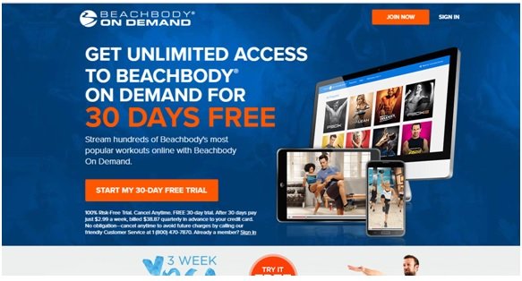
Clicking through for an offer of “3-Week Yoga Retreat” brings you to this boldly colored landing page, that makes the call-to-action — to “Start My 30-Day Free Trial” easy to find. Instructions are clear, and you see the benefit right there on the screen, with unlimited access on the most popular wireless devices.
2. Thrive Market
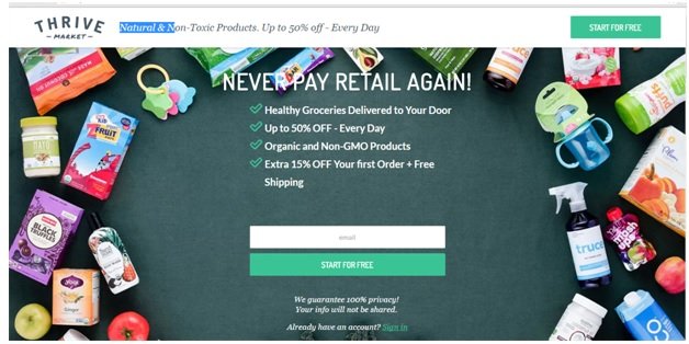
The soothing colors, the easy-to-read list format that shows you exactly what you’ll be receiving, and the prominent call-to-action buttons, in two separate locations, draw your attention to the easy step to take advantage of the listed benefits. We like that they show an array of products you can purchase, putting a real-life visual example to the words.
3. Don’t Buy Into Puppy Mills
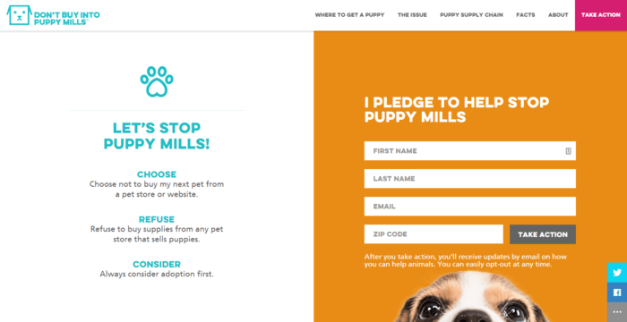
With the sad puppy-dog eyes drawing your attention to the already highlighted call-to-action, Don’t Buy Into Puppy Mills has done a good job of harnessing the power of the visitor’s emotions to sign the pledge. We like that they give you three actions you can take that will help to stop puppy mills. The social sharing buttons are especially helpful, as peer-to-peer recommendation goes very far.
4. Rosetta Stone
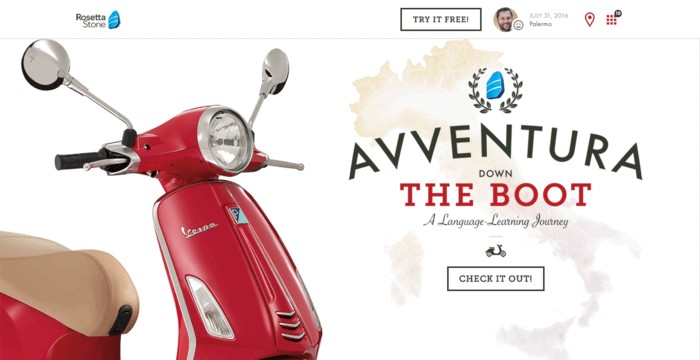
The call to action on this page isn’t to sign up for free, but to check out Peter’s travels through Italy. The videos and photos, the brief journal entries, and the fact that learning another language was important to him during his trip is a great way to draw on visitors’ attention and desires to travel the world.
5. Big Brothers Big Sisters of America
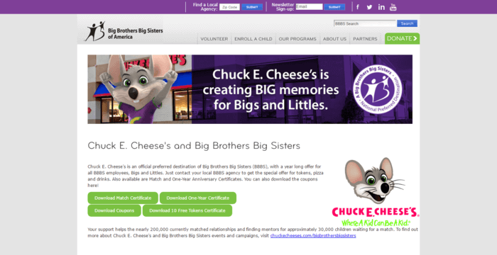
The landing page about the partnership between Big Brothers Big Sisters of America and Chuck E. Cheese’s is one that stands out because it offers multiple, clear calls to action and shows the steps that individuals can follow to make a difference for the organization and for your family. While we would like a slightly more pointed call to action, with more white space on the page, we love the way they highlight the partnership between the organizations.
6. The Children’s Page
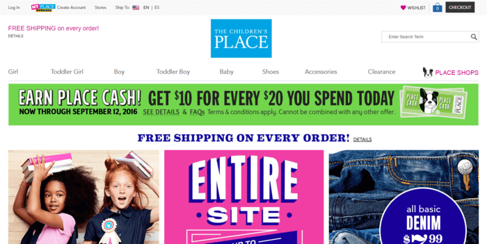
The children’s clothing provider offers customers a $10 coupon when they sign up to receive e-mails from the company. It’s simple, clean, and directs customers to the call to action.
7. Zillow
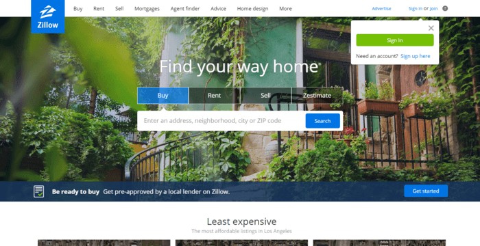
From the beautiful house to the picturesque sunset, Zillow makes its purpose and call to action clear — enter and address and you can find your dream home. A small, bold pop-up in the corner prompts you to sign in or create an account.
8. Walt Disney World
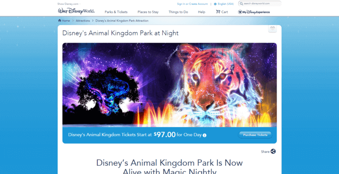
Striking images and a simple design point visitors toward Walt Disney World’s goal — getting visitors to purchase tickets for Animal Kingdom.
9. Heartwood and Oak
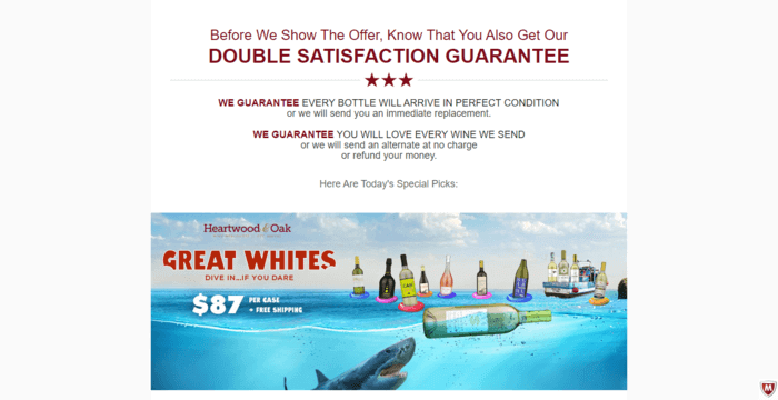
Heartwood and Oak’s landing page for their Great Whites package is a little long, but also includes a check-out component, right next to the description of the package. The humorous image and prominent placing of the guarantee stand out on the stark white page.
10. Paleo Magazine
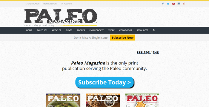
The bright blue call-to-action stands out on the clean white background and the grey header. Yellow boxes also draw attention to the offer to subscribe.
