Every month, thousands of businesses open their doors. Regardless of the size of the company, it will require financial assistance in some form or another. This market is ripe for grabbing if you work in finance or for someone who works in finance. You must, however, employ effective techniques to expand your services successfully.
Two of the most effective ways to spread the word about your startup are personal endorsements and an internet presence. Personal recommendations are beneficial. This is because no one will refer you to their contacts until they have first experienced your quality of service. It’s an invaluable seal of approval. On the other hand, its reach is severely limited, particularly if your client doesn’t have an extensive network.
That leaves us with the other option: developing an internet presence. A well-built website is the best way to do so. With a website, you can work with new clients at any time, no matter where they are. The key challenge with a website is convincing potential clients of your expertise and reliability. It’s critical to make a strong impression of your qualifications and previous work.
This is just one factor to consider when making a financial website. Take a look at these top financial website designs to see what they bring to the table.
Our Picks for Top Financial Website Designs
1. Ellevest
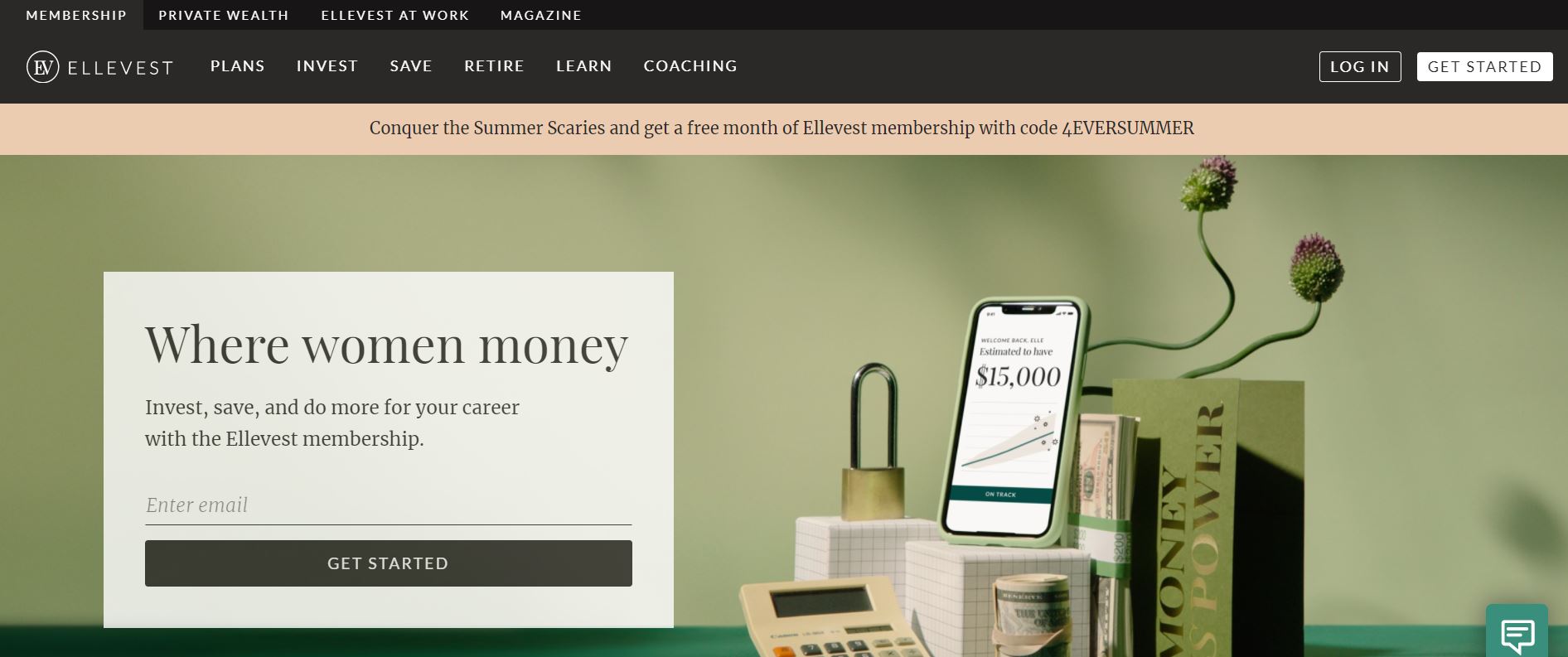
Security is one of the things that users will look for in any financial website. Aside from being able to keep consumers’ information secure, the website should also appear trustworthy. Check out how Ellevest’s website earns the trust of its visitors.
What We Like About It
Ellevest, like many financial websites, is secured with an SSL certificate. You can tell because its URL reads as HTTPS. On top of that, the website gives the impression of being trustworthy. It features neutral colors and sleek typography. Furthermore, it does not look like it used a generic template.
In order to create sections on the homepage, each major component has a slightly different colored backdrop. Well-drawn illustrations always accompany the portions containing texts. Additionally, the webpage makes good use of white space. The space is meant to keep the website from looking cluttered, even if it contains a lot of information.
The wording is brief but powerful. On the website’s homepage, the selling points are succinctly explained. The menu is also meticulously organized, with labels such as “plans,” “invest,” “save,” “retire,” and “learn.”
2. Nutmeg
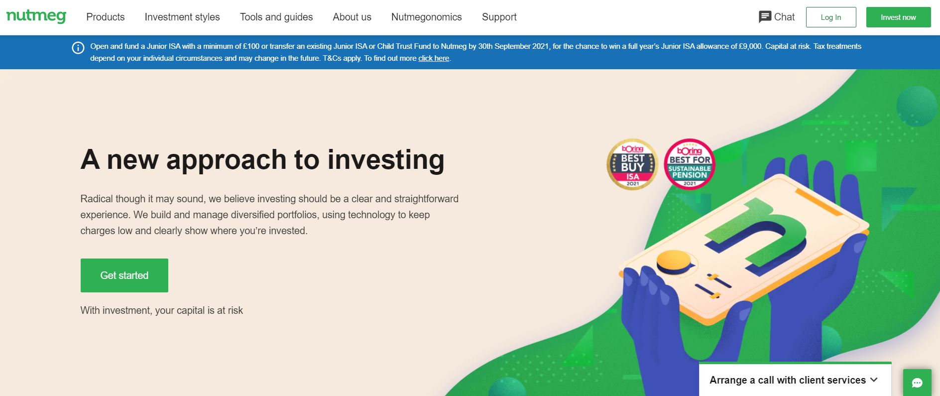
Web users have very high expectations of any finance-related website. Nutmeg’s website is a multi-awarded online wealth manager site, and it manages to meet every one of those high expectations.
What We Like About It
Nutmeg has won numerous awards for being one of the most innovative wealth managers in the industry. Its website is visually appealing despite using neutral colors and typical fonts. First, the designer chose to divide the pages into sections by using different colored backgrounds. Next, the website uses sparse graphical elements to ensure that the focus stays on the words. By highlighting the text and not hiding behind flashy visuals, the website projects a more trustworthy appeal.
Right away, the website offers a compelling value proposition. For example, in the header, the key phrase “A new approach to investing” indicates that this firm provides innovative solutions to its clients’ financial needs. Then right below the fold, the website mentions three more reasons you should do business with the company. A good value proposition tells the visitors precisely what kind of money managers work here. And if you like that strategy, you can talk to one of their managers right away. There are also multiple call-to-action buttons on the header.
3. Wealthsimple
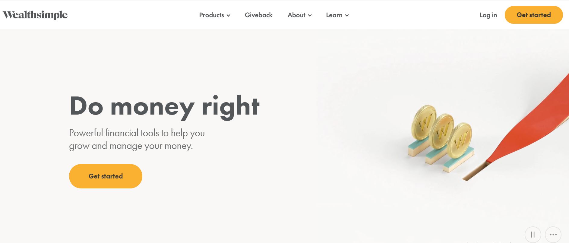
Visitors will always remember your website if it features a unique design. The website Wealthsimple employs a creative technique to capture visitors’ attention.
What We Like About It
Wealthsimple is an online investment management service provider. Its website is not at all like the stuffy websites that people are used to seeing. It is highly interactive with plenty of animation. For example, the homepage’s header features a clever animation of coins falling into what looks like slots. It depicts the client’s money going into different investment vehicles. The effective display of technology utilization on the website is a wise approach because the value proposition of this organization is that they utilize sophisticated technology and human aid to make informed decisions about their clients’ money.
The website also presents the company’s different services cleverly. The various services fall under the main headline, “Grow your Money.” Each comes in a multi-colored box with plenty of white space. Scrolling activates their appearance. Each box contains a one-sentence description of the service. And it always comes with a CTA button. Indeed, this makes navigation easier because visitors can easily choose which type of service they want to explore.
4. Moula
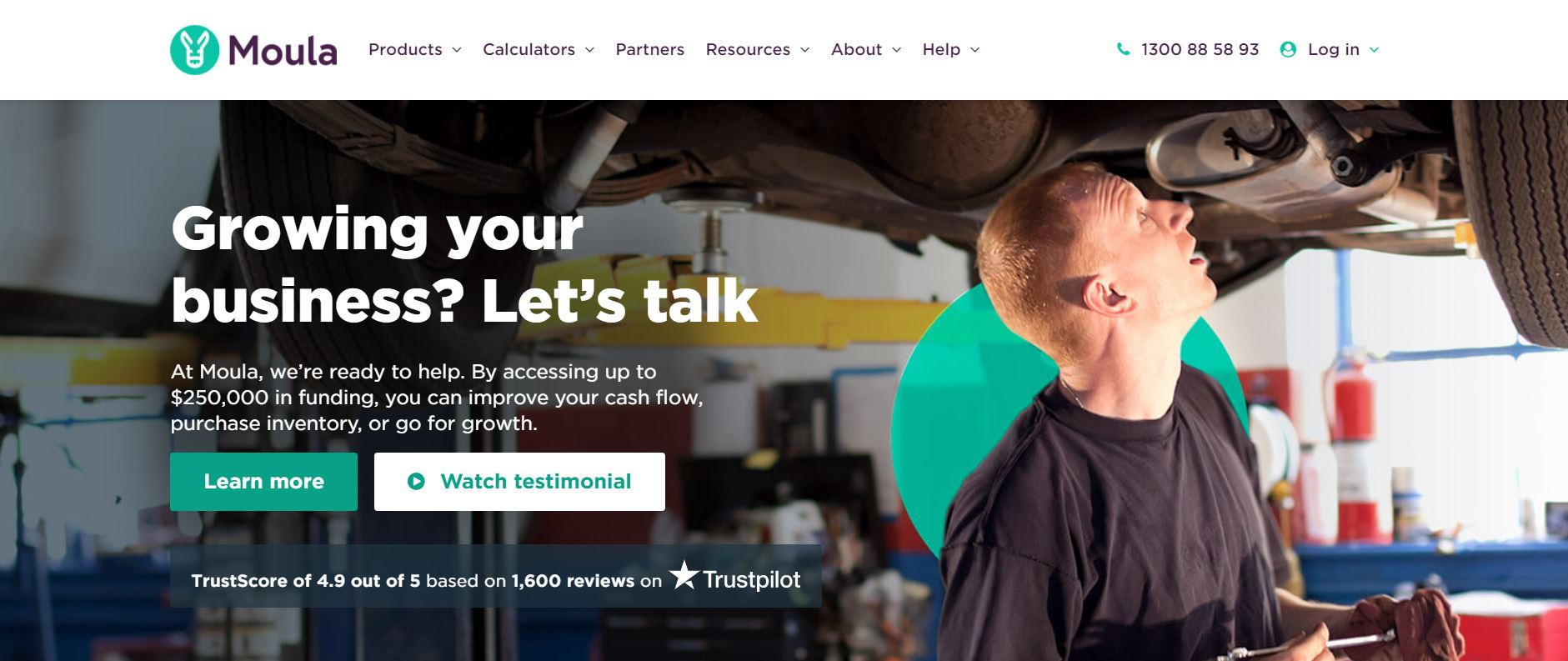
Money matters may puzzle you. A money manager’s website should not. It takes only a few seconds for visitors to browse a financial website and determine if it can meet their financial needs. Therefore, it is critical to have an intuitive website in order to ensure that all of the important information is visible within those few seconds. Moula’s website design is highly intuitive. It is easy to use, even for non-tech-savvy visitors.
What We Like About It
In the header, the website asks visitors if they are growing their businesses. Then it quickly offers up to $250,000 in funding. Right below that text, you will find two call-to-action buttons. One is to encourage the visitor to learn more about the business loans to file with the institution. The other CTA button leads to the company’s testimonial page. It directs the two kinds of people who arrive at their site, those who are already convinced and would like to start the process and those who still need a little more convincing and proof of the company’s reliability. The website guides visitors to the appropriate pages that they need to access.
Moula’s website is visually appealing. For example, It uses a great combination of photos and illustrations to accompany the texts. Also, the sections are well-spaced, and the text is informative but not too wordy. While there is plenty of information to process on the pages, they are not cluttered and are all easily scannable.
5. With Jack
While many financial websites maintain a serious, professional appearance, Jack’s website takes the opposite approach and adopts a playful, cartoony theme. This sets it apart entirely from different insurance providers. See how they successfully managed to stand out from the crowd.
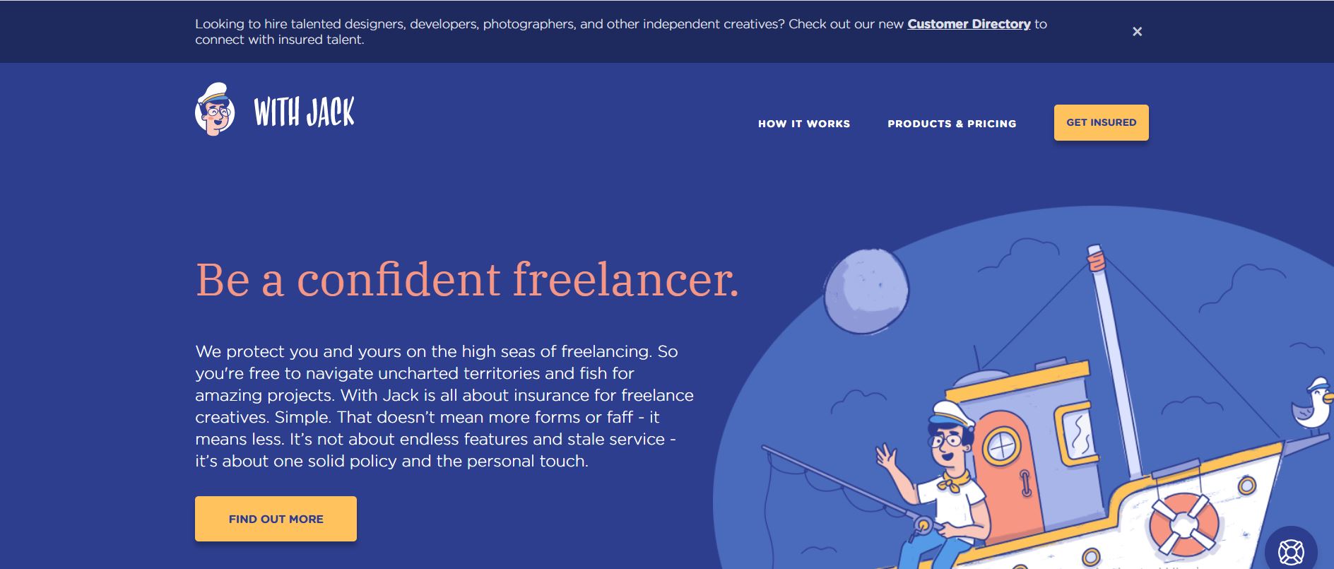
What We Like About It
With Jack has a fun-looking website that features a boat captain as its mascot. This character is featured prominently in the cartoon illustrations that accompany the copy on the web pages. A good mascot helps to raise brand awareness and recognition. Even if the visitor forgets the company’s name, they are unlikely to forget the mascot and go back to the website because of that retention.
While the website contains cartoons, it is exceptionally well-designed. First, the header includes a great value proposition that details the company’s target audience. Next, it also has two yellow call-to-action buttons that stand out.
Below the fold, the website details the types of products they offer to freelancers. Each product comes in a separate box with an accompanying illustration. The designer used a blue font for the headings. The crucial words in the description are in bold black.
6. Insurify
Insurify’s website does not want to waste time on marketing. It goes directly to the service that it offers – car insurance. Check out what unique features the website has.
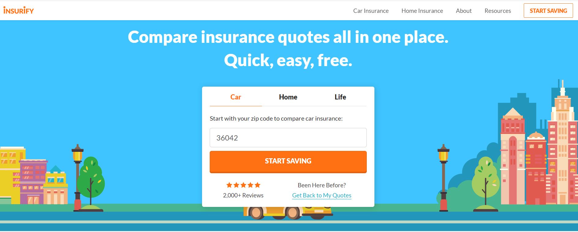
What We Like About It
Visitors are greeted by a form that asks about their car and driver information. As you fill in the details, discounts get added to the piggy bank at the top right corner. For example, you can get low mileage, a safe driver discount, and much more. Once you’ve filled out all the information, you will receive insurance quotes for your vehicle.
If you are not yet ready for a quote, you can also read their various articles. These are mainly about the best insurance to get for your car and home. Any visitor looking to get vehicle insurance will benefit from this content. There is also a slider of images that allows visitors to compare car insurance costs per state.
Insurify uses bright orange call-to-action buttons. These are easily noticeable. The ‘compare quotes’ button even floats, so it stays with the visitor during the scroll down. There is also a chatbot available to answer some queries that visitors may have.
Conclusion
When it comes to making the best financial websites, security and reliability are the primary concerns. All of the websites on this list have security features in place. More important is to make the visitors believe that the companies are trustworthy enough to keep their information secure.
Other aspects are reliability and convenience of use. Most financial websites use a neutral color palette and a professional-looking layout. One of the companies on the list went the other way and included cartoons on its page. However, all look professionally designed, as a shabby-looking website is not a good choice for a financial company.