As a medical professional, a significant part of your treatment is building a good relationship with your patient. A website can help you not just with the relationship aspect but also with reaching a larger audience. However, simply putting up a website might end up doing more harm than good. Your website needs to highlight your skills and experience and show that you want to help your patients.
For the reasons mentioned above, you need to pay special attention to your website’s design. Therefore, we are here to help you with the list of the best doctor website designs that can give you some unique ideas for your own.
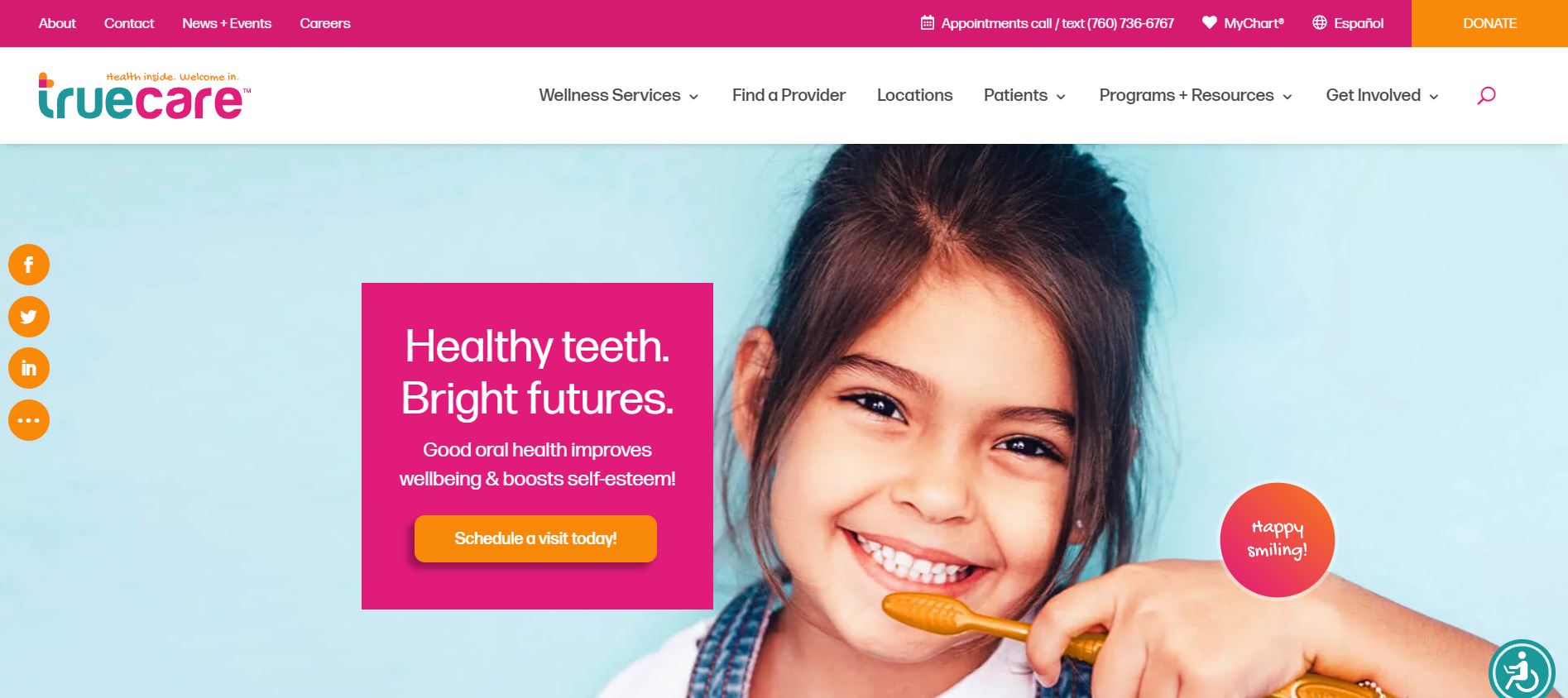
1. TrueCare
TrueCare has an excellent website, complete with a stunning color scheme and simple navigation options. Their website layout is simple and easy to browse, and the content is available in both English and Spanish.
What We Like About It
Like most modern websites, the TrueCare designers have ditched the traditional navigation for a sticky menu because of its efficiency. It is relatively detailed, with links grouped into categories for efficient organization. The header features the picture of a patient receiving her vaccination along with a call-to-action to learn more. Similarly, you have options for finding a provider, scheduling an appointment, and new patients.
The social media links are displayed on the left side, with the information section having a call-to-action for scheduling an appointment.
If you scroll a little more, you’ll see options for various services. You can click on the one you need. They have the MyChart application so that all the patient information is available in one place. The website also has testimonials, doctor profiles, and more links for getting the information you need.
2. Northwestern Medicine
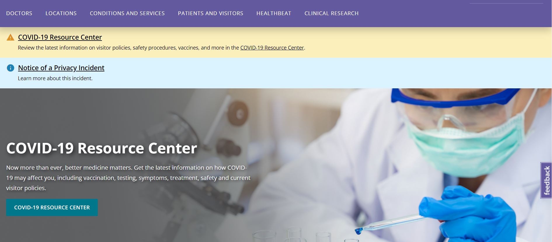
Northwestern Medicine’s website screams professionalism. They have a solid purple-dominated color scheme that is elegant yet professional. Other than that, the website is comprehensive and offers increased functionality.
What We Like About It
The web designers for Northwestern Medicine opted for a traditional menu. The navigation has the usual links plus additional ones for paying bills and accessing patient information. The menu also has a search option that you can use to find help. Any additional updates are displayed under this menu. Moreover, the website header is focused on the COVID-19 resource center.
Next, there are links to Request An Appointment, Find Doctors and a Location Near You. There is also information on their medical team and stats about their employees and ranking. Finally, there is a section dedicated to their locations, of which you can see a complete list by clicking on the link.
Right above the footer is the space for subscribing to a newsletter. The footer has quick links, including options for donation and volunteering. The rest are divided into categories like About Us, Billing And Insurance, Medical Professionals, and Feinberg School Of Medicine.
3. John Hopkins Medicine
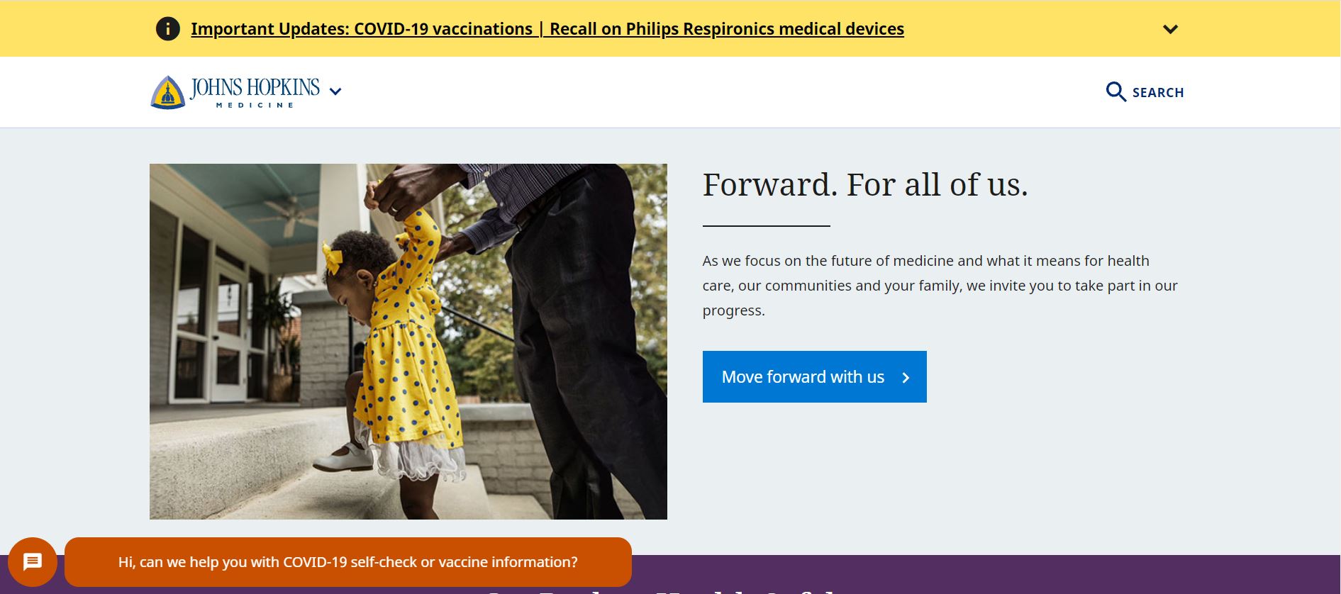
John Hopkins is a prestigious organization and, as such, has a reputation to uphold. Their official website lives up to the expectations. Though the website has a lot of information to display, it has still arranged it properly to be accessible to all.
What We Like About It
The website ditches the top menu in favor of a drop-down menu. Information is divided into sections; the first section allows you to look into their progress regarding the future of medicine. The following two sections explore information regarding COVID and John Hopkins Medicine.
The website has a dedicated news section where it features the latest news about the institution. There are links to help patients find doctors, book appointments, pay their bills, get financial assistance, and more. The bottom of the homepage has quick links divided into groups for patients, students, health professionals, and researchers.
They also provide language assistance for 31 languages, including ASL. In addition, the footer has links to social media handles as well as their policies.
4. Perry Avenue Family Medical Center
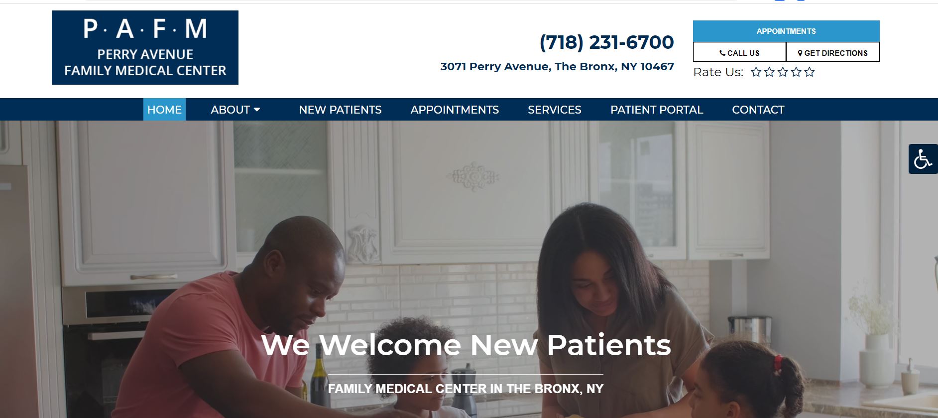
The Perry Avenue Family Medical Center has not put much focus on the aesthetics of its website. Instead, what stands out about this website is its accessibility. Everything is easy to figure out, and you don’t have to weed through loads of irrelevant information to get your answers.
What We Like About It
The navigation menu includes the Homepage, About, New Patients, Appointments, Services, Patient Portal, and Contact options. Above the menu is the contact information as well as options to book via call and get directions. You can even rate their services.
The homepage header features the picture of a family and welcomes new patients. There is a clear call to action for patients to book their appointment at the earliest. You will see an accessibility section on the right side that you can use to change the fonts and other things for better visibility.
New patients can choose options from About Us, New Patients, and Getting In Touch. Then, there is a section for Testimonials, Family Medicine, Men’s Health, and Pediatric Care. The footer has their contact information and location on a Google Maps add-in. It also has a form that you can put your information into for an appointment. You can also see what their office hours are through this section.
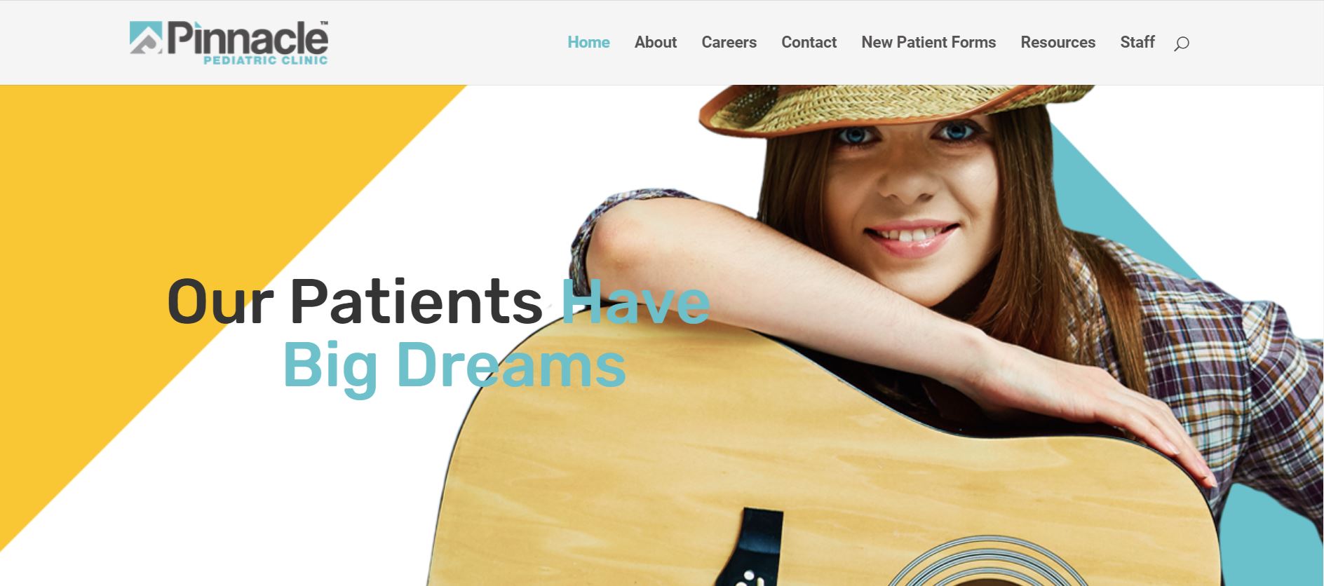
5. Pinnacle Pediatric Clinic
The Pinnacle Pediatric Clinic has one of the most aesthetic websites we have ever seen. The cheery vibes are appreciated since it’s a pediatric clinic, and children are big fans of joy. Therefore, the color palette utilizes pastel colors and high-quality pictures of smiling children.
What We Like About It
The navigation menu is placed at the top and has options for Career, Resources, Patient Form, in addition to the usual links. It is a sticky menu with a search feature handy for getting what you want as fast as possible.
The header consists of a slide show featuring pictures of children. Below are options for accessing the About Us section, patient forms, and other helpful resources. The next is the testimonial section, which contains positive reviews from happy patients and guardians who have found the services satisfactory.
Next, the footer has options for navigating the website like Home, About, Careers, Patient Forms, Resources, Staff, and Contact. The clinic has displayed the address and phone number in the footer, along with their working hours.
Overall, the entire website is cheery and bright. That is good because it reflects how the environment is within the clinic. Since most children dread going to the clinic, this is certainly helpful in that regard.
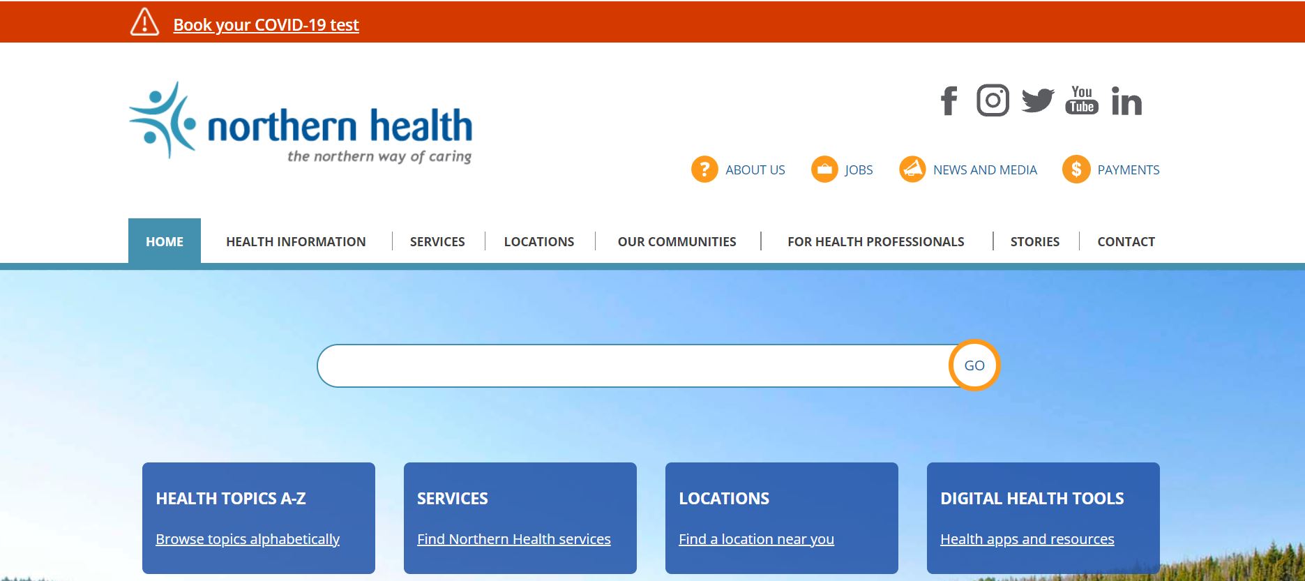
6. Northern Health
The Northern Health website is straightforward and easy to navigate. The website design is clear and leaves nothing to be criticized. Features such as virtual ED and telehealth are useful to folks as they allow them to get help while staying at home.
What We Like About It
The top-strip is there to provide the latest updates for ongoing issues; in this case, that’s COVID. Adjacent to the organization’s logo is the search option for virtual ED, TeleHealth, and donations. The navigation menu also has quick links to different pages on the website. The links have been grouped into categories so as not to clutter the menu.
The header banner has graphics for updates. Below are thumbnails for Patients and Visitors, Health Professionals, Research and Education, Work With Us, Support Us, and Locations. The section below is for the latest news regarding the organization.
Below the news section is the section for feedback, so you can leave remarks about your experience there. Moreover, the footer has location addresses along with their numbers, emergency contact number, and social media links. They also offer interpreters, which is a standout feature and opens them to a wider audience.
Conclusion
Aesthetics are not the most important factor when it comes to doctor website designs. Instead, your focus has to be on the accessible provision of information. Patients must find it easy to access their medical history, make easy payments, and book appointments through your website.
Of course, that does not mean you can get away with an ugly website, but you should emphasize functionality. Hopefully, this list was enough to give you an idea of what you’ll need for a good website.