Residential architecture is constantly evolving, and today’s houses look wildly different from those built just a few years ago. This evolution is due entirely to the architects’ efforts to create better designs. But while some architects effectively apply these design skills to their websites, others do not.
It is understandable why some firms do not put much thought into their websites. After all, the majority of their business often comes from word of mouth. However, as more soon-to-be and existing homeowners rely on the internet to find people to hire, how an architect or firm digitally presents itself becomes crucial.
Let’s look at these best architecture websites to see some features to incorporate in your next project.
Best Web Designs for Architects
An architect’s website must find the balance between showcasing its planning and design skills and giving the client a great experience as they go through the website.
We will explore these five websites that are not just visually appealing but also offer a unique experience. Plus, they give the clients all the information they need to hire the architect or firm for their residential project.
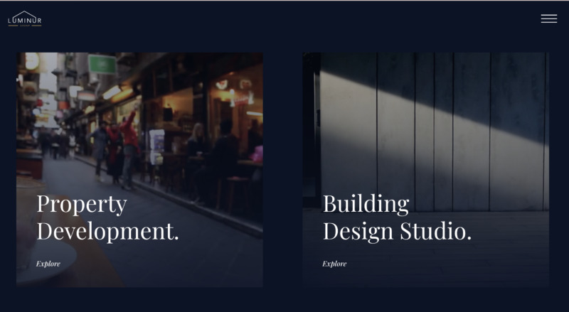
1. Luminur Group
This architecture firm promises to create a unique space for its clients. The aim of their architects’ designs is to improve the client’s quality of living. The firm’s website is also a unique space.
What We Like About It
The content is limited to what the client needs. For example, you get to choose whether you want to explore their property development or design services on the homepage. This is a strategic way of keeping the content targeted for their audience and avoiding cluttering the pages.
The website showcases the firm’s unique service and makes it easy for clients to contact the firm. When you click on the “Property Development” option, a video of people walking fast while a person off-screen drinks coffee will greet you.
As you scroll down, you’ll see that the team offers various property investment and development services. The video now makes sense since, while everyone else is working, the client has time for a leisurely coffee.
You’ll also notice that the page presents all the information a potential property owner needs. This includes the firm’s process in property development and a portfolio of the beautiful properties they manage.
The website effectively reflects the firm’s aesthetics. Different sections of the website allow for a seamless transition. Furthermore, the dark blue theme and all-white text make the site come together. The web design uses various fonts so that the viewer does not get bored while scrolling through the pages.
Overall, the website design gives the clients all the information they may look for. The pictures on the main page of the Design studio are muted and slightly transparent. This makes the page look sleek, as most of the architecture firm’s designs are.
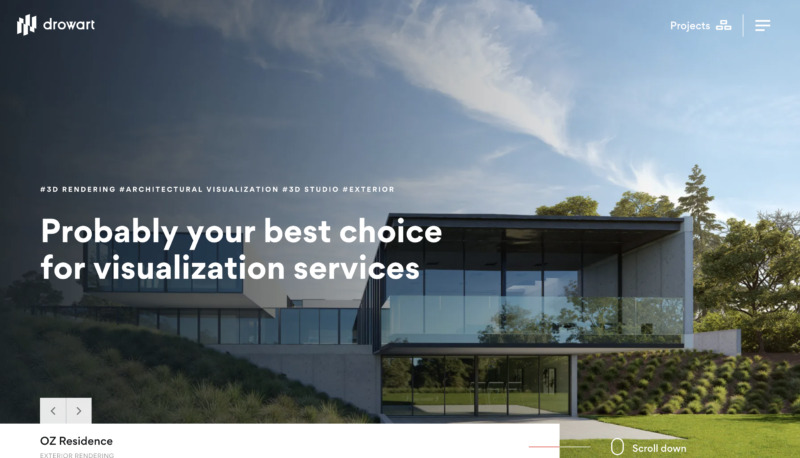
2. Drowart
Drowart is a visualization studio that uses advanced computer techniques to create a photorealistic design that captures the client’s vision. Their website seems to use those cutting-edge techniques to capture the attention of their visitors.
What We Like About It
The site immediately sells the firm by highlighting what sets them apart from others. The first thing you will notice when you get to Drowart’s homepage is its sales pitch. Against the backdrop of some of their great designs, they flash the selling points for their firm. Below is a concise description of what the company does with a clear and straightforward explanation.
The website provides a unique user experience, to say the least. As you scroll down, the elements of the site slide up. It is as if the website is building itself as you go. This could be a nod to the building process that the client and firm undertake together.
Another unique aspect of this website is the use of moving images. When you bring your cursor over the menu for the different services they offer, the text slides up, and the picture begins to pan.
Furthermore, you’ll find an FAQ section on the homepage. Clients have several questions they might want to ask. The placement of the meticulously organized FAQ on the homepage is ideal so the visitor would not need to hunt for it.
At the bottom of that section, the company provided a contact form so that if a question remains unanswered, they can immediately get back to you with the answer. On top of that, the inclusion of the digital clock showing the time in Cracow, Poland, is an excellent touch.
The layout of the content pages resembles an architecture magazine, even on a smaller screen. The information in the body of the website is relatively precise. Concise paragraphs make up the “About Us” and “Services” sections. Each paragraph is accompanied by an eye-catching label, image, or heading. Even on mobile or tablet screens, the photos do not look squished, and the text is still readable.
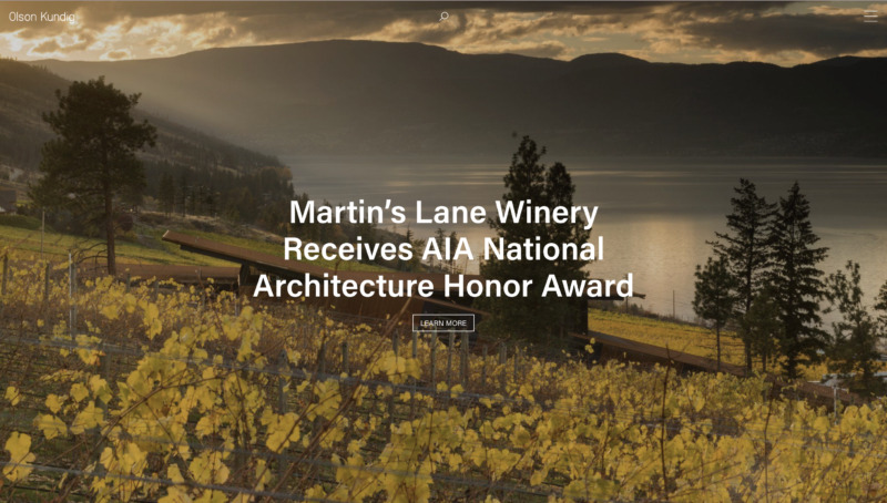
3. Olson Kundig
This collaborative design practice website took to heart the quote, “Let your work speak for itself.” The web designer for this project maximized their visual impact hoping that the visitor would be impressed enough to hunt for the architect who did the design.
What We Like About It
The website uses pictures rather than words. Unlike other sites where the architectural firm’s name and description are prominent, here, you immediately see the company’s projects. Other than a small “OK” that stands for Olson Kundig, at the top left of the screen and the hamburger menu on the right, the only other words you will see are the project’s title and the CTA “Learn More” button.
The description for the projects is comprehensive and easy to understand. If a particular project catches your eye, you need to click on the button to see its description. Only then will you find out who the designer is and the work they did for the commission.
Each project is detailed in three short paragraphs. Next, a quote from the designer follows this description so they can explain the process. Finally, the names of the team follow. This further pushes the message that the picture of their work is enough to sell their firm.
Navigation is simple. Under the pictures, you will see links to the recognitions and media coverage that particular design received. And if you like that design, another link will show you the firm’s other projects that are similar to it.
Furthermore, the website doesn’t use any gimmicky call-to-action buttons. The company knows that the people who will hire their architects already know them and their work. So their website is more of a place where they can park beautiful pictures of their work rather than a way to attract more clients.
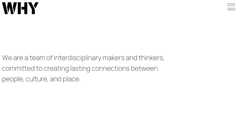
4. WHY
WHY has quite a contemporary feel to their website. It mirrors the kind of space the company designs. Just like most other architecture websites, it features only a few words. Instead, the webpage focuses more on the images of the firm’s completed projects.
What We Like About It
The website starts with branding. When you get to the homepage, you will see the word “WHY” right in the middle of the screen. Immediately after, the text on the firm’s description streams in. This bold but clean approach makes sure that you recognize the featured company.
The website effectively uses auto-play videos. When you scroll down, the “gallery” automatically plays videos that talk about the projects. For example, in one video, the gallery owner describes the space that the firm created and expanded. If you want to learn more about a particular project, you need to click on the “Explore project” button.
The project information is short yet comprehensive. Each project is featured in six or seven pictures, each accompanied by a short paragraph. The paragraph is the description and the reason for the design. At the bottom, you will find the name of the people who were involved in that project.
The use of the virtual tour video is astounding. It is animated but effectively showcases what the architects planned for space. It starts with the bird’s eye view of the space, and then it becomes a sped-up walkthrough. This is an excellent element to incorporate if you want to showcase your work in a unique and attention-grabbing way.
Another feature worth mentioning is that if you mouse over any of the static images of their projects, the cursor turns into the initials of the title of the project.
5. GLUCK+
GLUCK+ is the only website on this list that fully informs the client about the design process. This award-winning design firm makes sure that its clients are part of the process from beginning to end.
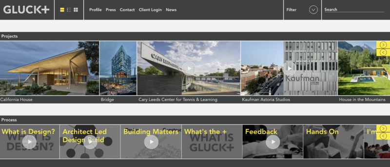
What We Like About It
The website is information-packed but surprisingly easy to navigate, thanks to the options for viewing methods. The first and last options utilize a horizontal grid to arrange the images of its completed projects and a link to the explainer videos detailing the firms’ design process. You don’t have to keep on scrolling down since all of the links and images are already on the screen.
The middle viewing option is a simple vertical text list of the company’s projects indicating the project’s name, description, location, date of completion, and category. If your client has several projects under their belt, this vertical list is an excellent way to fit all the information on the page.
The details of the projects contain only the most essential information. Therefore, you can read it at a glance. It also has a colored index detailing the category of the project and its state of completion.
Conclusion
A client searching for an architect is probably not looking to learn more about designing a house. Instead, what’s important to that person is the portfolio of the architect. That is why it should be the focus of an architect or architectural firm’s website.
Besides the eye-catching pictures that show the details of the project, a short description of the design and the reasoning for those is enough. If you can include unique elements that go well with the architect’s design style, even better.