Do you know the number one reason why people enjoy going to salons? It’s so that they can look and feel fresh, clean, and gorgeous when they leave. These are the terms you want users to think of when they visit your website. Since your website is the face of your digital presence, you want it to be as appealing as the individuals who walk through your doors.
When designing a salon website, it is essential to leave plenty of room for photos. You should demonstrate to guests what they may expect if they opt to be pampered at your salon. The website should also rank well in the local search results to increase the likelihood of getting noticed by potential customers.
We have chosen the following best salon website designs to inspire you for your own.
Our Top Choices for Salon Websites
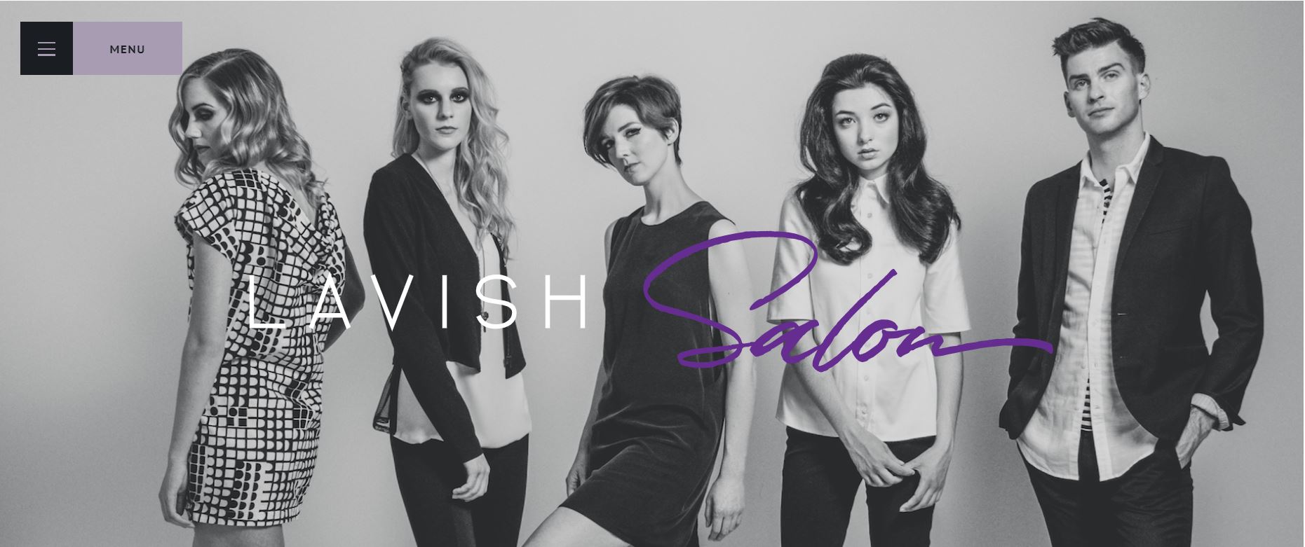
1. Lavish Salon
It is essential to highlight the looks that your salon specializes in when you present your website. This makes it easier for clients to determine whether or not your stylist can help them achieve their desired appearance.
Lavish Salon is known for its contemporary and clean looks. Take a look at how they showcase this on their website.
What We Like About It
The Lavish Salon website appears to be modern and polished. The appearance that the salon’s stylists prefer is depicted in the hero picture. It shows fashionable young people, who seem to represent the shop’s target demographic. Furthermore, the website employs off-canvas navigation, which keeps the homepage uncluttered.
The homepage also gives an insight into some of the salon’s value propositions. The first is that the stylists at the salon put a premium on continual learning. Next, the brief copy outlines the salon’s dedication to providing stylists with a progressive work environment. The commitment to remaining environmentally friendly is the next value showcased on the website. If visitors appreciate these sentiments, it will be easier to persuade them to visit the salon.
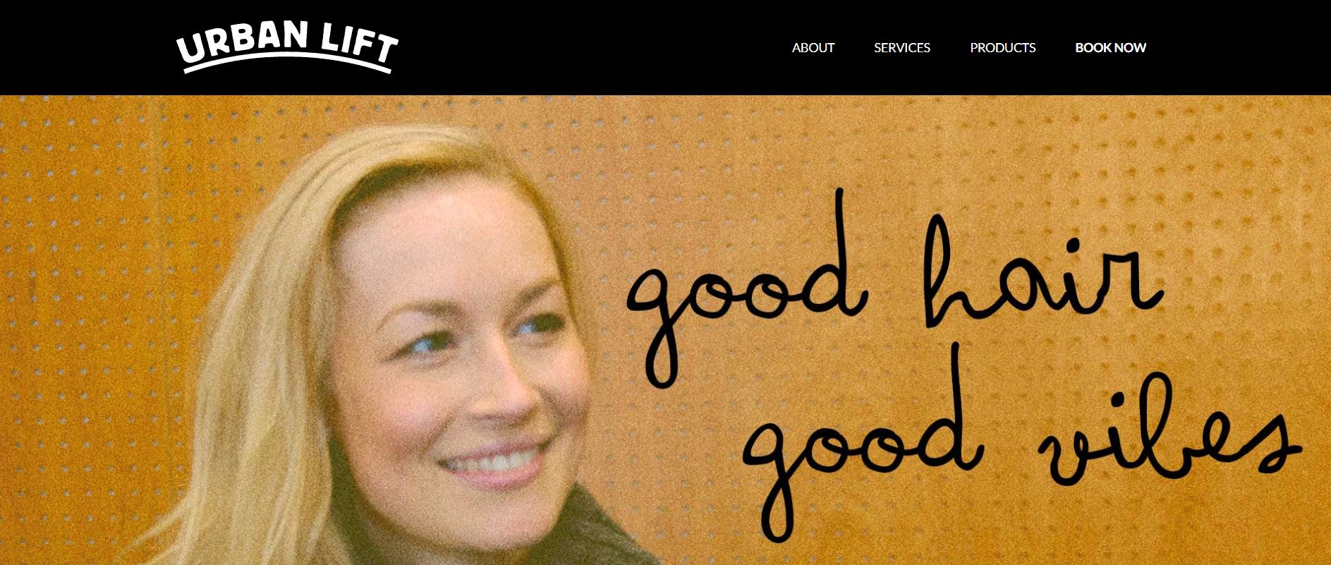
2. Urban Lift
Most people prefer to go to a salon where they are treated as friends rather than paying customers. This is the kind of vibe that Urban Lift is going for, and you can see it on the company’s website right away.
What We Like About It
Urban Lift is not your typical salon. Instead, it’s a place where clients are encouraged to feel comfortable and enjoy themselves. As a result, the salon’s website appears to be laid-back and delightful.
The tagline on the header says, “Good hair, good vibes.” This works well with the slightly grainy picture that serves as the hero image. The landing page has a casual appeal, enhanced by hand-drawn illustrations of hair products and grooming equipment.
Furthermore, Urban Lift provides a list of the salon’s services on its website, which is almost always an excellent idea. This makes it easy for site visitors to determine whether or not the salon provides the services they require. The designer simply included a few details under each service category to keep the website from getting too crowded. As a result, visitors can access the rest of the information once they click the “Read More” button.
3. TONI&GUY
Toni&Guy’s website is sleek and trendy, just like the haircuts offered at this salon. The site has many eye-catching images that show off the many hairstyles they can do for their customers.
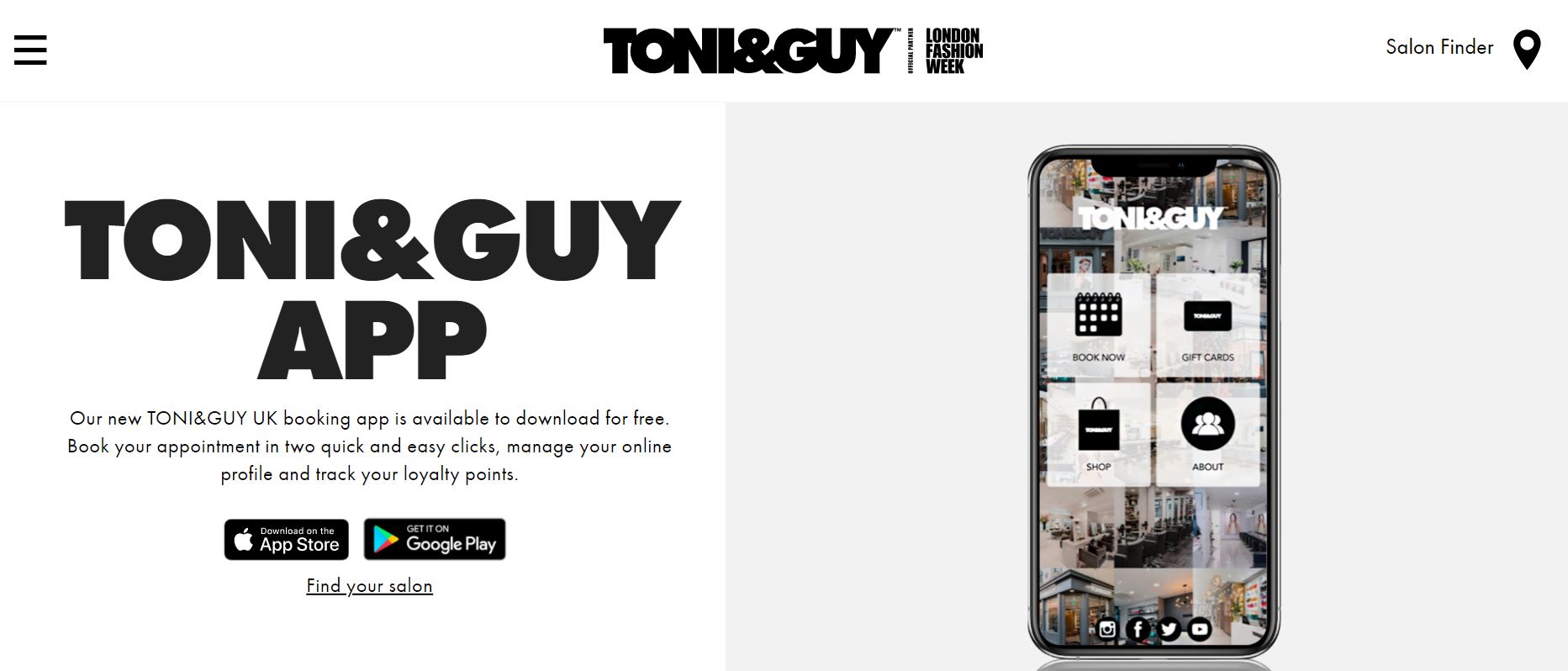
What We Like About It
The website features almost ten pictures on its homepage alone. The best part? Each one stands out as much as the hero image. The photos are of excellent quality and have great illumination. What’s nice about these photos is that the audience can identify right away which aspect is being highlighted — the hair.
Moreover, the website’s typeface is modified to match the company’s logo. The bold letters do, in fact, stand out from the rest of the text. It acts as the section heading font, making it simple for users to scan the page for the information they want.
A digital magazine is also available on the website. Instead of a blog or newsletter, the company publishes this magazine to keep its customers up to speed on the latest hair trends. A magazine not only serves as a wonderful source of industry knowledge but also allows the salon to market its stylists, products, and services. In a nutshell, it’s educational content that enables them to promote their business.
4. SALT Hair
SALT Hair is an award-winning salon that specializes in hair coloring. Since it caters mainly to women, its website features details that are geared toward this particular demographic. Take a look at how the website radiates the ideal blend of luxury and comfort.
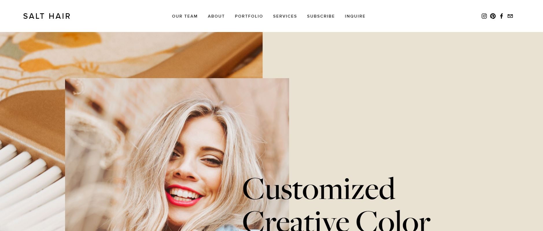
What We Like About It
Keeping in view the diversity of the women in SALT Hair’s clientele, the website’s color palette isn’t limited to pastels. Instead, it opts for warm and neutral tones with a gold tint. The background images on the site incorporate elements that appeal to most visitors. You’ll see a lovely brush, champagne flutes, and a card in the background as you scroll. Moreover, the parallax scrolling effect on the webpage is rather dynamic.
Along with the list of services, SALT Hair also displays its price list on its website, which is a rather bold move that we don’t see quite often. As a result of this disclosure, visitors can determine whether or not they can afford a service. This also makes it a lot easier to decide on the sort of service they want to use.
An “Inquire” button is carefully positioned next to the rates so that an appeased client can instantly proceed with the pre-consultation screening. Moreover, the CTA buttons placed in strategic locations are quite successful at converting visitors into customers.
5. Hounds Barbers
In the world of salons, your website serves as a receptionist. It welcomes guests and instructs them on how to get to the physical store. The website also provides answers to frequently asked questions and assists clients in scheduling appointments. Take a look at how Hounds Barbers’ website assists its customers.
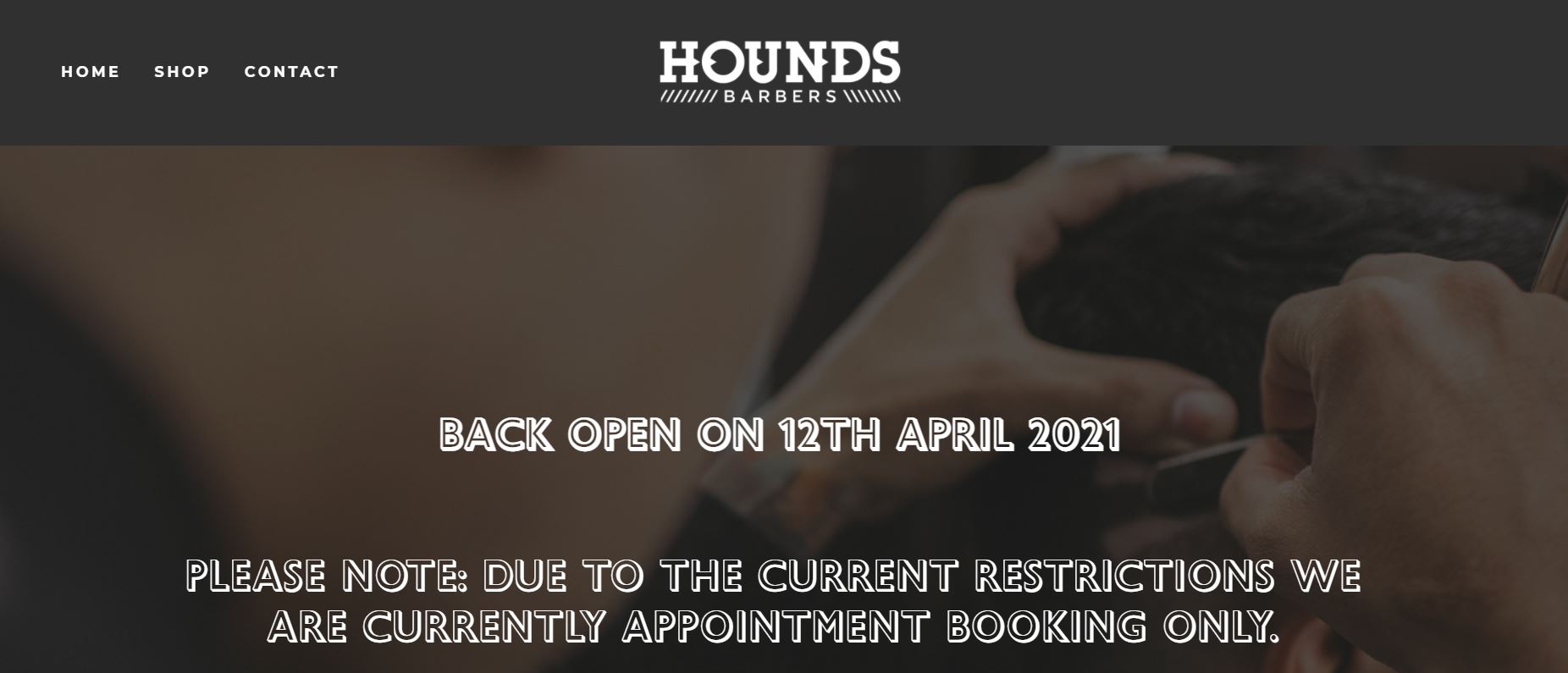
What We Like About It
Hounds Barbers’ website reflects the shop’s vintage vibe. The page has a retro feel thanks to the font and grainy, slightly monochrome pictures. Its homepage offers all of the elements that a visitor needs to learn more about the store, schedule an appointment, and discover its location.
It starts with a big statement about online booking and the shop’s new regulations due to the existing constraints. The notification is prominently displayed in the header, making it difficult for any visitor to miss it. Moreover, a green “Book Appointment” button can be seen underneath the announcement. Since it is the only colorful element visible on the screen, it successfully stands out from the rest of the page.
Making the online booking option highly visible minimizes the likelihood of someone coming up to the shop without making an appointment. Finally, visitors can find a map showing the shop’s location at the bottom of the website. Customers can easily use their mobile devices to access the map, which provides driving and walking instructions to the shop.
6. Bleach
Bleach is a hair-dying salon specializing in edgy coloring. The collections pages are the most visited section of its website. Take a look at how Bleach presents its finished hair masterpieces.
What We Like About It
Bleach is known for its quirky and fashionable hair hues. Visitors enjoy looking over their stylists’ portfolios to see what they have to offer. On the website, there are two photo galleries. The first one is its editorial collection, featuring the salon’s more creative work, such as futuristic designs and two-toned hair tints.
Furthermore, their regular work is displayed in their floor collection gallery. This is a grid of photos of Bleach clients after they’ve had their hair dyed. Visitors to your website can get a sense of what styles your salon can and can’t manage by looking at your portfolio. Indeed, seeing what your stylists can accomplish will make it easier for them to decide to come to your shop for a haircut or hair color.
Conclusion
A salon website is essential for attracting new customers and making it simple for existing clients to schedule appointments. In addition, considering the present circumstances, online booking is a vital function to have on your website.
It’s also important to have high-quality photographs on your site so that you can promote your stylists’ work. The photos, color scheme, and typography all work together to offer potential clients a sense of what to anticipate when they come in for a haircut or treatment at your salon.