Updated for 2021. Real estate is a business of trust. The person looking to buy or sell property needs to trust the real estate agency since it’s a pivotal purchase that entails a considerable amount of money. This is why, besides the usual website features, you need to incorporate elements that prove the competence of a real estate agent.
Of course, the main objective of the website is to convert visitors into clients. Whether they are buying or selling, you want to get them to sign with you. In order to achieve that, there are certain elements you must include in the site design. Let’s take a look at these ten exceptional real estate web designs and see why they are so effective.
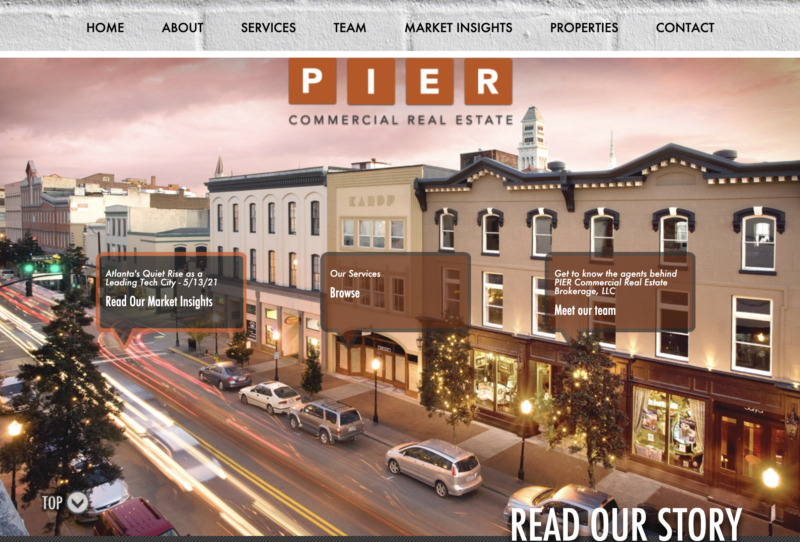
1. Pier Commercial Real Estate
Contents
This brokerage and real estate management firm offer tailor-made services for the client’s needs. In addition, the website is easy to navigate as it is one of the few out there that utilizes a single-page layout.
What We Like About It
This no-frill website means business. Everything you may need to know, from their list of services to the details of their team members, are all placed on one page. They designed the site so that each significant piece of content fits into an entire screen. There are buttons for the different sections, but it does not go to other pages if you click on them. Instead, it simply scrolls up or down to the section on the same page.
If extra parts of the content don’t fit one page, it can be accessed using dynamic scrolling animation. This feature is what the designer used for the “Our Services” section. If you click on the different services category, the content is shown in the small window. This is an excellent layout if you don’t want your visitors clicking out of your homepage and getting lost in the various content pages.
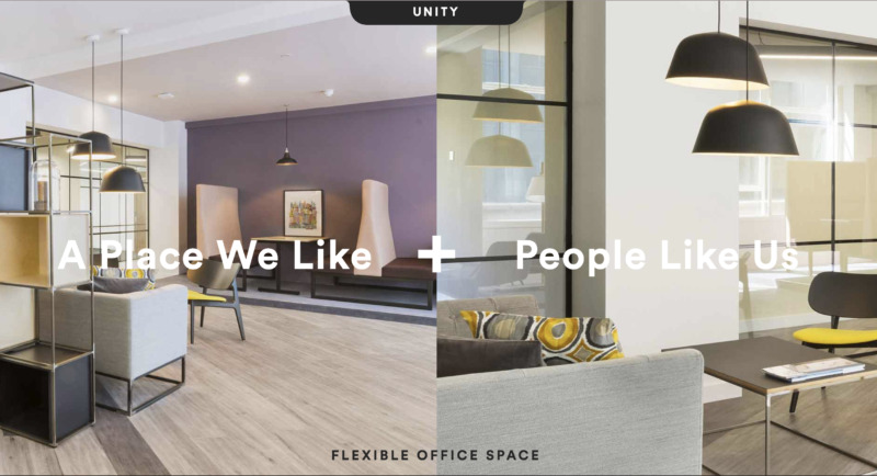
2. Unity Working
Unity Working is a firm that offers stylish and contemporary office spaces. The company’s website mirrors that aesthetic to a great extent. It provides users a slightly confusing but highly dynamic and visually appealing experience.
What We Like About It
When you get to Unity Working’s homepage, you are greeted by what the company refers to when it says Unity. It proclaims that they unite the spaces with people. These two elements work together to offer the client what they need – a beautiful yet functional office space where the company can grow. It is an excellent idea to feature this unique quality of the company as the face of the website. If the company has a distinct philosophy or motto, it is a strategic move to use as the basis for your web design.
The website also uses this definition to categorize the content. On the side marked “A Place We Like,” the content focuses on the spaces they want visitors to rent. On the side marked “People Like Us,” the content introduces the kind of people who rent their property. As a visitor, you get to choose which side to explore, and you only see the content you need. Even the text content used for every section is designed to be scanned. Furthermore, all this is placed over a backdrop of amazing pictures of the office spaces.
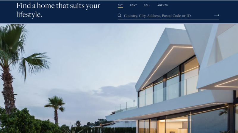
3. Keller Williams Realty
Being one of the largest real estate firms in the world, the company knows that it doesn’t need too much introduction. Most people are already well aware of the credibility of their work, which is why the website immediately gets down to business.

What We Like About It
If your company is already a well-known brand in the industry, like Keller Williams Realty, you don’t have to bombard the visitors with your achievements. As soon as you get to the company’s homepage, you find a Call-To-Action – “Find your Dream Home.” Under that, you can click on whether you are looking for a property to rent or to buy. Then there is a search bar where you can put the elements you are looking for, such as the city, district, address, etc.
If you have no idea what to put in that search bar, you will immediately get help when you scroll down. You can find another search bar this time and choose to type in the agent’s name or your location.
The website doesn’t have any extra content. If you go to the “About Us” page, you won’t see paragraphs of content talking about the company. Instead, you will find four words they use to define the firm. Everything is direct and to the point. From the description of who they are to the kind of culture you can expect from the firm, they limit the content to two to three sentences.
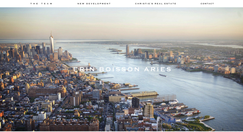
4. Erin Boisson Aries
Erin Boisson Aries is said to be one of the top real estate agents in New York. Along with her team, she has a collective experience of 18 years of handling multi-million-dollar luxury properties. The firm’s website features just two components: the real estate sold and the people doing the selling.
What We Like About It
The website oozes luxury without being too stiff. It starts with a page of white with the name “Erin Boisson Aries” printed in the middle. And then, as if you are opening your eyes, a picture of a luxury property appears behind the brand. Next, a succession of well-chosen shots replaces the first one. This allows the visitors to peek into the properties managed by the firm.
There are only six navigation buttons displayed on the page. The two prominent ones lead the visitor to the information about the team, and the other to the property they manage.
On the team’s page, the website immediately establishes the members’ excellence by highlighting the awards they’ve received. In addition, it is a reassurance to the visitor that the team knows what it’s doing.
On the New Development page, there is a brief description of their services and their new projects. Below is a list of their milestones and achievements regarding the developments listed. There are no pictures. It just plainly states the statistics, such as their record sales absorption. If you are a seller, this matters more than pictures since it tells you that this company knows how to get results.
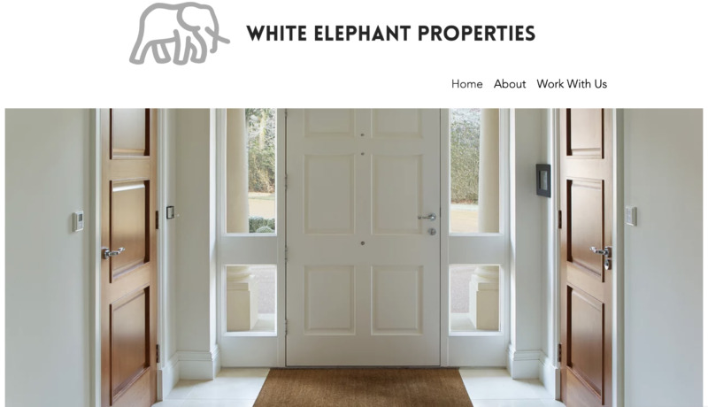
5. White Elephant Properties
One of the most important things a website should do is to introduce the people it represents and give precise details on what they do for their visitors. This is precisely what White Elephant’s website does.
What We Like About It
The experience this website offers has a lot to do with ease. The website is easily navigable, so you can contact the firm quickly. Moreover, the minimal content is easy to read and understand.
The first thing any visitor will notice is the use of white space in the pages. This is an excellent way to pull the visitor’s eyes to the essential things on the website. It also keeps them from getting confused since there are only a few elements on the page at a time. The web designer also stated that the white space symbolizes the improvements and customization the firm can do on any property they manage. This firm specializes in buying and selling distressed properties, and its website highlights this unique attribute.
Overall, the website makes it incredibly easy for visitors to contact the firm. Prominent on its homepage is who the company is and what it can do for the visitor. Immediately after the short but effective detailing of their services, the section features a Contact Us button. There is also a chatbot that can answer some of your questions if you need immediate answers.
6. Sotheby’s International Realty
Since it can be impractical to go out and view houses individually, websites that provide tours gain an advantage over those that don’t. Sotheby’s website uses this feature to its full advantage.
What We Like About It
The header of this website is a carousel of their latest and best properties being offered. While it starts out looking like a static photo, it automatically turns into a video tour after a few seconds.
The virtual tour on this website’s homepage is exceptionally well made. It begins with a video of the outside view of the property. Then, it zooms in and gives a tour of the inside. The video shows the feeling of entering the property and walking around.
Scrolling down, the visitor is introduced to what Sotheby’s is: what the company focuses on, what they do, and the benefits of selling with them. There are no long paragraphs here. Instead, everything is concise and to the point.
7. Barkli Gallery
If the real estate firm’s property is anchored on essential places to visit, you can use this as the basis for your design. For example, the Barkli Gallery is surrounded by culturally and historically significant sites, and its website reflects that to its full potential.
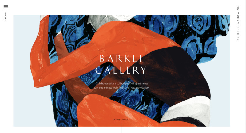
What We Like About It
The real estate firm manages apartments in a building near the Tretyakov Gallery. The details about the firm, its people, and the gallery it features are all presented artfully in short videos. There is extraordinarily little content to read. Instead, the focus is placed on the museum-like art shots of the apartments.
Below that is the piece de resistance of the website, its interactive map. It shows you the location of the building and the notable places you can find nearby. You can also choose to highlight specific categories like places of culture, gastronomy, shopping, etc.
Or you can highlight them all to have a better picture of what to expect should you rent an apartment from this firm. This is a great feature to add to a website if there are numerous notable places near the properties you are trying to sell or rent out.
Another nice feature on the website is looking at each apartment’s features using an interactive map of the building itself. You start by choosing which floor level you’d like. Then you get to see a floor plan of that level. Once you’ve chosen a particular apartment, you are led to a page containing its details such as floor area, unique features, and outside view. Below is the CTA to contact their office and schedule a viewing.
8. 1 OAK Real Estate Hub
While most real estate company websites immediately showcase the available properties for sale or rent, 1 OAK’s website focuses more on getting to know the client. Since the company’s objective is to connect the right people to the right property, they emphasize getting you to connect with them.
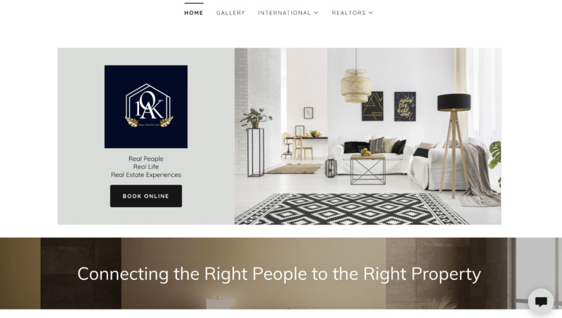
What We Like About It
The homepage is neat and clean, with lots of white spaces. The images are well curated to give the impression of the premium product and service that you get from the company. Sticking to its neutrals and gold color theme adds to that luxurious experience.
The only thing you will see above the fold is the company’s branding, a beautiful image of an interior of a property, and a call-to-action button to book a consultation online. Below is the explanation of why they want you to call them: they want to know more about you and match you with the property that suits your needs, quirks, and desires. On top of that, they promise to guide you through the process so that the whole transaction is worry-free.
If you want to see some of the properties they manage, you can easily do that using one of the four menu options at the top of the page. Each property is described briefly so that you get all the relevant information in just a few seconds.
9. Tribeca Real Estate
It can be challenging to hunt for a home or a commercial property, especially in popular cities, since there are so many options to choose from. And if you don’t know where to start, the search becomes a little more complicated.
That’s why it is good to provide a logical flow to your website so that you can guide your visitors through the process of choosing their next home or office space. This is what Tribeca Real Estate’s website did effectively.
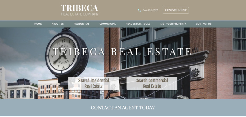
What We Like About It
From the homepage, you are already given a choice of exploring the residential or commercial real estate. After clicking on one option, you are taken to the next page that contains a few details about why the neighborhood is a good choice for residence or business location. Then there are more choices for which type of accommodations you want and if you wish to buy the property or rent it.
Once you’ve narrowed down your options, you’re offered a list of properties to choose from. Each property description comes with a picture, area, number of rooms and bathrooms, and the price. If that is too overwhelming, you can shorten the list using the filter options at the side.
You can also search through the listing based on your price range, the number of rooms, the presence of a doorman, pet policy, and more. You can even filter it to show you properties with a washer/dryer or a private roof. This is a great feature so that the visitor wouldn’t have to wade through hundreds of options that do not even fit their requirements.
10. Berdan Real Estate
Berdan Real Estate’s website is simple, easy to navigate, and effective. It has a no-frills design that looks elegant but is highly effective, much like the company it represents.
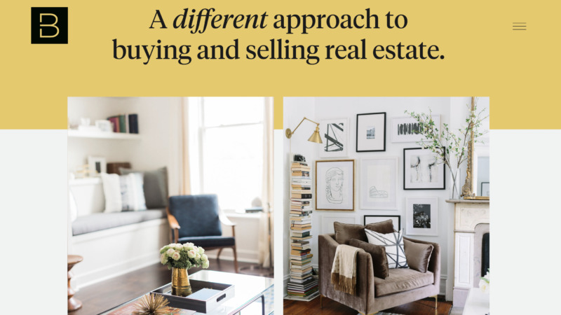
What We Like About It
There are three major sections on the homepage of this real estate website. The first panel states that the company takes a distinct approach to real estate properties. The next part is a statement to prove their agents’ expertise. One statement! And the final part is an invitation to meet over coffee.
The website looks fantastic on both desktop and mobile screens. In addition, it is easy to scan since there are probably less than 200 words on their homepage. But, of course, that already includes the company’s address.
As soon as you land on the homepage, you get to decide whether you want to see information for buyers or sellers. Then, when you get to the content pages, solid-colored backgrounds and white spaces separate the different sections. It makes the pages look neat and uncluttered.
On the left side of the screen, you will find the company’s achievements. The multimillion-dollar value of properties they helped sell and buy is a solid reassurance to their potential clients that this firm knows the business well.
For the selling part, the website uses a grid of images and text to guide the visitor through the company’s process for selling a house. This is an excellent feature to add as you want visitors to get a glimpse of the process should they decide to choose the firm.
This website focuses on brevity and simplicity but chooses the right pain points to hit that convince buyers or sellers to work with them. Plus, it makes it easy to contact the company through numerous buttons spread throughout the website.
Conclusion
In making a real estate website, you want to make it easy for the visitor to find the information they need. Whether that’s a listing of a property that fits their requirements or the contact details of the real estate agent that works near their location, it should be locatable either immediately or within one click.
Plus, since real estate deals with a considerable amount of money, you need to establish the professional’s credibility and expertise. You can do this by showcasing the agent or firm’s various recognitions, or you can make sure that the extensive listing under their name is noticeable.
When people see that so many property owners put their trust in that person or company, it automatically speaks of the entity’s credibility.